BubbleUp Meets Tracing (and Other Odd-shaped Data)
By Danyel Fisher | Last modified on March 5, 2019A few weeks ago, BubbleUp came out of Beta. We've been getting fantastic user feedback on how BubbleUp helps users speed through the Core Analysis Loop and lets people find things they never could have found before. We've also been learning more about how BubbleUp works with Tracing, which unearthed some difficult issues. Today, we're taking those head on.
Two of my favorite features in Honeycomb are the way we handle tracing, and BubbleUp.
Tracing lets you work your way through complex data histories, getting to understand how a complex system is interacting. It's no problem dealing with tracing data because Honeycomb has, roughly, unlimited dimensionality and unlimited cardinality. In other words: we'll take all the weird-shaped spans you want!

BubbleUp is meant to help you answer the question “What explains these unusual data points?” It takes each and every dimension in your data, and compares its distribution between the selected points and the rest of your dataset.
There's a problem, though. Didn't we just promise unlimited dimensionality? How can you use BubbleUp to to search through an unlimited number of dimensions to figure out which ones matter?
Different types of events can have different shapes
Honeycomb's approach is to think of the data as polymorphic — that is, different types of events can be differently-shaped. Tracing spans tend to be polymorphic because each type of span has different data associated with it. A span that refers to a database connection might have fields like sql.query and sql.resultsReturned, while a span that refers to an HTTP connection might offer http.status and http.version.
What does this mean to us? Well, here's a dataset for a server we're running at the Hive. I was curious why there was a cluster of very slow events. (If you're new to reading heatmaps, check out “Heatmaps make Ops Better”)
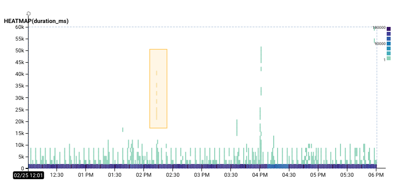
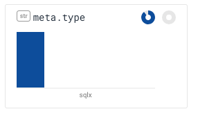
The selection I made in BubbleUp showed me these three charts. Remember that in each of these charts, the blue bars reflect the number of events in the baseline, while the yellow bars reflect the number of events in your selection.
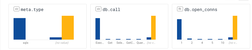
In this case, BubbleUp has given me some potentially valuable signal: the events in the selection are very different from the baseline: while lots of the events in the baseline are related to sqlx, these aren't. I can tell because their meta.type field is listed as (no value).
They can be read as “the events in the selection didn't have a meta.type, didn't have a db.call, and didn't have a db.open_conns.” That's not bad — but it's not the whole story.
See what matters first
With the improvements we've made, BubbleUp now shows this set of dimensions first (for the same selection as above):
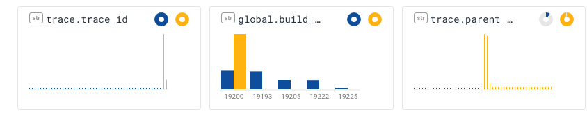
The first chart shows that most of the events in the selection share the same trace_id; the second, that they come from the same build of the software. That's pretty good! We know this selection pretty much contains events from just one trace.
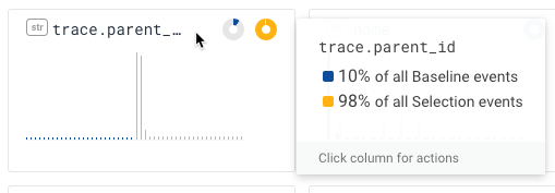
When I hover my mouse over the title bar, the popup tells me that “98% of the Selection events have a parent_id.”—and lots of them have the same parent_id. (In contrast, only 10% of the events in the baseline have a parent_id!)
In addition to drawing the donuts, this version of BubbleUp also adjusts the ranking function a little bit: if nothing from the selection participates in a dimension, it gets pushed to the back. For example, meta.type is now on the second page of results — and it clearly shows that nothing in the selection has a type.
What this means is that if you are using BubbleUp with tracing data, your life just got a lot better. You're more likely to see the most interesting BubbleUp fields first, and you'll see them at the front of the pile.
As always, we really appreciate your feedback. What does this tell you? What have you found with BubbleUp? Join the Honeycomb Community Slack and let us know!
Ready to dive in and see what's special about your data? Sign up for a free trial!
Related Posts
Introducing Relational Fields
Expanded fields allow you to more easily find interesting traces and learn about the spans within them, saving time for debugging and enabling more curiosity...
Safer Client-Side Instrumentation with Honeycomb's Ingest-Only API Keys
We're delighted to introduce our new Ingest API Keys, a significant step toward enabling all Honeycomb customers to manage their observability complexity simply, efficiently, and...
Now Available: Honeycomb Launches Data Residency in Europe
At Honeycomb, we are very concerned about privacy and data sovereignty—it’s something we take very seriously, and in an effort to serve our customers better,...