Handle Unruly Outliers with Log Scale Heatmaps
By Danyel Fisher | Last modified on October 27, 2020We often say that Honeycomb helps you find a needle in your haystack. But how exactly is that done?
This post walks you through when and how to visualize your data with heatmaps, creating a log scale to surface data you might otherwise miss, and using BubbleUp to quickly discover the patterns behind why certain data points are different.
Finding hidden latency
We recently got a question from one of our customers:
Is there a way to look at the distribution of
duration_ms(duration of a span in milliseconds) for all spans with a given name that were recorded within X amount of time?
That’s a great question because it can be solved with a handy visualization you may not already be using: the log-scaled heatmap. Let’s show you a few ways to help control unruly outliers and better understand your data using log scales.
Every event you send to Honeycomb has a timestamp and duration_ms field — what time it was sent and how long it took to be processed. That’s handy for looking at the latency of different parts of your application.
Additionally, with Honeycomb’s high cardinality, you can group or filter on any dimension. That also means you can look at request duration for a specific service or even for a specific customer. Let’s look at how that’s done.
Start with a heatmap
Heatmaps are useful when you want to quickly spot trends and issues at a glance. It’s pretty common to use Honeycomb line graphs to monitor some statistics about your requests: they make it easy to check out how long it takes for the 95th percentile of requests to complete (P95(duration_ms)), or the average time. But sometimes your data is more interesting than the 95th percentile. Thanks to their color-coded nature, heatmaps let you visually dig in further.
A previous post “heatmaps make ops better” helps show that numbers like min, max, and average can hide important and rich detail. For example, on this screen we’re looking at the latency for the RubyGems service. (This screen link, and all others in this article, link to a public Honeycomb URL — you can click and play with these for yourself!)
We can see that the shortest calls, the P05, is under 140µs, the P50 (median) is a little over to 400µs, and the P95 -- the slowest calls -- are nearly 2000µs.
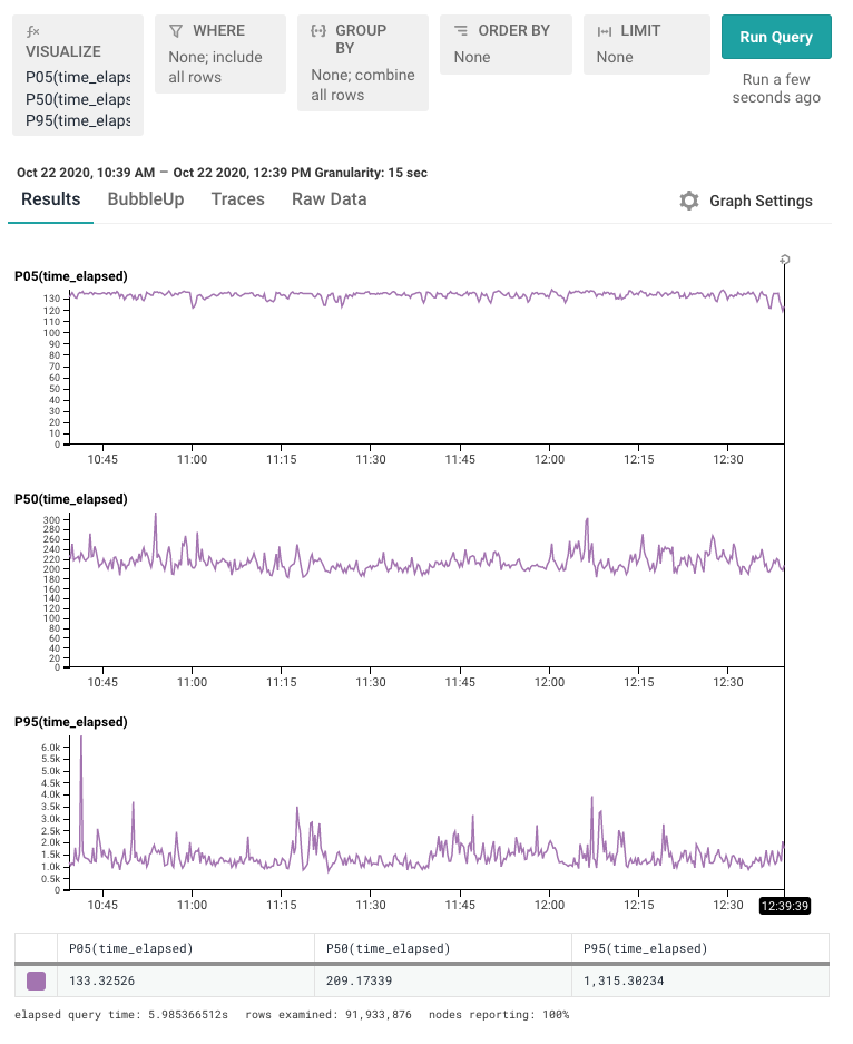
But this hides important detail, too! Knowing these numbers don’t tell us enough about the full distribution. Let’s change this to a heatmap:
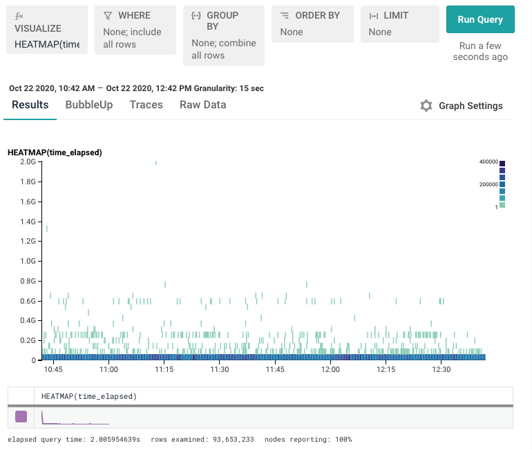
Unfortunately, it’s hard to see any real detail in the heatmap. There’s a lot of data along the very bottom of the screen — the lowermost bucket — and that there’s a sprinkling of data above it. But what’s hiding in that bottom row?
Let’s try exposing that bottom row with a better view.
Revealing the Good Stuff On the Bottom
To view the data we want to zoom in on, one choice is to simply chop out all the slow stuff. By filtering to time_elapsed < 10000, for example, we can see a little more detail.
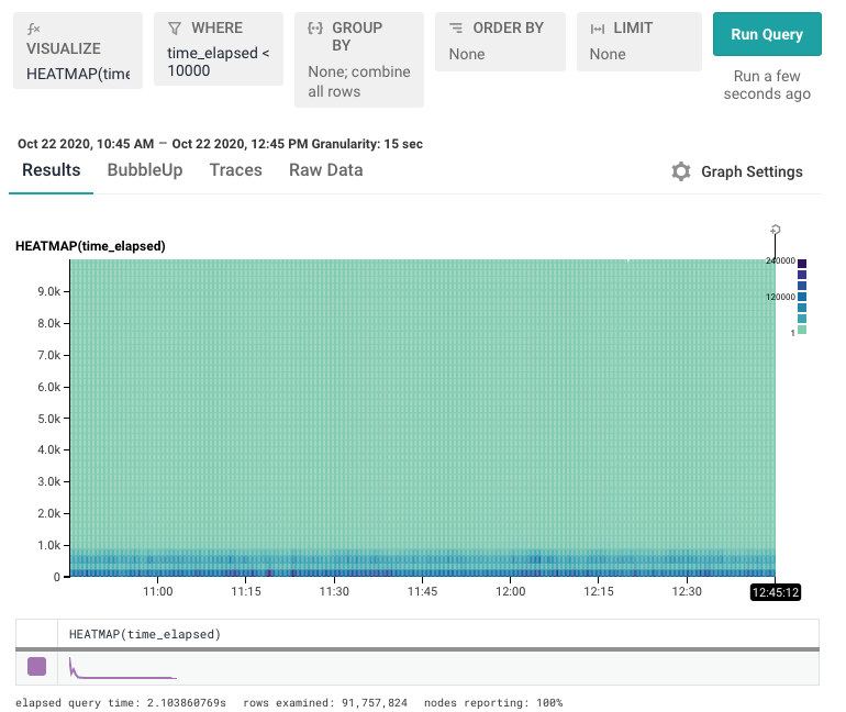
This view gets closer, but we still need to zoom even further to get to the valuable parts we want. We can filter down to time_elapsed < 1000 to get what we’re after.
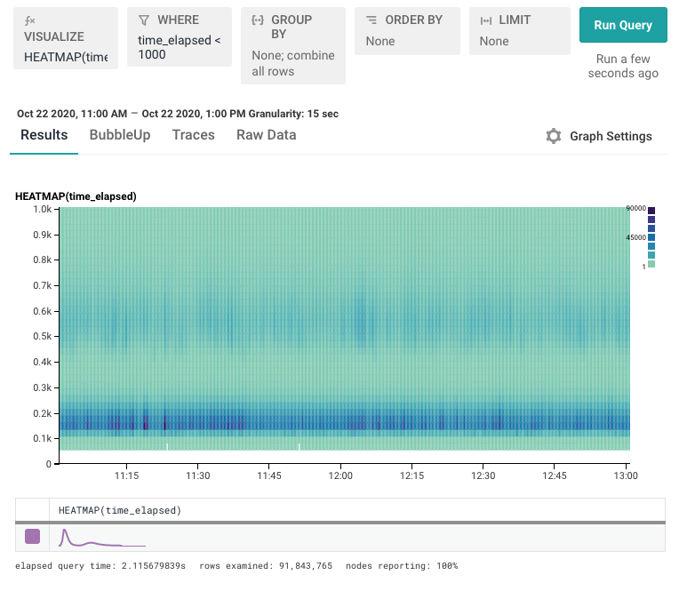
That aggressive filtering works in our example. But continuing to filter out value after value can become tedious. Worse, we can’t see how much stuff we’ve had to remove from the top. There has to be a better way to see the data that’s compressed down at the bottom.
Let’s get some (loga-)rhythm
There’s another trick we can use. Creating a log scale will expand the axis. A log scale takes the logarithm of each value, so it grows exponentially. That means that values from 1-10 take up one tick mark; values from 11-100 take up the next, and 101-1000 take the next.
That has the effect of applying a sort of fish-eye lens to your data. Below, you can see the same data we had before, but this time we’re looking at it on a log scale.
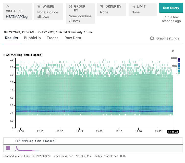
Since the Y axis is log(value), you can find the real values by running them through the 10^x button on your calculator: 0 means “1”, 1.0 means “10”, and 2.0 means “100”.
A few things become visible:
- The bottom area is much more interesting than we’d thought! There are two distinct bands: a really really fast one, and then another slightly slower one that has a long tail.
- There's a long taper off to the top.
This is amazing! We’ve really got two — maybe three — different sets of things going on here. In a moment, we’ll take a look at ways to quickly understand how these new groups we’ve discovered differ from each other. But first, let’s take an in-depth look at creating this view.
Wait, how did you do that?
Creating a log scale view is a little tricky right now. The right way to do that is to create a derived column. The wrong way to do that is to use this tempting button under the “Graph Settings” menu that says “Display LogScale.” (pictured below)
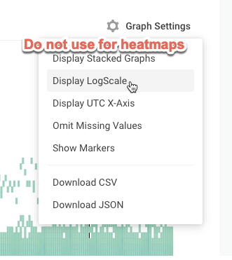
That option is meant for Honeycomb line graphs. If you use that option for heatmaps, it adjusts the scale correctly, but it doesn’t resample the data correctly and it appears in a distorted manner. As of the publishing of this blog, this is a known bug — though it has yet to be fixed.
Instead: what you want to do is create a derived column.
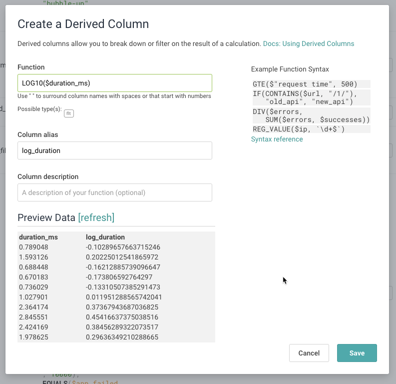
Create a Derived Column
The right way to get log scale data is to create a new derived column which represents the logarithm of the data. We’ll then draw a heatmap of that derived column.
The formula for this derived column will be LOG10($duration_ms).
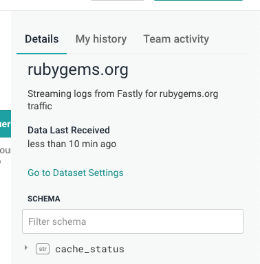
We’ve already done this on the rubygems dataset in our example above. In your own dataset(s), go to the Dataset Settings and navigate to the “Schema” tab. Expand the “Derived Columns” section and click on “Add new Derived Column.”
In the modal, fill out the form with the equation LOG10($duration_ms):
At Honeycomb we use derived columns just like this all over the place. They let us combine data from multiple columns, or transform columns in more useful ways.
In particular, we get really excited about transforming log scales: every internal dataset that has a duration field has gained itself a log_duration field; many datasets that have size fields (for example, for requests) also have a log_size.
Now, go back to the heatmap, and visualize HEATMAP( log_time_elapsed ). (In the RubyGems dataset, we call it log_time_elapsed.)
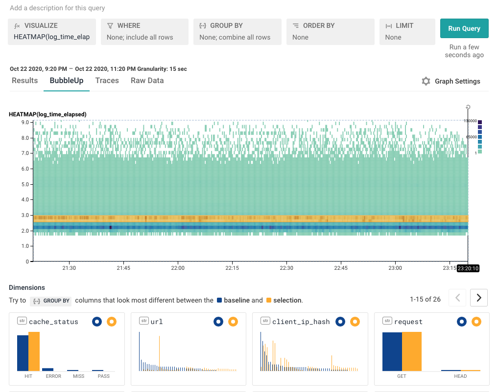
Quickly find differences using BubbleUp
BubbleUp explains how some data points are different from the other points in a heatmap — it helps understand what makes those points different. When we’re looking at a heatmap and start seeing areas that are interesting, that’s often a good opportunity to use BubbleUp.
As a general rule, multimodal data is almost always generated by multiple causes. Processes with singular causes tend to produce smooth curves. If you see something other than a smooth curve, there's usually an explanatory factor you're missing.
In this case, there are two stripes. That suggests that there are two dominant things going on in this data.
We can look at the logged heatmap and select one of them. Grab the region as a yellow highlight -- it shows how the selected yellow points are different from the others.
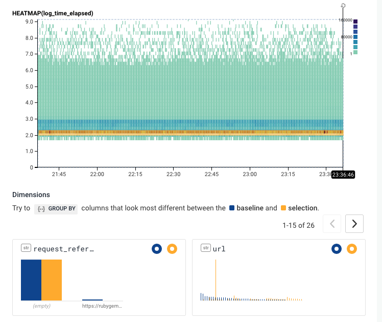
In this case, it’s pretty clear that the points differ on one particular URL -- the yellow line on the url column. Hovering over it shows that the url in question is url = /versions
From here, there are a number of different places we can go.
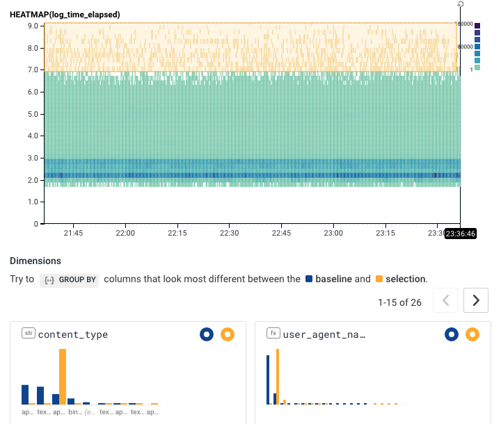
If we filter to only url = /versions, we can explore the patterns there. For example, grouping by status shows that response 200s are served much more slowly than other responses.
Or we can filter away url != /versions to start exploring other patterns. Or you can select different regions in the BubbleUp. Explore for yourself. What sorts of data can be found in the area above 7.0 in the heatmap? In these two images, we see one content-type seems to dominate the upper region; and one url seems to explain much of that bottom stripe.
In this example, you can quickly get to an explanation of what’s happening with unruly outliers. However, you can also explore this live dataset yourself by clicking any of the links above. What else can you find?
Find the hidden needles in your haystack
At the beginning of this post, we couldn’t see the latency that was hidden in our data. Using a heatmap allowed us to visually identify groups of slow performance. Altering that view using a log scale helped us zero in on the distinct groups that matter. BubbleUp then quickly identified patterns that explained why those groups were behaving differently.
Remember: create a LOG10(duration_ms) column yourself, and have all this power! Now you can start finding the hidden needles buried in YOUR data.
Try it out yourself -- go to our public Rubygems dataset. Compare a HEATMAP(time_elapsed) to a HEATMAP(log_time_elapsed) and go see what you can find out.
Related Posts
Transforming Financial Services with Modern Observability: Moov's Story
As a new company poised to transform the financial services industry with its modern money movement platform, Moov wanted an equally modern observability platform as...
ShipHero's Observability Journey to Seamless Software Debugging
Committed to timely service, ShipHero recognizes that the seamless performance of its software is paramount to customer satisfaction. To maintain this high standard, the development...
A Practical Guide to Debugging Browser Performance With OpenTelemetry
So you’ve taken a look at the core web vitals for your site and… it’s not looking good. You’re overwhelmed, and you don’t know what...