Welcome (to) Home
By Peter Tuhtan | Last modified on June 4, 2019Our latest product update features an intuitive home (landing) page that orients users with a quick, real-time view into what's happening right now in your production systems.
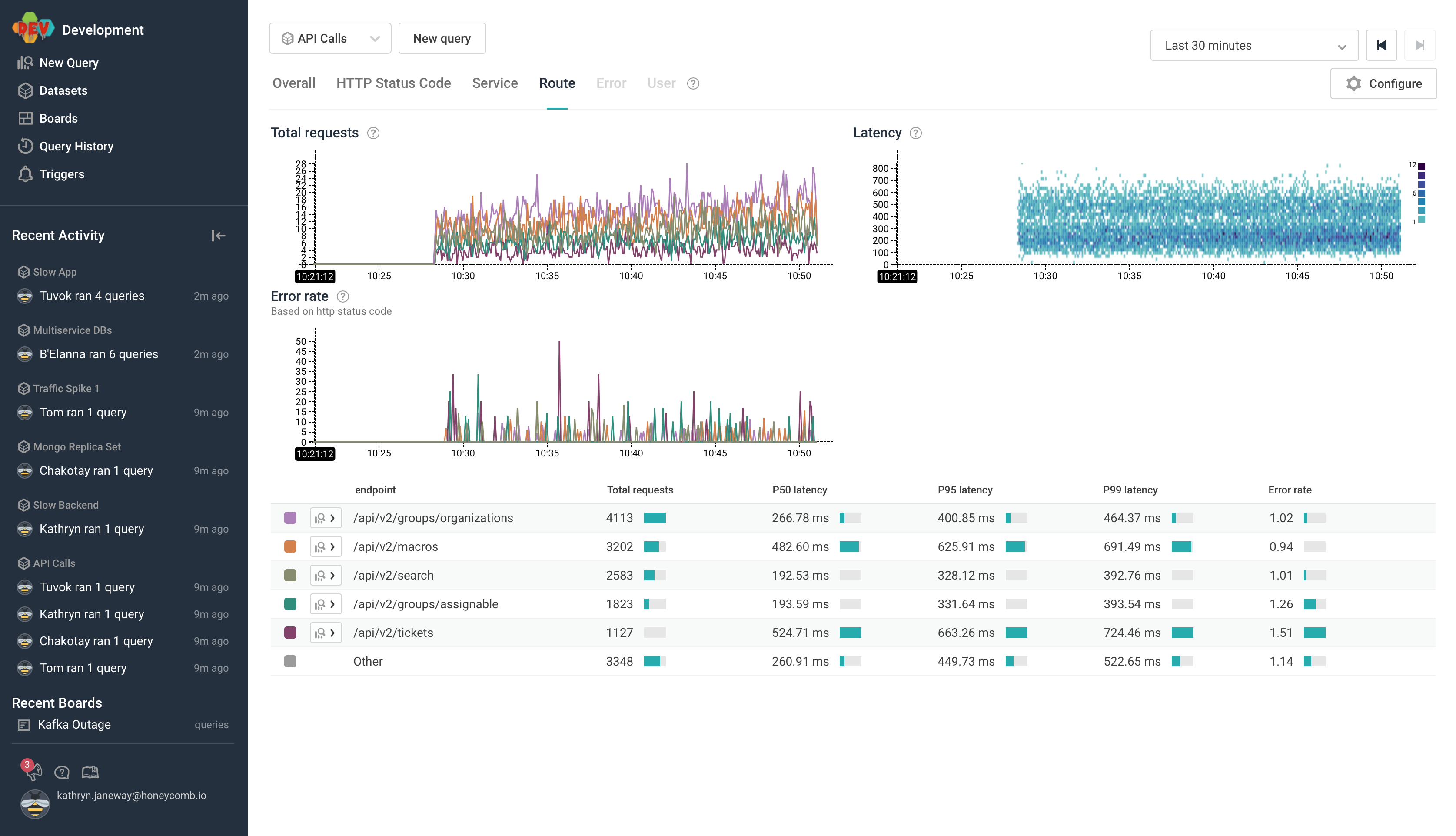
Home displays commonly used queries and breakdowns, and provides a jumping-off point to explore data about what's happening in production. New team members get an instant introduction to key system metrics, while the most experienced troubleshooters can jump directly into the debugging view they want, accessible from any top-level chart.
With this familiar, key-metrics-driven view into your system from a high level viewpoint, Honeycomb Home coexists with many legacy APM tools in support of teams transitioning to an observability-driven development process. Access to Honeycomb's deeper introspective views of your production data is just a click away.
Tracing
When configured for tracing, Home lets engineers click directly through from these graphs to more detailed waterfall trace diagrams and then zoom back out for more context or a different visualization as needed. With Honeycomb tracing, they see every field attached to a particular service request and what occurred at each step, with no need to switch to another tool and regain lost context.
BubbleUp
Home displays a Latency heatmap, which invites you to dig into interesting regions in the data via BubbleUp. BubbleUp is a groundbreaking interface for outlier detection and analysis, offering a huge decrease in time-to-issue resolution. BubbleUp automatically surfaces potential places to look for signal within your data by identifying a large number of the most likely outliers in parallel and letting the engineer do what humans do best: use their eyes to figure out what could be happening.
Sharing that brain
We're firm believers in the power of collaboration, and it's not just because we love Care Bears.

Working together always reaps dividends, and we've designed Honeycomb to encourage and empower teammates to share what they learn. That learning is now accessible right from the beginning of a user's Honeycomb experience via the activity sidebar on Home; see where the querying action is and what Boards are in the most use right now, then click through to find out why. From there, you can dig into your own investigation, or follow along someone else's (maybe your past self's!) annotated work.
This is just the start
Observability is about being able to ask your data the questions you need to operate your particular service. To that end, we'll soon be making it possible for you to customize what Home shows your team so it reflects your business goals and processes even more clearly. Sign up and help us with your feedback!
Related Posts
Introducing Relational Fields
Expanded fields allow you to more easily find interesting traces and learn about the spans within them, saving time for debugging and enabling more curiosity...
APM From a Developer’s Perspective
In twenty years of software development, I did not have the privilege of being on call, of tending to my software in production. I’ve never...
What Is Application Performance Monitoring?
Application performance monitoring, also known as APM, represents the difference between code and running software. You need the measurements in order to manage performance....