Jack Henry Incorporates BubbleUp and Honeycomb’s New Service Map to Quickly Debug Issues and Get Ahead of Customer Latency
By Rebecca Carter | Last modified on March 10, 2023Not long ago, we announced the launch of Honeycomb’s Service Map, a new feature that gives users the ability to get an overall, filterable view of their system and how everything is connected, along with some exciting new enhancements to BubbleUp. What’s the story behind these changes? They make it even easier for developers to zero-in on issues, even when they are hidden in billions of lines of code.
Of course, it’s one thing for us to be psyched about it, but the true test is to see how these updates to Honeycomb are faring in the wild. We sat down with user Zach McCoy, Principal Staff Engineer at Jack Henry, in a recent technical session and learned more about how they are implementing Service Map and BubbleUp to surface issues early and get ahead of customer latency.
Bubbling up problems downstream
Jack Henry is a fintech platform that provides information processing solutions to small banks and credit unions. In a highly-regulated industry and with a complex distributed environment, finding issues lurking in their system can pose quite a challenge.
“Right now, we're in a move between data centers and (Mesos) Marathon and Kubernetes,” Zach explained. “We're deployed in both. We've had times where our Kubernetes did not run as well as our Mesos. When we use BubbleUp, you may not be looking at the host, but it appears immediately.”
For those of you new to Honeycomb, here’s a (very) quick overview of BubbleUp: BubbleUp greatly accelerates debugging. It takes your high cardinality data and automatically detects commonalities in your outliers. It then presents the findings in easy-to-understand visualizations to help you answer the question, “How is this thing I find meaningful different from everything else?”
“We're connected to a bunch of downstream things. All of them are separate. One being down for one institution may be different than one being down for another. It may be hosted in the same place. It may be hosted on the same node. It could be hosted in a closet at the credit union,” explained Zach. “So it is difficult to find where things are failing. They don't usually fail at the top level. It’s one institution that’s failing, but it's 1% of our traffic.”
Jack Henry used BubbleUp to investigate a group of status codes that the team knew could indicate a potential problem. BubbleUp compared everything in that group of codes and was able to quickly identify two credit unions on the same node that were failing. “BubbleUp immediately found exactly what was wrong,” described Zach. “I think the biggest thing is: Can you do that with metrics? Usually, you can't. You will break Prometheus.”
Tag—you’re it!
Of course, finding the problem is just the first step. Next, you have to fix it. In a large organization, especially one with an intricate environment, designating who owns each remediation is a task in itself, and making sure you don’t burn through precious engineering resources is always important. Because Jack Henry added tags to its spans, Zach and his team know right away who owns which service, making it easy to hand the fix off to the right team. With 250 services and constantly changing teams, keeping track is clearly a job for machines, not humans.
Honeycomb’s Service Map > spaghetti
Being able to surface and remediate issues quickly is of course crucial, but so is being able to see these problems before they arise and become customer-noticeable. That’s where Service Map comes into play. Service maps in and of themselves are nothing new; they show you how everything is connected in your environment by visually depicting all of your systems and their dependencies. But what if your environment is super complex, like Jack Henry’s? How do you make sense of and sort through what can initially appear to be one giant mess of spaghetti?
Most traditional service maps are limited to only showing users the topology of how things are related, forcing developers to jump to different tools (we know how much devs love to do that) for further investigation. Honeycomb’s Service Map is different. Our Service Map not only gives users an overall view of their systems, but also lets them filter down to focus on what needs investigation. For example, which services are generating the most events or experiencing the most latency. These differentiating features were especially useful for Jack Henry.
Mapping a path to action
Jack Henry has hundreds of microservices, and it can be hard for even experienced engineers to understand the system as a whole. See for yourself:
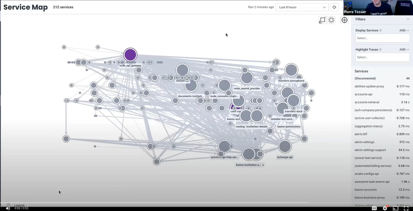
“We have a gateway. You can see it highlighted in purple there. It's extremely connected, compared to anything else, and that makes it really difficult for us to look through from this initial view,” Zach explained. “Next, we'll go through the filtering and highlighting and how that really helps narrow it down to what we want to look at.”
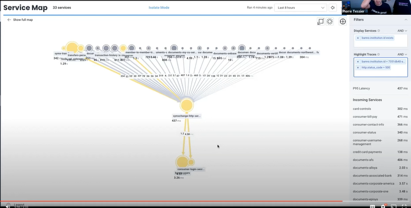
“As we've shown, we have 212 services in this gateway. We're going to display only the ones that have an institution ID. Then, we're going to isolate down on the SymXchange server that talks to the SymXchange,” explained Zach. “We looked at the fail. Now we can see where everything is going for that single institution. We're also able to highlight down to what is 500ing. That will get us to the point where you can see login secrets or users, and maybe that's what’s causing our errors, and we can look at spans and traces for that service.” Want to see a step-by-step of how we got there? Check out the technical session.
With Honeycomb’s Service Map, Jack Henry now knows exactly where to focus, and its engineering teams can take it from there.
Want to learn more? Check out this blog where we dig into Service Map or this one that dives into BubbleUp. If you want to give Honeycomb a try, sign up to get started.
Related Posts
Transforming to an Engineering Culture of Curiosity With a Modern Observability 2.0 Solution
Relying on their traditional observability 1.0 tool, Pax8 faced hurdles in fostering a culture of ownership and curiosity due to user-based pricing limitations and an...
Transforming Financial Services with Modern Observability: Moov's Story
As a new company poised to transform the financial services industry with its modern money movement platform, Moov wanted an equally modern observability platform as...
Driving Culture Change: Phorest's Observability Transformation
Phorest delivers a premier software solution that empowers their salon and spa business customers to thrive. Ensuring every engineer has access to an observability tool...