Heatmaps Are The New Hotness*
Heatmaps are a visualization that shows the statistical distribution of the values in a dataset column over time. Each column of squares in the below graph represents a histogram over roundtrip_dur, with the color…

By: Chris Toshok
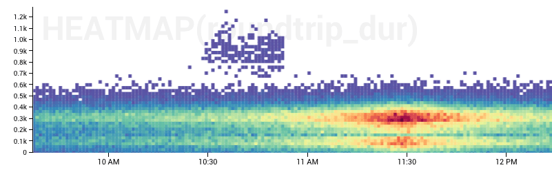
Heatmaps are a visualization that shows the statistical distribution of the values in a dataset column over time. Each column of squares in the below graph represents a histogram over roundtrip_dur, with the color mapping to the number of events where roundtrip_dur fell into that bucket and is a particularly beautiful example, IMO:
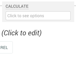
Using them in the UI is easy. They’re just another calculation available in the dropdown:
Heatmaps look best when you have a lot of events to visualize, and where the spread of values is wide enough to see some differentiation, but not complete noise. Basically any column you might run a percentile or average calculation on could likely benefit from being rendered as a heatmap. Say, anything representing a duration or size.
The Rollover
The rollover for heatmaps is different than for the normal line and stacked graphs:
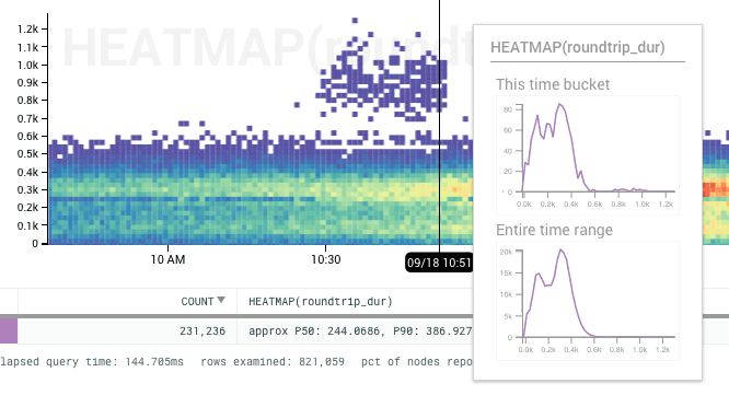
“This time bucket” shows you what the histogram is for the column under the time bar. You can see those outliers represented as small bumps on the right hand side of the histogram (from about 0.8k and 1.0k.)
“Entire time range” shows you the merged histogram for all data within the time range displayed in the graph. Note the difference in y-axes, and the smoother shape for “Entire time range.”
Breaking down with Heatmaps
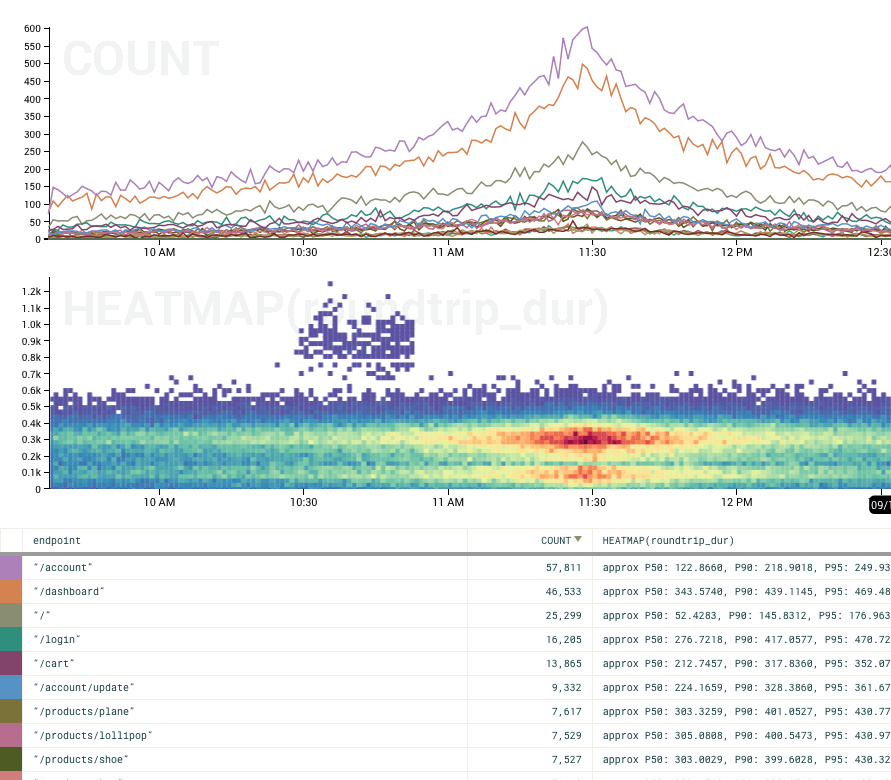
One of the most powerful features of Honeycomb is the ability to break down a calculation into groups based on values in columns. Heatmaps work well with this. Take the query below, where we’ve broken down by endpoint. By default the heatmap of all endpoints is shown (approximating what you’d see if you did the query without the breakdown.)
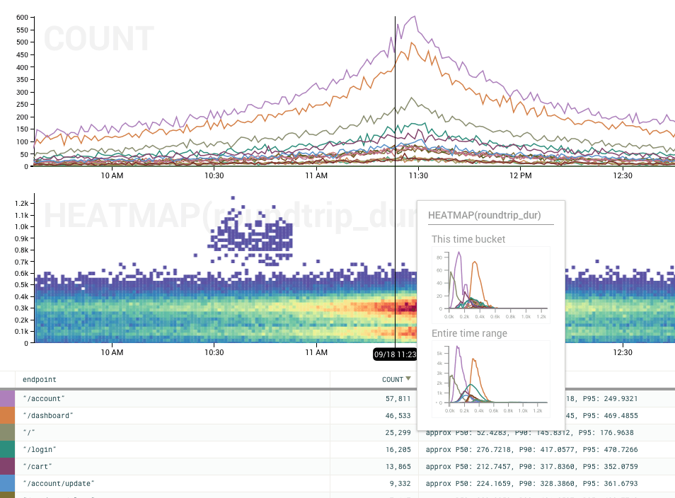
Note that the rollover displays independent histograms for each group. This makes it especially easy to see the reason for the bimodal distribution: /account accounts for the lower of the two peaks, and /dashboard for the upper.
Just as we highlight the corresponding line in line graphs as you mouse over the summary table, we also show the heatmap corresponding to that group:
You can clearly see the difference between /account and /dashboard peaks by mousing over their lines – they’re almost completely disjoint. If you watch closely, you can also see the outliers (from about 10:30 to 10:50) appear only when hovering over the line for /login.
How to make your own
Check out the documentation for heatmaps and try it for yourself!
We’ll be back with more examples, including how Honeycomb uses heatmaps soon. In the meantime, let us know how you’re using heatmaps at support@honeycomb.io or @honeycombio–we’d love to know!
*Yes, we know what we did there. And we’re not sorry.
Want to know more?
Talk to our team to arrange a custom demo or for help finding the right plan.