The Core Analysis Loop, or: Heatmaps Make Analysis Better
In this blog miniseries, I’m talking about how to think about doing data analysis, the Honeycomb way. In Part I, I talked about how heatmaps help us understand how data analysis works. In Part…

By: Danyel Fisher

In this blog miniseries, I’m talking about how to think about doing data analysis, the Honeycomb way. In Part I, I talked about how heatmaps help us understand how data analysis works. In Part II, I’d like to broaden the perspective to include the subject of actually analyzing data.
Let’s talk a little more about this process of discovery. I would suggest that a dive into log data is almost always a process of figuring out what caused a given situation or a confusing graph. Why does this user think our site is slow? Why are we using twice as much CPU as I expected? Why aren’t our users clicking on the new button?
We want to answer these questions with data, to make them concrete and specific. We choose variables that might help reflect the situation — start with a visualization that represents the overall situation. When we learn that a user thinks our site is slow, we should look at things like HTTP response time.
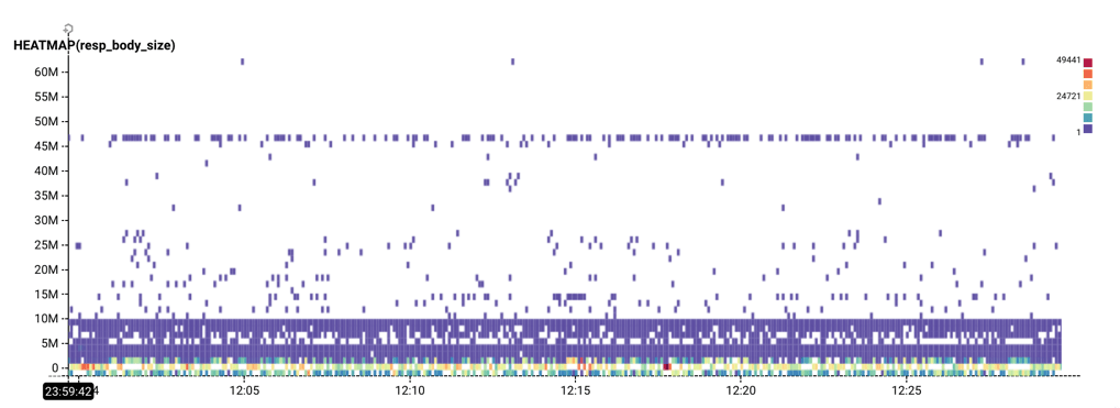
From the Rubygems dataset, a horizontal stripe shows response body sizes consistently at 45 million bytes.
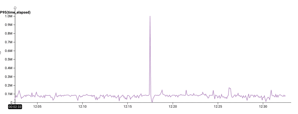
From the Rubygems dataset, a startling spike in the 95th percentile of time elapsed.
Identifying the driving factor
Each of these implies that there is some other factor that drives this behavior. Now it’s a matter of finding that factor.
- Formulate a hypothesis about what the different groups might be: is there a variable that could explain why there are differences in the values?
- Break down across a dimension that would test that hypothesis
- Check whether that breakdown successfully separates the groups.
If it doesn’t, return to step 1.
If it does, then you have a new visualization. If that’s enough to explain what happened, declare victory and act on the discovery. If not, filter on the group and continue further.
We gave it a name
This process is so fundamental to the Honeycomb way of thinking about data, we call it the Core Analysis Loop. It is incredibly powerful: this loop entirely shapes the way we look at data. (Both the Gatekeeper Tour and the Tracing Tour guide users through the Core Analysis Loop.)
The key step of the Core Analysis Loop is the Break Down. I find a breakdown exciting because it’s like running every possible filter on a single field at once. (It’s not that exciting: in databases, it’s called a “Group By.” But still. It’s pretty exciting.)
The really special thing about Honeycomb is that it lets you break down on both the obvious fields, and the surprising ones. Lots of systems let me slice and dice by, say, the country that a user was logging in from — but Honeycomb lets you break down on every dimension in your data.
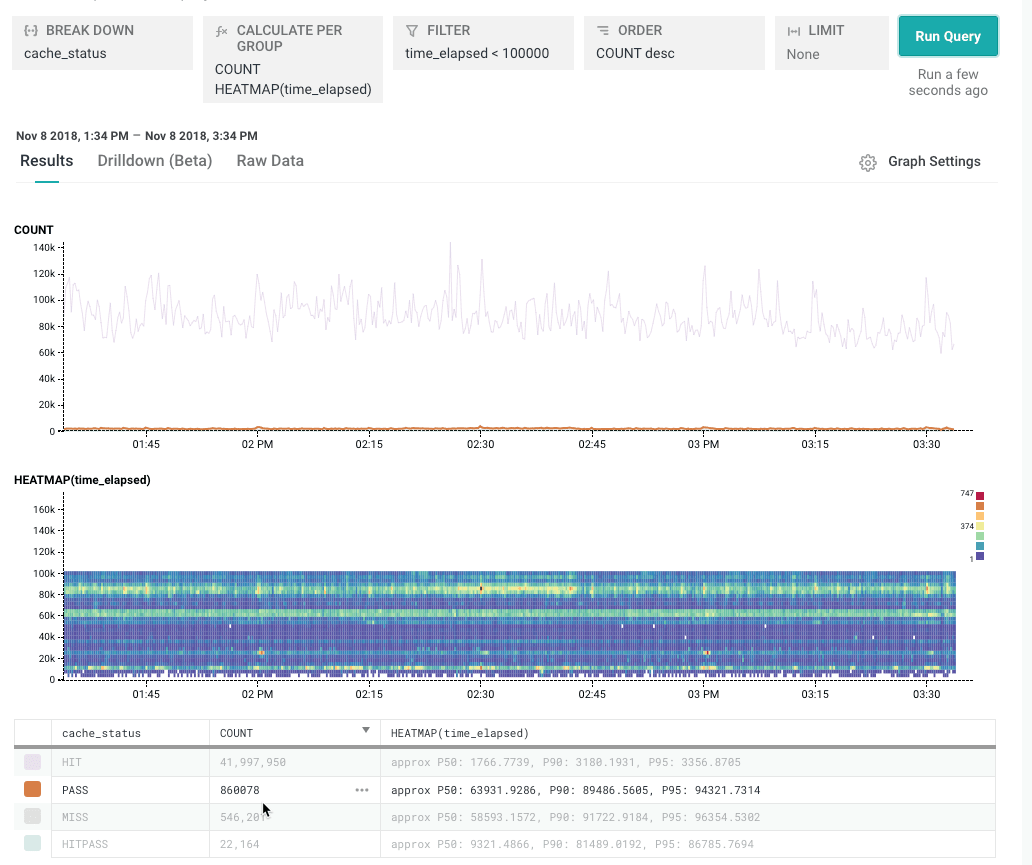
Some of these dimensions are low cardinality: they have few distinct values. In the Rubygems dataset, cache_status is a good example: it can be one of HIT, PASS, MISS, or HITPASS..
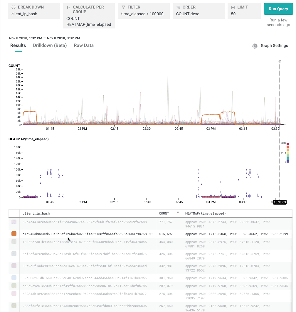
But you can also break down by high cardinality dimensions. Like, say, client-ip-hash. That might seem unintuitive, bu it’s a great way to hunt down the top few users, or the slowest few pages on a site, or the slowest few queries that have ever been executed.
In Honeycomb, the breakdown is controlled by the ORDER and“LIMIT clauses: ORDER says “choose the top few by this;” LIMIT says “how many of them.” This chart shows the top 50 items by their total COUNT.
If Honeycomb can support high-cardinality breakdowns, why not continuous measures? It’s because measures assume that the number doesn’t matter in detail. It doesn’t make sense to break down on milliseconds — a process that takes 1003 milliseconds isn’t really different than one that takes 1003.02 milliseconds. If it is important to group by a measure, the first step would be to create a derived column that buckets the field into fewer distinct values.)
To conclude, then, a good breakdown helps make progress in the Core Analysis Loop. It helps explain where variation comes from. The most effective breakdowns, then, are those where one dimension shows a spike, and others don’t.
In my next post, I’ll show a way to accelerate the process of finding good breakdowns.
Want to know more?
Talk to our team to arrange a custom demo or for help finding the right plan.