MySQL and Honeycomb: My First 10 Minutes
As part of the process of building our RDS connector for Honeycomb, we ran it on our own database logs. A few neat things came out of the first 10 minutes of looking at…

By: Ben Hartshorne
As part of the process of building our RDS connector for Honeycomb, we ran it on our own database logs.
A few neat things came out of the first 10 minutes of looking at the graphs.
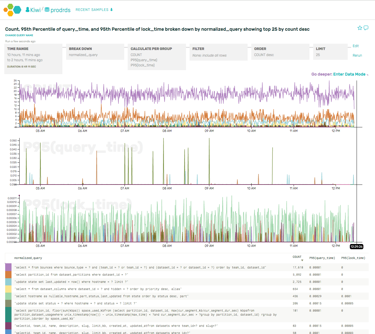
Our most frequent queries all come from the API server (rather than the UI or other jobs). This makes sense, as the API receives a high sustained rate of events. We have some caching for these queries, and we can actually tell that the caching is working based on the periodic queries run on cache expiration.
For example, if we dive into a specific type of query (select... from bounces, which tracks rate limit/blacklist status) and break it down by client IP address, we can see a clear pattern of individual API servers asking the same question every 30 seconds (the period of the in-memory cache).

(As an aside, we also got to file a bug against ourselves for using SELECT * …)
Next up, we took a look at the slowest queries by looking more closely at the p95(query_time).
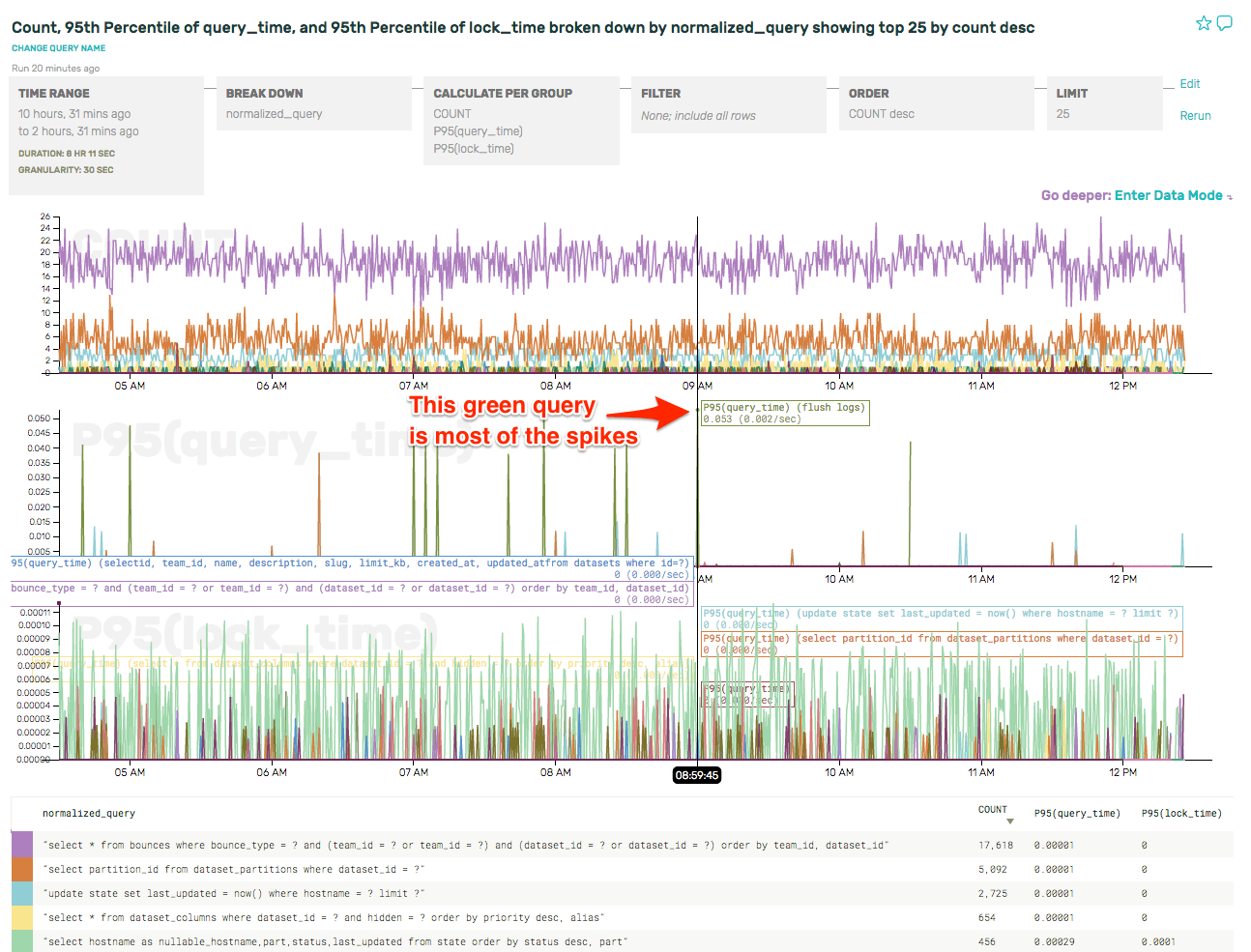
As the label indicates, that query is flush logs. That’s really not very interesting, and it pollutes the overall data. Let’s just filter those out so that we can see the relevant slow queries.
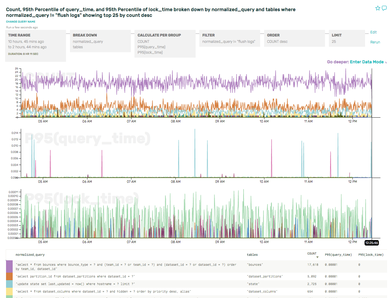
The P95(query_time) graph is much less cluttered now, and the spikes it shows are real and relevant queries.
It’s also interesting that there really seems to be one query dominating the P95(lock_time). Let’s take a look at that more closely, by swapping out the P95 for a SUM(lock_time), which will provide a better sense of the overall load on the server. And if we order by SUM(lock_time) desc, then our summary table pops the culprit right to the top:
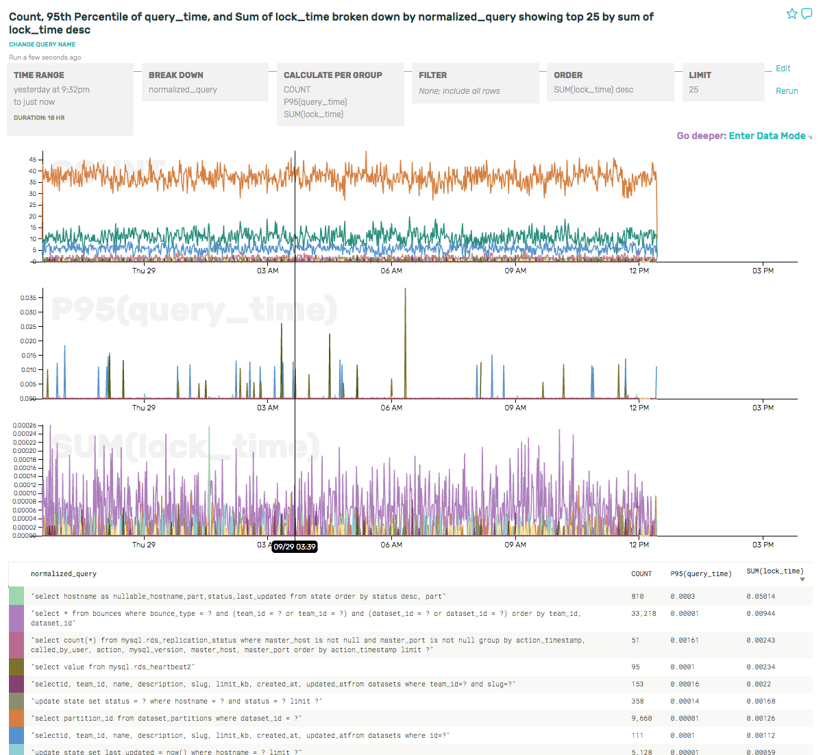
The query holding the most lock time (by 5x!!) is actually the 5th most frequent query (1/40th the volume as the most frequent query). When we need to optimize our MySQL usage in the future, this gives us some terrific places to start.
Learn More
Check out all of the ways you can send data to Honeycomb.
Want to know more?
Talk to our team to arrange a custom demo or for help finding the right plan.