Debugging Just Got Faster and Easier With New Enhancements to BubbleUp
We’re thrilled to share that we’ve made significant enhancements to BubbleUp that will enable users to BubbleUp from more parts of the Honeycomb UI beyond heatmaps.

By: Fahim Zaman
BubbleUp is Honeycomb’s machine-assisted debugging feature and is one of our most powerful differentiators. It leverages machine analysis to cycle through all of the attributes found in billions of rows of telemetry to surface what is in common with problematic data compared to baseline data. This explains the context of anomalous code behavior by showing users exactly what changed when they don’t know which attributes to examine or index, resulting in a dramatically accelerated debugging process.
BubbleUp also goes beyond the challenges of traditional AIOps tools that rely on historical data (known-knowns) to predict and automate fixes, but hit deadends in modern architectures where system behavior is unpredictable (unknown-unknowns).
Today, we’re thrilled to share that we’ve made significant enhancements to BubbleUp that will enable users to surface issues from more parts of the Honeycomb UI beyond heatmaps. This means users can leverage our powerful pattern detection on specific groups of users or conditions beyond numeric values, such as users from a particular region, using specific devices or operating systems that are experiencing a particular error message—or are using a unique part of your application, such as a discount code, allowing users to investigate more combinations of factors by asking a wider range of questions about their data, in fewer steps.
Revisiting: why BubbleUp matters
Software teams frequently troubleshoot unusual behavior in their systems to understand the root cause or drivers. In many cases, discovering the problem requires several checks across multiple services and attributes, and those checks may occur across many tools.
A traditional APM debugging workflow (if you can call it that) would look something like this:
- An incident occurs and you get alerted.
- You start from the metric spike alert that leads you to a chart of how a count changed.
- You can look at a dashboard of metrics to eyeball what else spiked.
- If you don’t know what’s behind it, you can try to switch to a different application such as log analysis.
- If after a few searches no golden ticket log error message shows up, you might need to configure a new metric visualization or switch to trace views that coincide with the incident.
- If you do find the right log or trace, you still aren’t sure it’s the answer (small errors are not necessarily tied to your incident).
Unless you have deep knowledge or tenure, you have to find similar cases and comb through attributes to establish a trend.
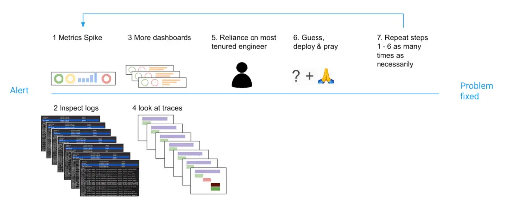
This wastes your most precious resource—time—and reduces developer focus and productivity. Now, imagine if your debugging workflow could look like this:
- Click straight from an alert to debugging the event data that created it, using one UI to zoom in and out of traces, queries, or visualizations without switching tools and losing context.
- Select any range of anomalous data and automatically know every attribute that significantly changed in your selection compared to your baseline telemetry.
- Address what changed, and stabilize your application.
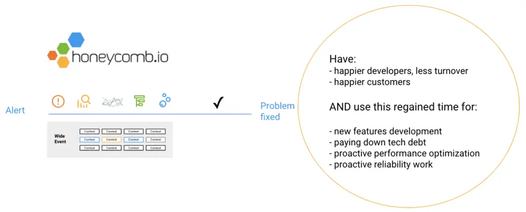
This is what BubbleUp makes possible. You can see what changed with your outlier data without having to worry about what attributes to check and without looking for trends manually. And now, BubbleUp is getting even better.
What’s changing: Easily bubble up from more places in Honeycomb
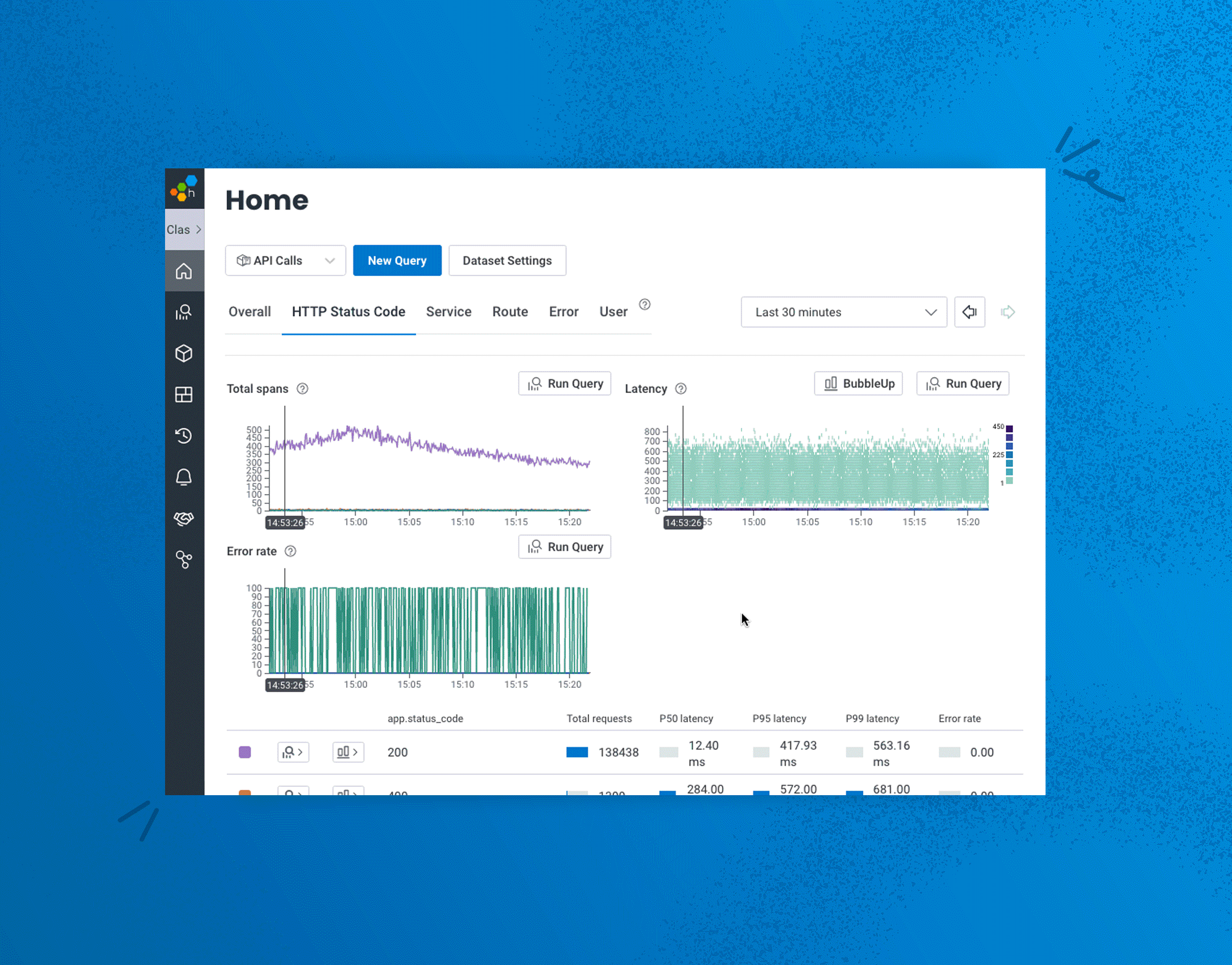
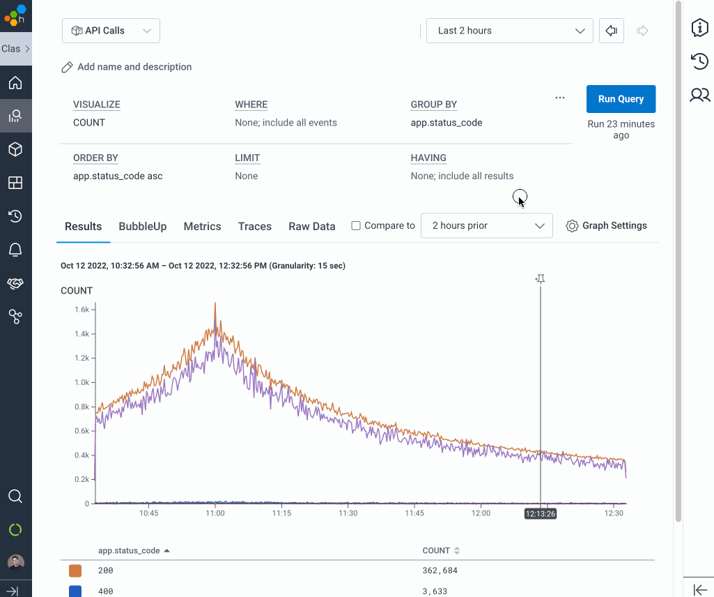
Previously, Honeycomb users would access comparative analysis by querying from a heatmap (allowing only numeric fields), switching to BubbleUp, and selecting anomalous events on the graph. This was (and still is) great for anomalies that can be mapped with a numerical value, such as latency or error count, and for visualizing anomalous events along a time range. But today, you can run a query with any fields and click into a BubbleUp from the results.
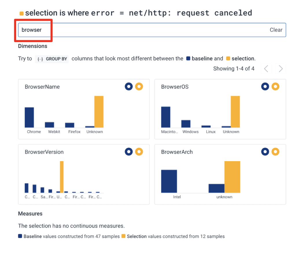
Below is a simulated BubbleUp example from a Home view, looking at error codes and selecting the new BubbleUp button next to a net/http: request canceled error code.
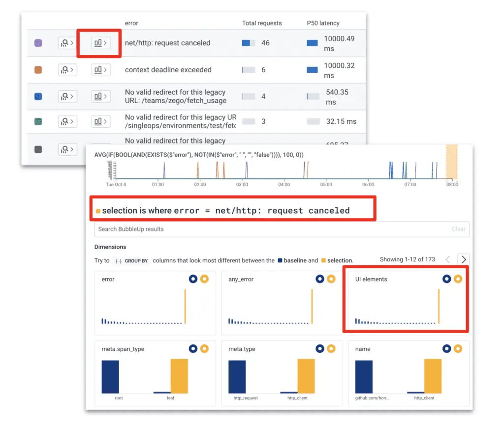
Allowing BubbleUp to be accessed from new places with a wider range of data gives users the power to answer more questions than ever before. For example:
- We’re getting an unusual increase in errors after releasing our latest discount code promotion. Let’s bubble up where this code is active and see what looks different.
- What are contributing factors to my route “*QueriesHandler).QueryRunStatus-fm” having a higher latency than other routes?
- Where are most of my “No valid redirect” errors for a certain link coming from?
- I just joined a new team and am looking at an unfamiliar data set. I want to see how the groups they’ve prioritized in APM Home are different from each other.
- Users from the Widgetdish company are reporting latency. What is in common for users with @widgetdish.com domain vs. other users from other domains?
We expect you to discover many more ways to use this feature, and we’re excited to hear about them.
BubbleUp Result Filtering: Faster analysis, less time to insight
Situation: You’re in a BubbleUp analyzing recent slow events with hundreds of attributes compared to the baseline. You’re curious about a few particular fields based on what you know about a recent deploy, so you don’t want to look through the many pages of attributes.
Solution: With Result Filtering, you don’t need to scroll through pages looking for the deploy version’s related fields in BubbleUp’s page ranks. You can get to the comparison you want immediately.
Faster analysis, less time to insight.
BubbleUp Permalinks
Situation: You and a teammate are investigating a performance dip and want to share complex queries that you have found valuable comparisons in.
You’ve filtered out several services and attributes in your specific BubbleUp comparisons to take out the noise, and you want to share the BubbleUp results without having them go through the complex query and selection path you took.
Solution: BubbleUp Permalinks. This new feature enables users to save and share their BubbleUp results with others who can use the link to view the exact same results on the same data.
Now, you can share a URL that contains your entire query as well as your specific comparison, improving your teamwork—and, ultimately, your application stability. It’s also great for increasing team awareness about the power of Honeycomb.
Looking forward
Since its release, the power of BubbleUp was slightly hidden away behind our heatmap UI. Heatmaps are fun and great for identifying visual patterns and clusters across time, but limiting BubbleUp comparison views in this way made it a secret only our more advanced users could leverage.
Now that there are several ways to access the power of BubbleUp, we’re excited to see how all users—beginners and experts—will find new ways to get smarter about their applications and answer questions faster. As a beginner myself, I’ve already learned new things about our highest latency route handlers, the relationship between new builds and HTTP error codes, and some of the BubbleUps our SREs deploy to address a customer issue.
Interested in trying this out with your own application? You can get started with Honeycomb today. Our free plan has all of the functionality described in this feature update, with up to 20 million events per month. Dive in and share your adventures with BubbleUp by dropping into our Pollinators Slack community with questions, stories, and comments.
Happy BubbleUp(ing)!
Want to know more?
Talk to our team to arrange a custom demo or for help finding the right plan.