All Together Now: Better Debugging With Multiple Visualizations
“Nines don’t matter when users aren’t happy” is something you may have heard a time or two from folks here at Honeycomb. We often emphasize the fact that while your system can look healthy…

By: Travis Redman

“Nines don’t matter when users aren’t happy” is something you may have heard a time or two from folks here at Honeycomb. We often emphasize the fact that while your system can look healthy at a high level, deep down something is likely broken in ways that cause pain for users. If you are empowered to ask detailed questions about your services, you can find and understand these problems more easily. At Honeycomb, we’re always working to create new and powerful ways for you to query and visualize your production environment. Tools like Tracing, Heatmaps, and Derived Columns are powerful on their own, and used together they can give you a better understanding of your systems. Recently, we added a new visualization to Heatmaps called Sparklines, which are already giving us new insights. Here’s a story about how we combined Tracing, Sparklines, and Derived Columns to identify and detect a particularly tricky problem.
The investigation
A few days ago, a customer contacted us and reported some unusual query performance. Repeatedly running the same simple query over the same time period resulted in dramatically different performance: 500ms, 10 seconds, 400ms, 6 seconds, etc. Some queries process a large amount of data and these do take several seconds to run, but this was not one of them, and we expect consistent performance for the same query so something was definitely up.
Our storage service, internally named Retriever, is complex. A simple query is executed across multiple hosts, each of which may process hundreds of segments and millions of rows. Fortunately, we have thoroughly instrumented the query code path using tracing, so when a customer reports a slow query our first response is to go find the associated trace.
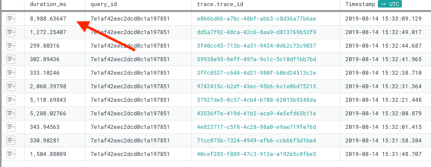
After pulling up a list of traces for this customer query, we could quickly confirm the behavior on our end just by looking at overall duration. Digging in, we tracked the time spent to two segments processed on a single host. Extra context attached to these spans helped us further isolate this issue to storage in the Fast Query Window and rule out Secondary Storage.
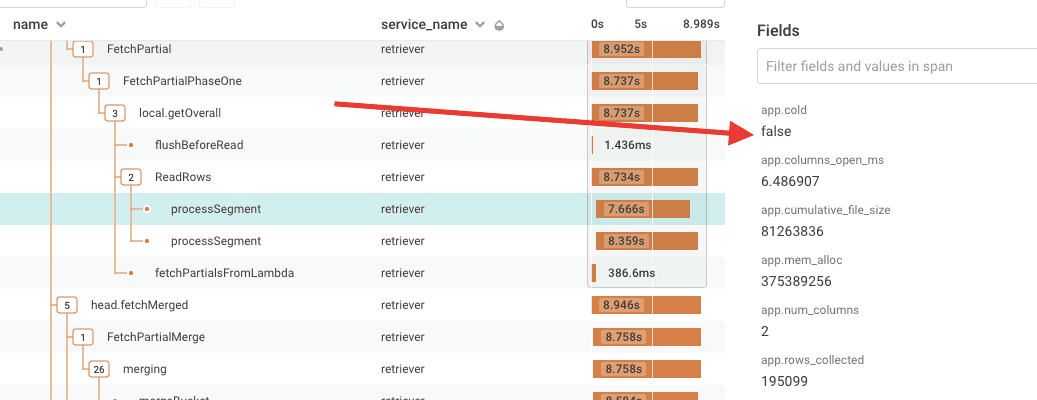
The handful of slow traces we had all showed this same pattern: two unusually slow processSegment spans on a single host with id ending in dfb5. A quick glance at basic system metrics for this host didn’t reveal any problems. CPU, memory, I/O wait, load etc all looked normal. With only five or so data points suggesting a problem with this host, it was difficult to say whether this was a problem with the host or if we had an obscure bug in our code randomly introducing performance issues in queries at odd times.
Sparklines: tiny graph, big timesaver
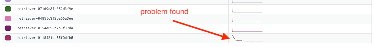
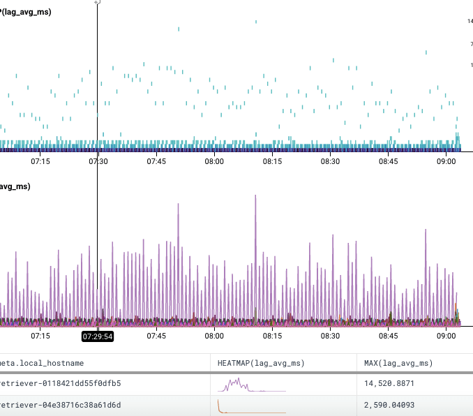
We started looking across other measurements of service health to see if anything stood out. When digging into measurements I’m not familiar with, I like to start with Heatmaps as they help you understand how values are distributed and they give you a good jumping off point to explore outliers using BubbleUp. Sometimes though, outliers aren’t visually striking, like in this heatmap of write latency values over a 12 hour period. My initial reaction was that there was nothing interesting in this graph, and it didn’t occur to me to use BubbleUp and look at any of the less common values. I decided to break down by meta.local_hostname, and glanced through the list of hosts and the newly added Sparkline histograms.
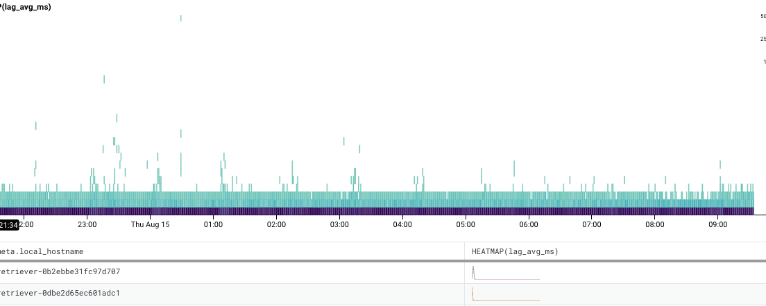
It was at the very bottom of the list but the message was quite clear: there was something significantly different about the performance on this host. Sparklines saved us a lot of time in isolating this issue by giving us a new way to look at the data.
Zooming on a smaller time window and throwing a MAX(lag_avg_ms) to the list of calculations made this more visually apparent.
The host was terminated and replaced. The customer continued to report the problem though, so we looked again and saw the same degraded performance on the new host. After some more tinkering, we were able to determine that overall disk read performance on that host was degraded and terminated that one. The third host came up fine, and performance was restored.
The follow-up
Here we have an issue where a single customer noticed a problem that was likely affecting hundreds of others, but everything looked fine on our end. How can we detect this going forward? There were no clear signs of degraded hardware that we could alert off of. A high duration_ms, while high for this particular customer, is not a good indicator of problems on its own because some queries will take a long time, depending on the amount of data that must be processed.
The solution we went with is to adjust duration_ms by the total number of rows and columns examined, using a Derived Column:
IF(AND(EQUALS($name, "processSegment"), EQUALS($app.cold, false)), DIV($duration_ms, MUL($app.num_columns, $app.rows_examined)))
Look back in time so you can see in the Future
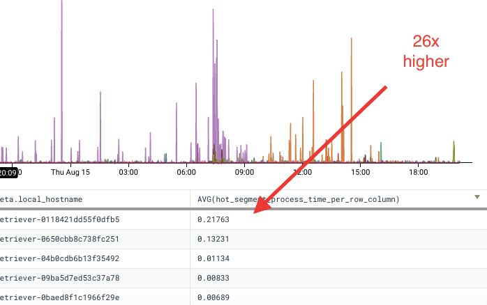
One neat feature of Derived Columns is that they apply to data we’ve already received, so we can go back and look at our incident graphs and determine if this would be a good measurement for detecting the problem. We can see that the host (and its first replacement, ending in c251) had perf times that were an order of magnitude higher than all of our other hosts. With this retroactive analysis, we can set up a trigger based on this column and have confidence that we’ll catch this again going forward.
It takes a village
OK, maybe not an entire village, but–the ability to look at the problem through multiple different lenses, each offering a unique perspective and “depth-of-field” on the data helped us solve this performance puzzle quickly. (And being able to look back in time at the situation will help us ensure we catch it if it happens again in the future.) At one point, it took seeing things from a little further out for me to catch on to the issue in this case–but if your approach took you down the path of using BubbleUp, you’d have ended up in the same place.
Ready to find out what it’s like to have all these tools at your disposal? Sign up for a free trial today!
Want to know more?
Talk to our team to arrange a custom demo or for help finding the right plan.