Iterating Our Way Toward a Service Map
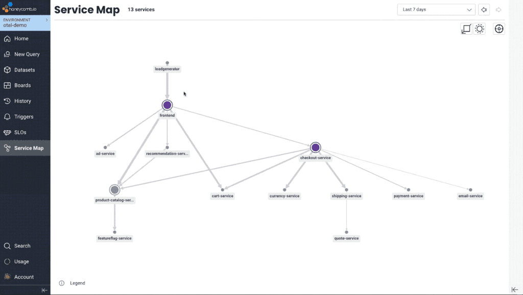
For a long time at Honeycomb, we envisioned using the tracing data you send us to generate a service map. If you’re unfamiliar, a service map is a graph-like visualization of your system architecture that shows all of its components and dependencies. We didn’t want it to be a static service map, though—the kind you’d view once before going “huh, neat”—and then never looking at it again. We wanted to build an actually useful, uniquely Honeycomb-y service map that could become an integral part of your team’s observability workflow.

By: Jessica McElroy
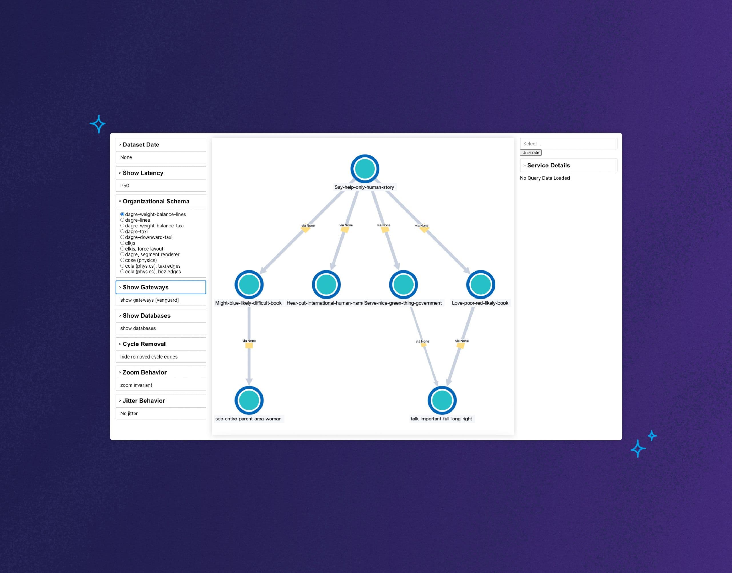
For a long time at Honeycomb, we envisioned using the tracing data you send us to generate a service map. If you’re unfamiliar, a service map is a graph-like visualization of your system architecture that shows all of its components and dependencies.
We didn’t want it to be a static service map, though—the kind you’d view once before going “huh, neat”—and then never looking at it again. We wanted to build an actually useful, uniquely Honeycomb-y service map that could become an integral part of your team’s observability workflow.
If I were a (useful) service map
We envisioned a map that would not only give you a high-level point-in-time view of your system, it would also immediately reflect changes, such as newly-instrumented or phased-out services. Additionally, it would allow you to peek back at what your system looked like in the past.
This map wouldn’t just be nice to look at, it would serve as a new jumping-off point for formulating queries about what’s going on in your system. It would help you investigate issues in real time. Honeycomb’s query builder is great for an experienced user who knows what questions to ask, while a service map could help new users generate questions and get familiar with their data.
A useful service map would use the full power of Honeycomb’s query engine to allow you to highlight and filter the map to show traces of interest. It would let you ask questions like:
- Which services does my team own?
- Where in this system did this type of error happen?
- Which services participate in this type of request?
From there, it would be essential to let you drill down into the raw trace data being represented.
So… where to start?
Building a useful service map is a daunting task, from both the design and engineering perspectives. As with many data visualization projects, one challenge is the inability to anticipate the shape it will take for different data sources. You also have to worry about the type of challenges those differing visualizations may run into.
Honeycomb’s internal service architecture is relatively simple. We have <10 connected services instrumented, whereas the median among Honeycomb teams is about 30 services. Our largest customers have hundreds! As such, we weren’t the best test case. We knew it would be important to obtain real graph data from real systems to inform design and development.
To support Service Map, we planned to stand up a service that would consume the event ingest stream and record service-to-service calls (the “edges” on a map). However, our front-end engineers and designers couldn’t afford to wait weeks (or even months) to get their hands dirty with real data.
Scrappy scripting
To unblock design and development, we hacked together a one-off script that would scrape a sample of raw tracing data from a range of early access teams. It would traverse the traces to find service-to-service calls, writing out this edge data (with anonymized service names) to files hosted in S3.
With realistic graph data in hand, engineers could start exploring and stress testing visualization technologies. The initial result was… upsetting. Early versions of the map looked more like a tangle of spaghetti than anything else! We had our work cut out for us to make complex maps readable and navigable.

In the early stages, we didn’t want to worry about introducing new dependencies to our main app. To allow for rapid iteration, we bootstrapped a playground app to try out various graphing algorithms and rendering libraries with all their options and parameters across a range of maps. Create React App came in handy for this.
DDDDM: data-driven design decision-making
On the design front, access to realistic graph data enabled us to check our assumptions and determine which problems were worth solving. For example, could we assume service graphs are mostly hierarchical? How frequent are cycles, and how long do service names tend to be? How often are service meshes, gateways, databases, and other system component types instrumented? And how big of an effect do they have on a graph?
Later on, we would add telemetry to get quantitative information about service map layouts. We logged things such as the number of hierarchical layers in the graph and the density of nodes. This helped us make decisions, like zoom thresholds for displaying labels, and how to calculate and bucket edge weights.
Can’t stay in the playground forever!
As fun as it was to develop in our playground app (and merge to main willy-nilly), we felt urgency to get something in front of our early access users. The streaming service to generate real-time service map data was still in development, so we couldn’t count on that data source yet. But we did know the intended shape of the data and where it would be stored. So, we altered our script to run as an hourly cron job in our staging and production environments and to write out to the data store.
With our semi-real-time script-generated data in place, we began developing the frontend in our main app. Using the intended data schema and storage location early on made for a seamless switchover to the streaming service data when it was ready. It felt really good to merge a big red PR to remove the cron job!
Putting an early, rough version of the service map in front of our early access users was scary. Fortunately, we have awesome users who became crucial partners in our development and design process. Their feedback validated certain themes we intended to focus on, like layout and readability. They also shared use cases and requested features we hadn’t considered.
How it’s going
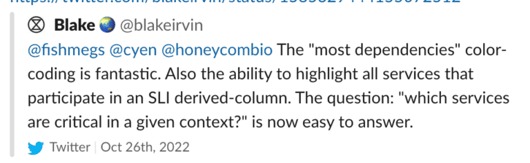
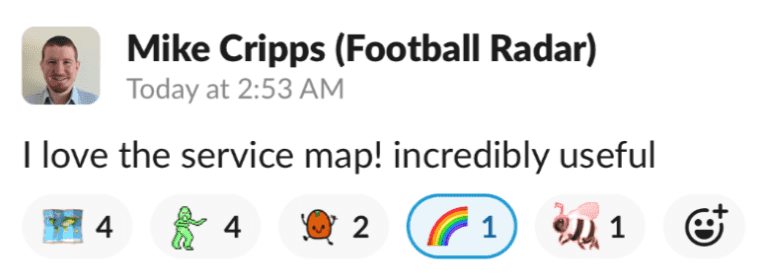
Service Map launched to all of our users in October 2022, and it was met with excitement. We’ve eagerly tracked ongoing engagement through events we instrumented, querying in Honeycomb about feature usage (e.g., highlighting, filtering, and viewing sample traces), as well as page and query performance. My favorite success metric, though, is hearing directly from users that they find it—well, useful!
Even better is seeing service map’s usefulness in ways we didn’t anticipate. Internally, it has become an important part of our onboarding process. It has played a role in incident response. And, it has highlighted gaps in our instrumentation we didn’t even know about, sparking enthusiasm for connecting more services within our traces.

Conclusion
Every service map is like a unique fingerprint of the system it represents. It felt weird to launch something to our users that, in a way, we had ourselves never seen before. We would not have had the confidence to do so if we’d only ever developed with our own data or with contrived graph data of an idealized system. Taking the time to iteratively write and scrap code, as well as getting users to play early on in the process, allowed us to move faster and make more informed design decisions.
Interested in trying out Service Map yourself? You can play with a demo version in our sandbox! Follow the provided scenario to tour the features, or chart a course of your own.
Service Map is an offering in our Enterprise tier. You can contact one of our friendly sales representatives to discuss pricing options for your team.
Want to know more?
Talk to our team to arrange a custom demo or for help finding the right plan.