Introducing Honeycomb Service Map: A Dynamic, Interactive, and Actionable View of Your Entire Environment
Today, we’re announcing the launch of Honeycomb Service Map. This isn’t your grandparent’s version of a service map. This feature reimagines what it is that you want to know or investigate when looking at visualizations of how your services communicate with one another.

By: Nick Rycar
Today, we’re announcing the launch of Honeycomb Service Map. This isn’t your grandparent’s version of a service map. This feature reimagines what it is that you want to know or investigate when looking at visualizations of how your services communicate with one another.
The Honeycomb Service Map gives you the unparalleled ability to quickly make sense of incredibly complex environments, letting you slice and dice that view into whatever you need to understand so that you can quickly resolve issues, understand how service relationships evolve over time, make performance improvements, and drive your engineering teams toward production excellence. In other words, it’s exactly what you’d expect from a Honeycomb version of service maps.
With this feature, you’ll be able to do things like apply filters for services or traces to surface what you need or dig into the full details of any trace used to generate your map—and you can start using it today, for free. Today, I’ll run through some example use cases and show you how our new service map breaks through the limitations of traditional maps.
The Fine Print™
Before we dig in, let’s get some formalities out of the way: who has access to this feature, and what are the prerequisites?
Service Map is included in Honeycomb Enterprise plans, but is currently available to all Honeycomb users on a promotional basis until the end of 2022. This gives Free and Pro users the opportunity to evaluate these new capabilities before deciding whether to upgrade.
As for prerequisites, if you currently have Honeycomb Classic datasets, you will need to migrate them to Environments before you are able to use the Service Map feature. There is no cost associated with this migration, but Environments feature an extended data model required for the generation of Service Maps. Once that’s done, so long as the spans in the traces you send contain the minimum requisite data, your Service Map will be generated automatically. If you need help with this, please reach out to your customer success representative, who will be more than thrilled to assist.
Onboarding and discoverability
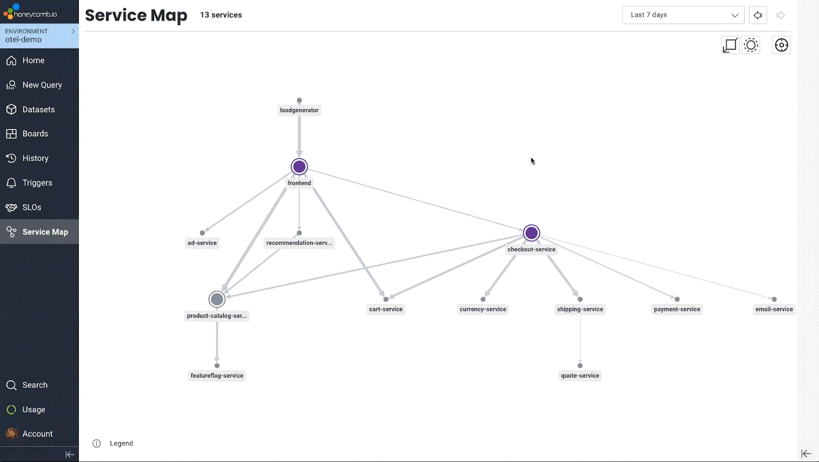
At its highest level, a Service Map is an architecture diagram similar to what we might otherwise create by hand. Take this diagram from the OpenTelemetry demo application:
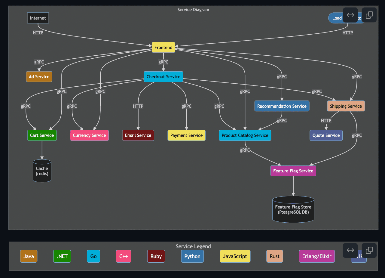
Service maps can be an invaluable aid to onboarding new team members or sharing knowledge across teams. Yet, creating this diagram requires working knowledge of how each service interacts with its peers, over which protocols, and in which language each is written. This knowledge may not all live in one team and can require multiple subject matter experts. Plus, this diagram has the potential to go out of date as soon as the next commit is merged!
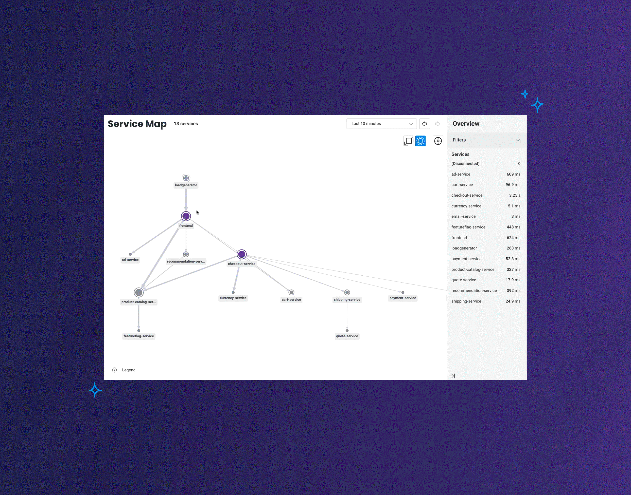
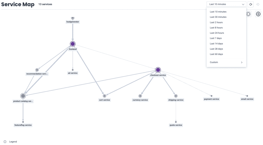
Now, here’s a Service Map generated from the same application:
The first thing worth noting is that it looks very similar to our first diagram. And it should—this is a good first validation that our environment matches our mental model. Since this map is generated from live data, we have some additional data at our disposal, like each service’s P95 latency for the selected range collected in the list on the right. We can also see which services are generating the most spans, denoted by the relative size of each circle and the width of their connecting arrows.
When moused over, a service’s connections will be highlighted, and their latencies shown. There is also an option to click through to an isolated view of just that service and its direct dependencies.
We’re also able to apply filters to the map to find out information about its constituent services. For example, the manually created service diagram denotes which language each service is written in. Can we find the same information on a Service Map? You bet we can!
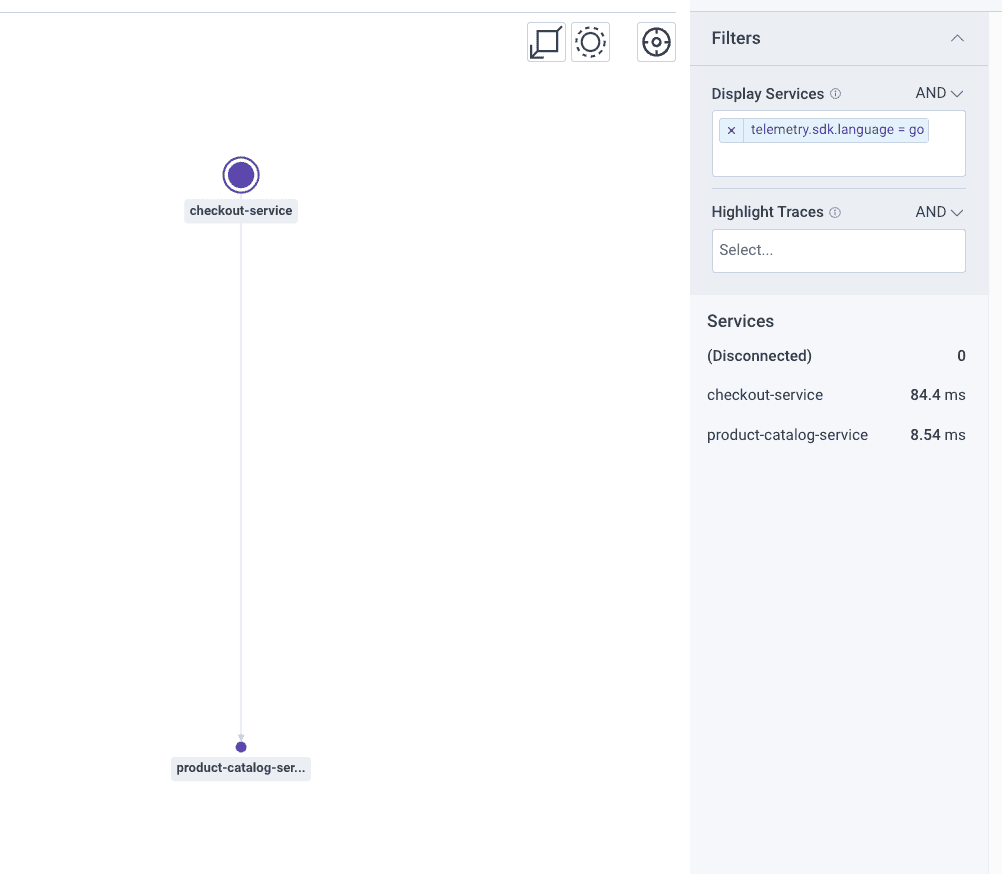
In the “Display Services” filter, I’ve asked for all services where the telemetry.sdk.language field has a value of “go.” Taking this a step further, we can filter for any information we’re collecting in our telemetry in the same way. We’ll dig into some more examples of this in our next section.
Instrumentation QA and advanced insights
Just as a Service Map can guide a new team member through the architecture of your apps, it can give a domain expert the tools to quickly validate their instrumentation, confirm the status of migrations, or even uncover indirect dependencies between services.
Take the filtering example from earlier. While we were able to filter for services written in Go, and the result matched our manually created diagram, what if my code wasn’t instrumented to collect that data? Or worse, what if it was instrumented in some places, but not others?
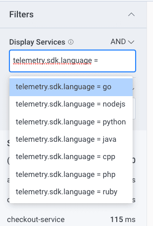
For starters, the filters in Service Map support the same operations as the Where clause in the Query Builder, which means we can filter for things like: “telemetry.sdk.language exists.” There’s even autocomplete, so we can see at a glance whether any languages are missing from the list as we’re filtering.
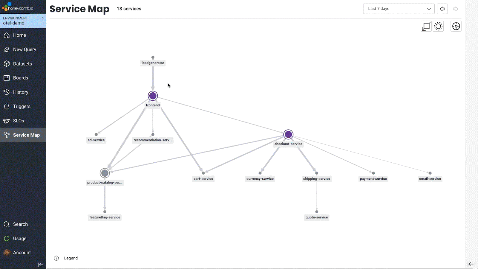
We’re able to adjust the time range of our Service Map from the last 10 minutes all the way through the last 60 days, with the ability to set custom ranges in between. This allows us to see whether span distribution or latency changes considerably over time, as well as apply our filters to specific time periods for more nuanced fact-finding or migration validation.
Finally, there’s one more filter we haven’t talked about yet: trace highlighting.
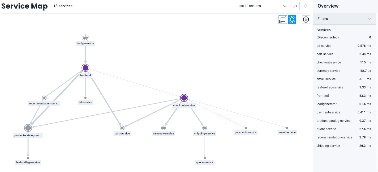
Let’s say we wanted to know which services are responsible for serving a particular url. We can filter just like we did with telemetry.sdk.language, this time with http.url. Instead of “=” I’m using the “contains” operation to match all URLs that have the string “cart” in them.
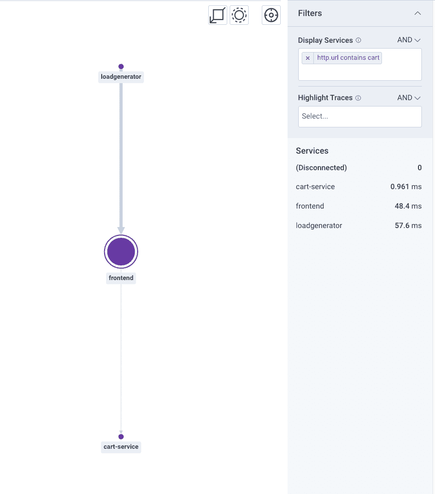
Well, that checks out. All of my URLs are going to hit the frontend, and the cart-service would seem a reasonable one to be responsible for serving the request. But let’s see what happens when we run the same query in the Highlight Traces filter:
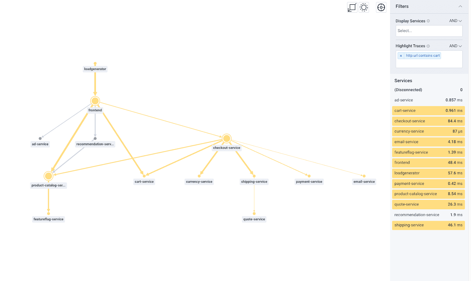
Instead of showing the services that match our filter, it highlights all the services that appear in traces that match. This effectively helps us uncover indirect dependencies. While the currency or shipping services aren’t directly responsible for serving our “cart” URLs, they’re invoked along the way. Therefore, they have the potential to impact the performance of those requests.
Interestingly, we can also see that the ad and recommendation services do not appear in any of those traces. That definitely makes sense—when our customers are ready to check out, it’s time to get out of the way and let them finish the transaction. Even though we’ve yet to look at a single line of any of the underlying code, we’re already getting a feel for how our environment operates.
Digging into the details with traces
Of course, the time will come when we need to get out of discovery mode and get into remediation mode. From our Service Map, we can go directly to the Query Builder to drill into our aggregate data or into Traces to view the end-to-end execution of a single transaction.
When you click on a service, five sample traces will render in the right-hand panel and will open a new tab for us to evaluate the trace. The “see query” button will take us to the Query Builder pre-populated with the query used to generate those traces, and from there, we can add additional filters to customize the output. The same is true for each of the connecting arrows, which will provide traces only where those services directly interact.
Get started today
Reminder: All Honeycomb accounts will have Service Map access through 2022, after which it will become an Enterprise exclusive feature, so be sure to check it out!
To learn more about configuring your datasets for Service Maps, see our documentation.If you don’t have a Honeycomb account, there’s never been a better time to sign up and get a Service Map of your very own—for free!
Want to know more?
Talk to our team to arrange a custom demo or for help finding the right plan.