A Systematic Approach to Collaboration and Contributing to the Lattice Design System
The Honeycomb design team began work on Lattice in early 2021. Over several months, we worked to clean up and optimize typography, color, spacing, and many other product experience areas. We conducted an extensive audit of all components, documenting design inconsistencies and laying the foundation for a sustainable design system. However, a more extensive evaluation and audit were necessary before updating or developing components.

By: Tesha Richardson

The Honeycomb design team began work on Lattice in early 2021. Over several months, we worked to clean up and optimize typography, color, spacing, and many other product experience areas. We conducted an extensive audit of all components, documenting design inconsistencies and laying the foundation for a sustainable design system. However, a more extensive evaluation and audit were necessary before updating or developing components.
“The more decisions you put off, and the longer you delay them, the more expensive they become.”
Craig Villamor, Google Maps
The journey ahead
At the start of 2023, my team was tasked with defining processes for creating components, collaborating, and contributing to the Lattice design system. Creating a process for team members to contribute to the design system required a systematic approach with research, prioritization, iteration, and measurement. My team and I conducted internal user interviews with various stakeholders, specifically engineers and designers, to understand their challenges, expectations, and needs.
We asked questions such as:
- Historically, what has made it challenging to create, update, and implement existing components?
- What are some things you hope to see to make you feel confident with the design system?
- How do you add and update components today?
By gathering this feedback, we identified the challenges that team members faced and the areas of the design system that needed improvement:
- Anyone can contribute to Lattice and add value
- Accessible and clear documentation and best practices for stable components, tokens, and patterns
- Feedback channels to help bridge the gaps of understanding and status
Addressing the challenges
Now that we identified the challenges users faced, we needed to create a workflow to address them. Lattice needed to be restructured and the information organized intuitively to increase readability and usage. We needed to review the existing components in GitHub, and document and create a checklist for what makes a ‘complete’ component.
I wanted to identify and bridge gaps in the design process to encourage more collaboration between designers and engineers. This would ensure we have a “close to code” Figma library of components and tokens. I audited the Lattice style guide in Figma, cross-referenced the information with the current design system and GitHub, and documented the findings.
Based on the user feedback we collected and best practices, I created a sitemap of Lattice’s existing information architecture and worked to streamline the information, surfacing crucial areas of the design system. Documentation was linked to Figma’s stable components to give designers and engineers direct access to usage guidelines.
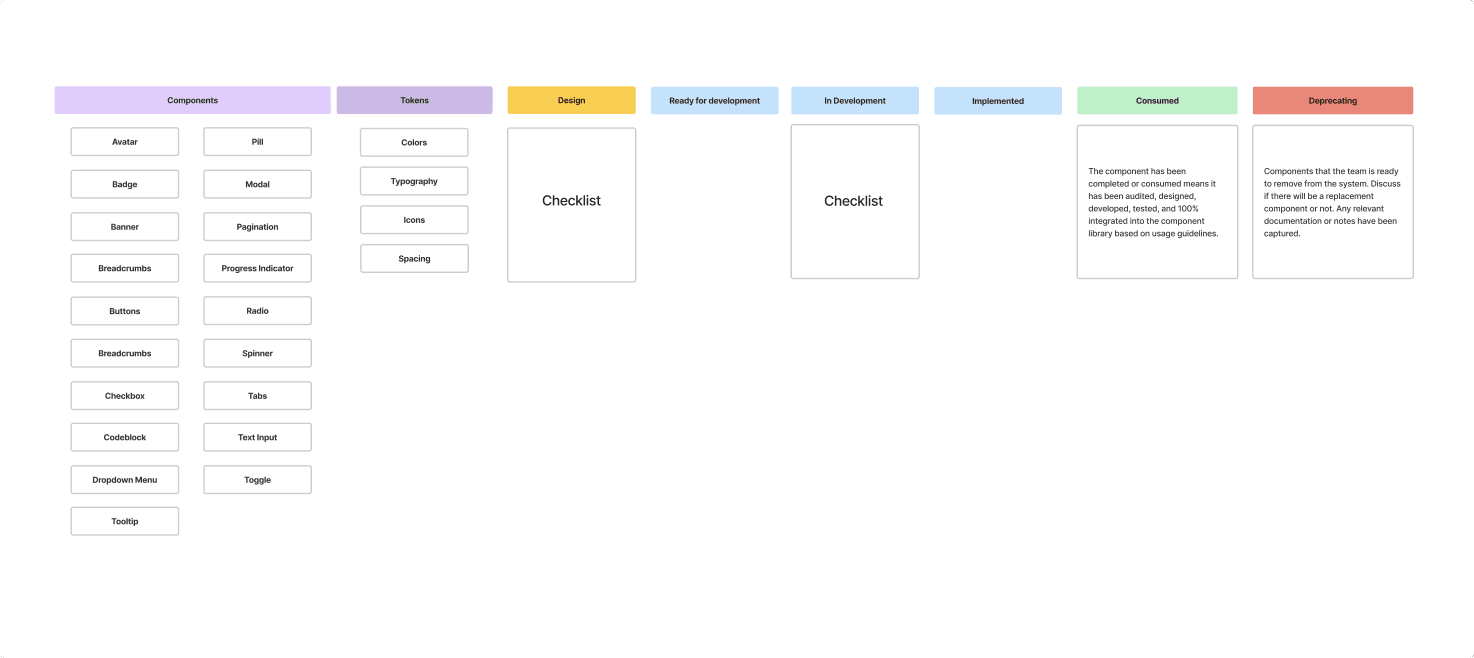
We created an Asana board to track the process of building components. Each component was re-evaluated because needs may have shifted, and the component may not be relevant to the product anymore. Engineering and I collaborated closely to determine if there were initial challenges or concerns we needed to be aware of. We double-checked naming conventions to ensure alignment between design and engineering and kept in mind the overall identity of components.
Once engineering established a plan to refactor an existing component or create a new one, they made a home for the component in Lattice, followed by unit testing and writing comprehensive stories in Storybook.
Together, we review the component in Storybook to double-check naming guidelines and capture any additional information, such as where it’s used in the system, accessibility concerns, and new or additional usage guidelines additions before it’s pushed live to Zero height. Simultaneously, the Figma component is reviewed and updated to match what’s in the component library in Lattice. Follow-up tasks are created in Asana, and the component is moved to consumed.
Headed in the right direction
We completed version one of the Lattice documentation and component-specific usage guidelines—and restructured Lattice to be more intuitive for designers and engineering—my team gathered user feedback on the current direction and process for creating components and contributing to Lattice. Overall, the feedback was positive, and team members were excited to see the changes to the design system. They were motivated to contribute ideas and enhancements to the product.
“I like that you start each page with a clear definition of the element that explains its intended use.” – Team member
“I liked it a lot! in particular liked the “component in progress” flag/link. nice to know what’s ready-to-use and what is wip.” – Team member
Everyone plays a part in the process
We wanted the process to have enough flexibility and structure to empower all team members to contribute to Lattice. The contribution process consists of three sections to allow for various contribution levels:
- Fixes: Errors, bugs in the code of tokens and components, documentation changes.
- Small enhancements: Changes that don’t break existing behavior.
- Large enhancements: System-wide changes coordinated across teams that significantly impact the product.
When creating components, we wanted to maintain the theme of motivation and empowering team members. We made the Component Lifecycle document by borrowing pieces from well-established design systems and customizing them to fit our needs. It outlines the three stages of the component, from exploratory to stable, which creates space for understanding the purpose and problem a component is trying to solve. Team members can feel confident based on data before complete adoption.
Everything is an experiment
Design systems are not a one-time solution; maintaining them is time-intensive work requiring a dedicated team. They should constantly evolve based on user feedback. With this initial strategy, the expectation is that team members will surface new ideas and take action collaboratively. We will continue documenting the process’ challenges and finding new creative solutions to streamline workflows for both designers and engineers.
On that note, we’d like to invite you to try Honeycomb for free. We put immense thought into the product and would love to hear your feedback.
Want to know more?
Talk to our team to arrange a custom demo or for help finding the right plan.