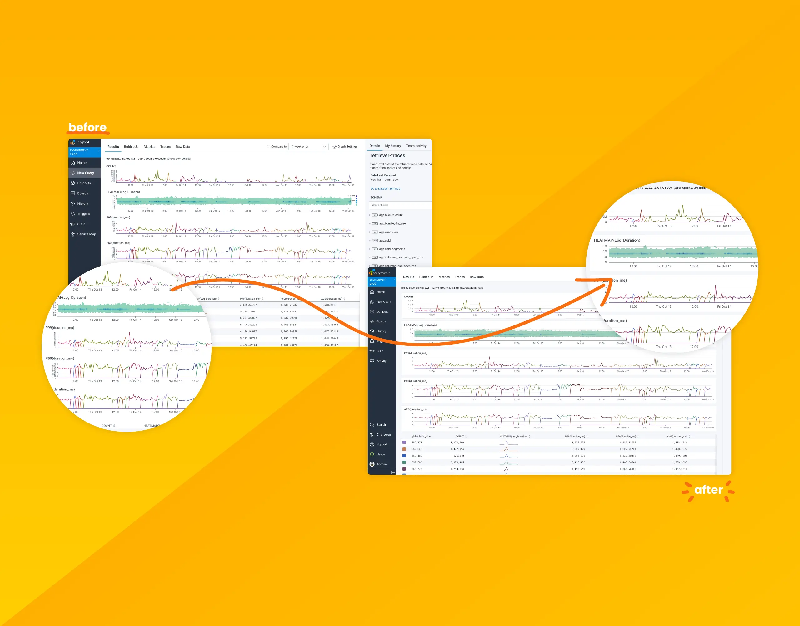
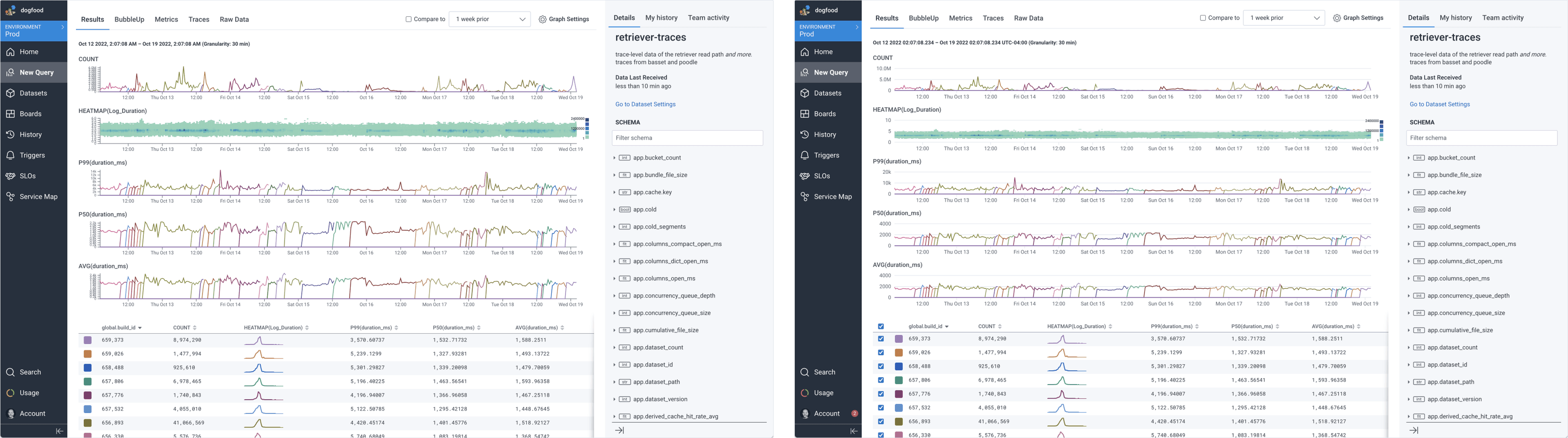
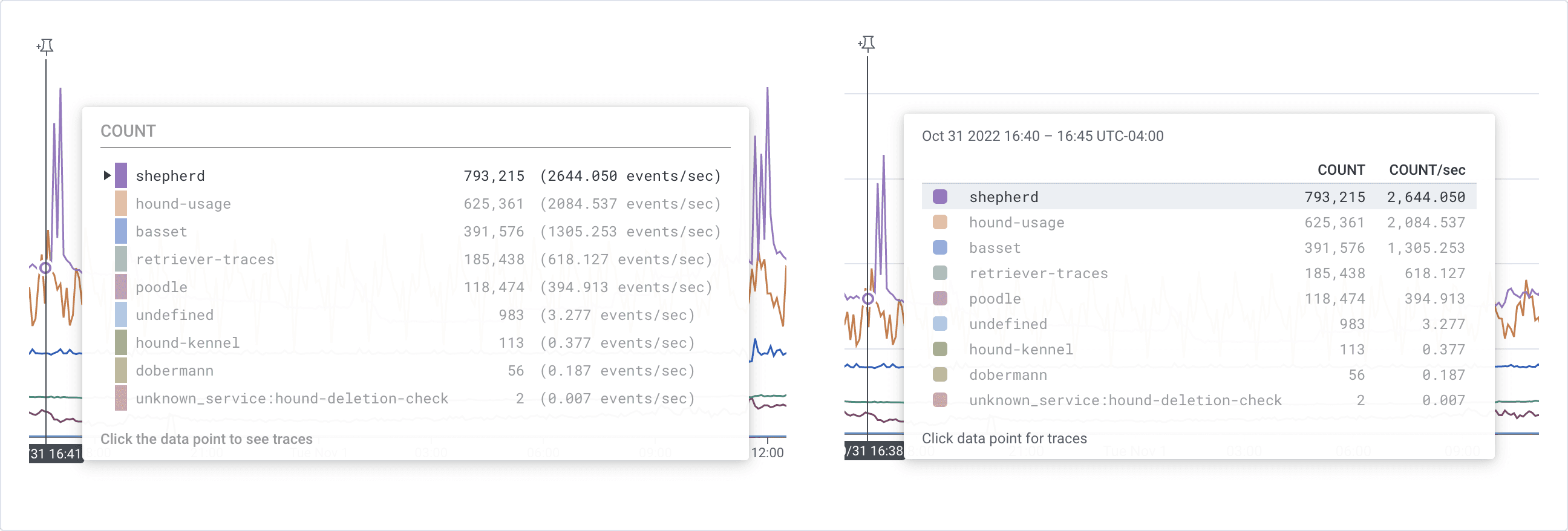
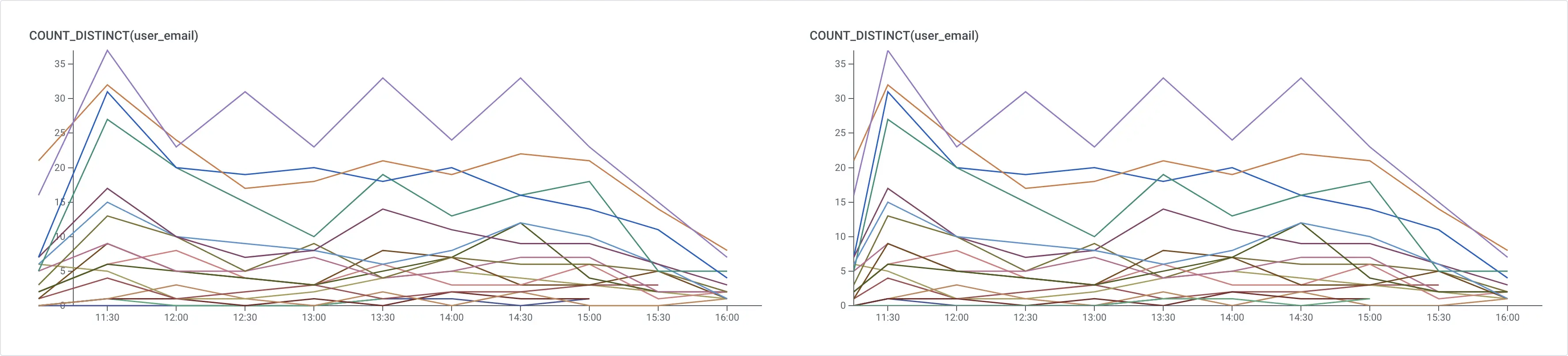
Your Data Just Got a Facelift: Introducing Honeycomb’s Data Visualization Updates
Over the past few months, we’ve been hard at work modernizing Honeycomb’s data visualizations to address consistency issues, confusing displays, access to settings, and to improve their overall look and feel.

By: Sarrah Vesselov
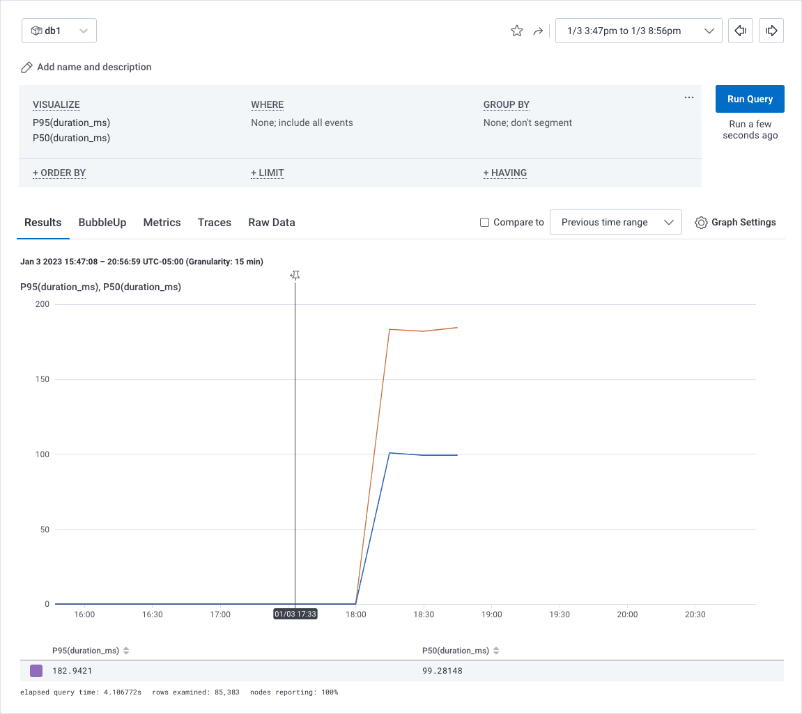
Data visualizations take complex information and present it in a clean and easy-to-understand visual. Done right, they can allow quick insight through easy pattern and outlier recognition. Done wrong, it can confuse, obfuscate, and lead to wrong conclusions. Yikes!
Over the past few months, we’ve been hard at work modernizing Honeycomb’s data visualizations to address consistency issues, confusing displays, access to settings, and to improve their overall look and feel.
How we did it
Data visualizations are a considerable part of Honeycomb, and making changes was no small task. Before diving in, the design team broke down the data visualization issues we had collected into three distinct categories:
- User Experience (UX)/Friction: Outright bugs and UX that cause friction for the user
- User Interface (UI)/Visual Design: Visual appeal
- Enhancement: Additional charts and graphs or enhancing existing ones
We hypothesized that addressing the UX/Friction issues first would yield the most significant improvements for our customers. Visual appeal often contributes to UX/Friction through things like tiny or inaccessible text, spacing issues, hierarchy, and color concerns. Addressing UX/Friction would simultaneously knock out many UI/Visual Design issues.
Enhancements would need to wait until we’d cleaned house and felt we had a solid foundation upon which to build. It didn’t mean we wouldn’t think about and consider them, but we would not prioritize them.
Do the research
It isn’t enough to hypothesize. We needed to establish confidence that the changes we were making would be impactful—and that we’d have a way to measure that impact. So, our Principal User Researcher, Justin Threlkeld, got to work gathering info, researching, and talking with our customers. He synthesized his findings and used them to set the guiding principles and best practices needed to create a vision or “north star” for where we wanted to take our visualizations.
This research also resulted in creating a benchmarking rubric we could use to evaluate how each improvement impacted Honeycomb’s comprehensive data viz experience. We identified three areas as key to benchmarking that experience: usability, functionality, and beauty. Each of these areas contains a set of corresponding core heuristics we could use to determine whether we were failing, meeting, or exceeding within that key area.
Data Viz Benchmarking Dimensions
Area: Usability
Core heuristics:
- A11y
- Visibility of data interface status
- Consistency and standards
- Match between system and the real world
- Flexibility and efficiency of use
- User control and freedom
- Error prevention
- Help users recognize, diagnose, and recover from errors
- Recognition rather than recall
- Help and documentation
Area: Functionality
Core heuristics:
- Insightful visualizations
- Top-level insights (what’s available within zero to two clicks?)
- Available data depth
- Tufte principles
Area: Beauty
Core heuristics:
- Aesthetic and minimalist design
- Aesthetic usability
Measuring these areas from the start helped us know where we were starting from, and which improvements to prioritize to see progress.
Prioritization and sequencing
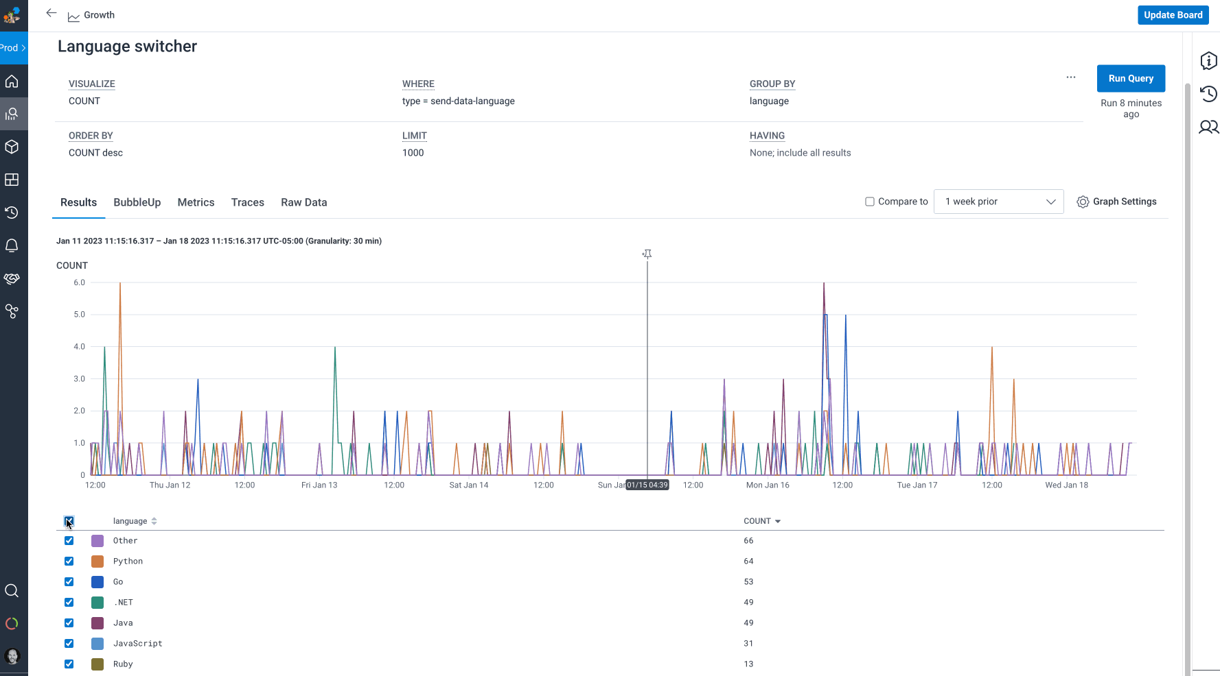
Having researched, established a plan, and gathered baseline metrics, the next step was determining which friction points we should focus on to have the most impact on the overall experience. This is where Product Management came in. Priscilla Lam, our PM on the project, looked to product metrics for help, focusing on the areas our customers most commonly leverage:
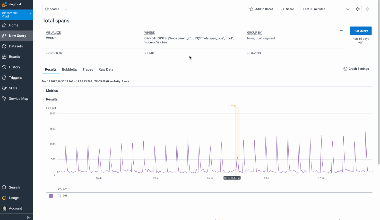
- Core charts (main query builder, Home, boards)
- Chart type (line charts far outweigh usage vs. heatmaps and stacked charts). Many tickets affected all charts, while some were more line chart focused
- Frequency of feedback
Using these three metrics, the team was quickly able to identify which friction issues could potentially have the most impact for the maximum number of customers. We started by tackling those, then made our way down the list.
Making it happen
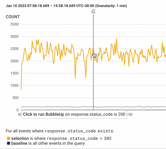
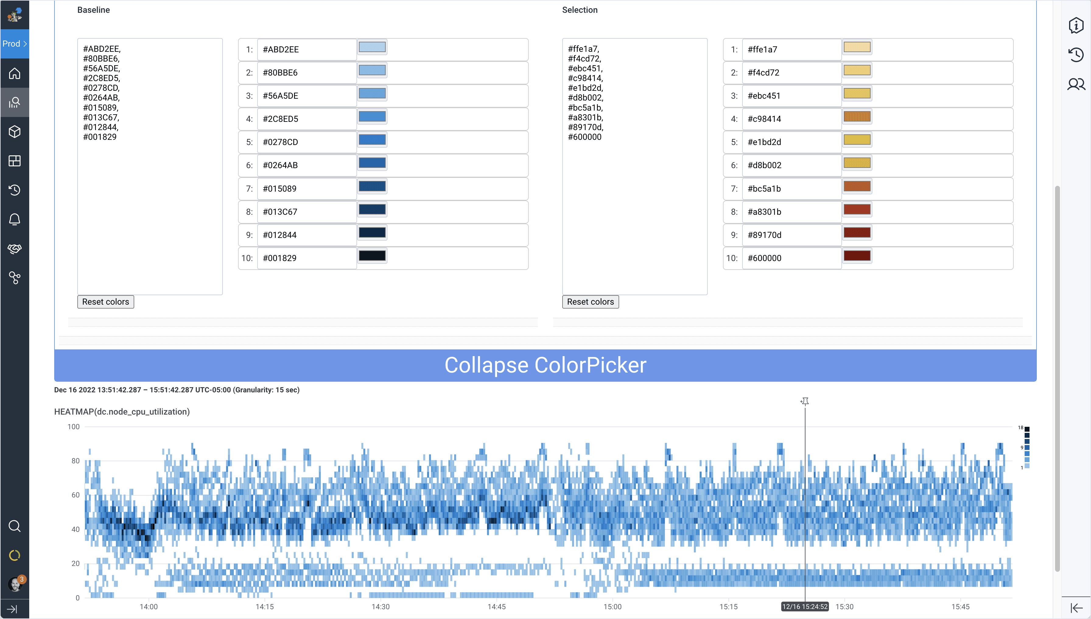
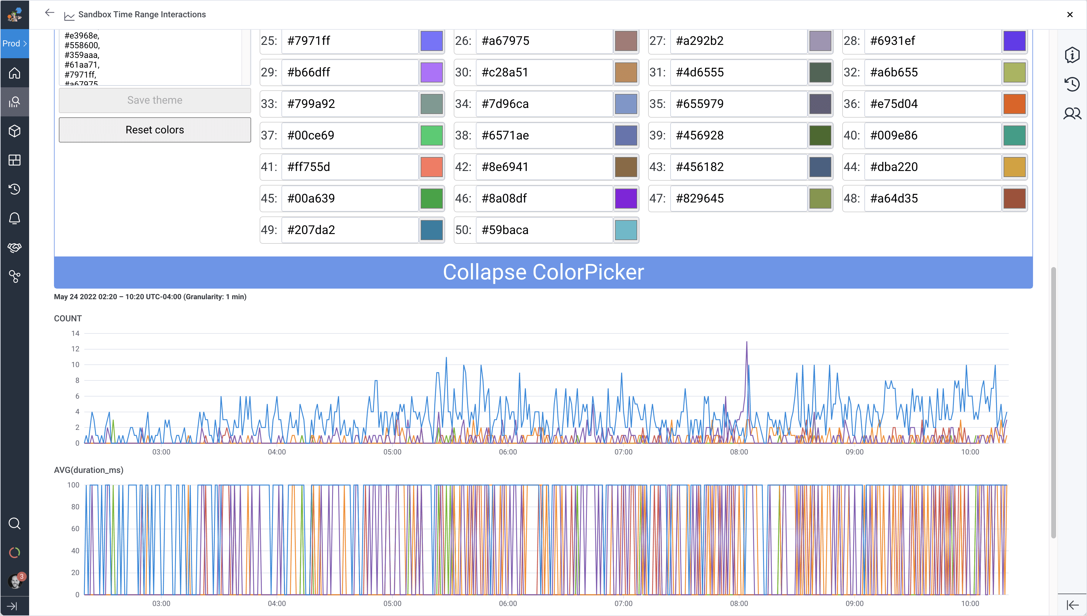
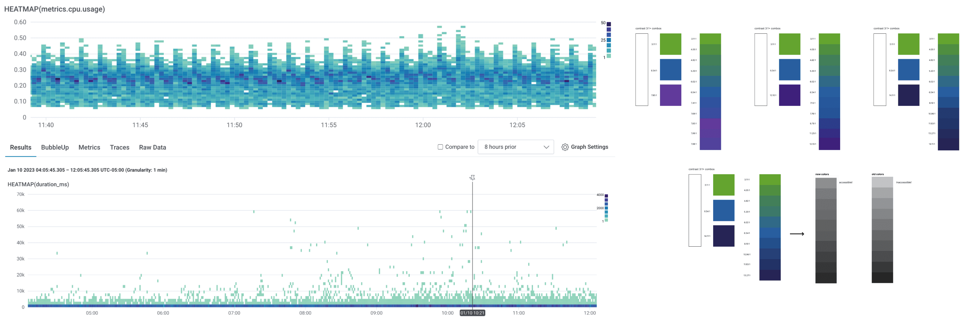
Color is an essential aspect of the data visualization experience. Unfortunately, some values in our graphing palettes were off-brand and inaccessible. To address these issues, we began experimenting with new colors for line graphs and heat maps derived from our brand palette that met W3C standards.
Testing colors in an analytics-heavy product like Honeycomb can be tricky since customer query results yield any number of data densities and patterns. Using design software like Figma to apply new color values to static vector charts using fake data is undoubtedly better than nothing. Still, it wouldn’t provide the same level of insight as real-life scenarios. Sharing this perspective, Product Engineer Ashley Robinson created a tool that allowed designers to input hex values and see them applied to actual Honeycomb graphs instantly. This tool proved incredibly valuable as it allowed us to quickly evaluate color palettes across different query results and eliminate options that didn’t work well.
Throughout this effort, we partnered closely with engineers on many other potential data visualization solutions. The tightly bound efforts between design, engineering, and product allowed us to achieve more than we could have alone. Special shout-out to Senior Product Designer Jeremy Ford, who led the design effort, and Senior Software Engineer Jeff Balboni, who tackled D3 for us. To the many others involved in this effort, thank you!
What’s next
We’ve come a long way and made many improvements, with more to go. Here are some of the ideas and concepts we are thinking about for 2023.
Some of these data visualization updates are still in the discovery phase and are not guaranteed to make it into Honeycomb, but we’d love to hear what you think! Reach out to us in our Pollinators community Slack in the #ux-feedback channel to give us your thoughts.
This post was written in collaboration with Jeremy Ford, Sol Escalada, and Priscilla Lam.
Want to know more?
Talk to our team to arrange a custom demo or for help finding the right plan.