Level Up with Derived Columns: Two Neat Tricks That Will Improve Your Observability
When we released derived columns last year, we already knew they were a powerful way to manipulate and explore data in Honeycomb, but we didn’t realize just how many different ways folks could use them. We…

By: Ben Hartshorne
When we released derived columns last year, we already knew they were a powerful way to manipulate and explore data in Honeycomb, but we didn’t realize just how many different ways folks could use them. We use them all the time to improve our perspective when looking at data as we use Honeycomb internally, so we decided to share. So, in this series, Honeycombers share their favorite derived column use cases and explain how to achieve them.
Have a favorite derived column use case of your own? Send us a screenshot and description and we’ll send you something in the mail! 🙂
Counts, Percentiles, … Ratios?!
We often ask of our observability tooling, “How many errors did we see in this time period?”
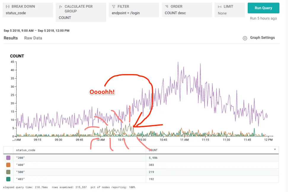
It’s common to see successes and errors showing up together on a graph–but sometimes it’s also useful to ask “What is the ratio of successes to failures?” Sometimes how many failures there are is less important than whether most of the requests are doing OK–so, let’s look at a few graphs!
Here, we notice an increase in some errored traffic. But successful traffic was still chugging along just fine!
Still though, despite a good volume of successful traffic (200 status code), I’m curious. What percentage of queries were failing there? For simplicity, let’s say that anything that’s not a 200 is an error. (You can certainly get more detailed in your own derived columns.)
We’ll build a derived column that counts a successful result as 1 and an error as 0. Because I want it to look like a percentage (on the range 0-100 rather than 0-1), we multiply by 100.
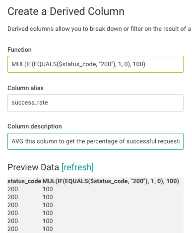
Then take the average. The average of this magical derived column will be our success rate!
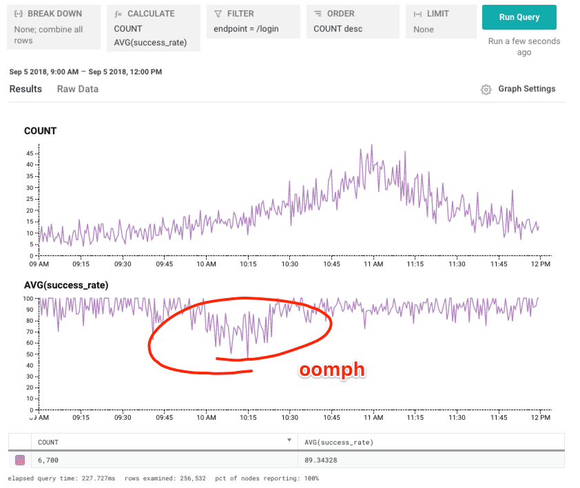
Looks like that “little spike” of errors dropped us from ~90% successful to closer to 70%. Ouch!
In addition to looking good, this derived column can be used in triggers to make detecting errors more responsive to changes in total traffic volume – even if your traffic fluctuates by 100x throughout the day, you can still set a threshold that is reasonable since it is a percentage of total traffic rather than just a raw count of errors.
Who did this, but not that?
When using tracing to traverse program execution, you can see the flow of your application laid out plain as day in a trace. It’s not always clear, though, how to build queries showing the larger behavior of the system. Using derived columns, we are able to ask a new kind of question: Show me the volume of traces that made it to one step but not an expected subsequent step. You can imagine all sorts of examples: How many times do we open a file but not close it? When do we start a SQL transaction but not commit it?
The example I’ll show you here is from our own end to end check. The check submits an event to a dataset, then attempts to read it back. I’d like to know – how many times do we submit an event and then fail to check for it? (This is interesting because if submitting the event fails, we skip checking for it.)
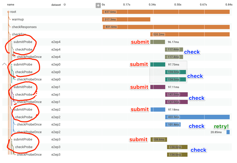
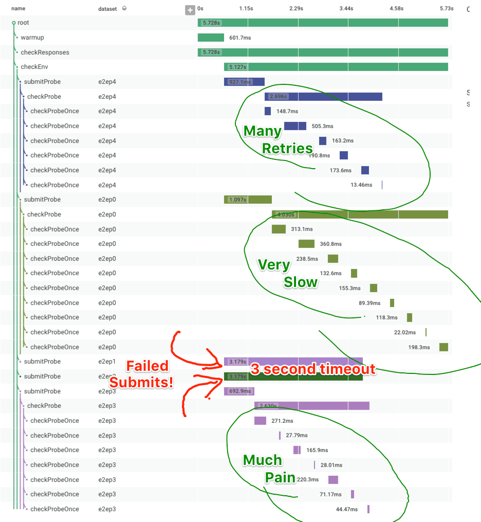
First, for context, let’s look at a successful end to end check as a trace. After some initial warmup, it submits a check to each dataset (there are several, to exercise different backend shards), then verifies that it can read back the submitted event (called a probe in this code). Sometimes it doesn’t succeed on the first read, so it retries; you can see this in e2ep2.
Now that we’ve seen what normal looks like, here’s a trace from some time our dogfooding cluster was suffering! It’s clear there’s increased delay between when an event is submitted to the API and when it becomes available for reading via the UI. Additionally, the event submission itself is significantly slower (600-1100ms rather than 90-100ms). To top it off, two event submissions time out after 3 seconds waiting for a response! It’s terrible!
Ok, so how often does this happen? We have a good sense of the distribution of time for checks (ooh, it makes a lovely HEATMAP), but how often does event submission failure happen? (Ok, we could also do a COUNT on submitProbe events that time out, since we indicate that failure explicitly, but say we didn’t.) Let’s make a graph that subtracts the number of checkProbe events from the number of submitProbe events! This gives us the difference as a time series!
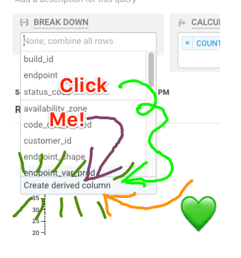
First, the derived column: We’re going to use the SUM calculation, so to subtract we’ll assign the submitProbe events a value of 1 and the checkProbe events a value of -1. If there are an equal number, the SUM is zero! When there are fewer checkProbe events than submitProbe events, the SUM will drift into the positive integer territory. (In this example there can’t be more checks than submits, but assuming that did happen, the SUM would drift negative.)
Derived column definition: IF(EQUALS($name, "submitProbe"), 1, IF(EQUALS($name, "checkProbe"), -1, 0))
And the SUM, graphed:
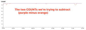
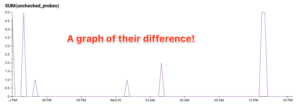
The volumes in these graphs are low enough that you can actually easily see the orange blips in the left graph above. But with small differences in the two lines, the right hand graph scales better to the magnitude of the difference, rather than the magnitude of the traffic.
The biggest benefit of doing this kind of calculation is that we can now create a trigger on the difference in volume between these two events! This is hugely helpful when trying to create notifications about the health of a pipeline style process – where many things all need to happen in a sequence, you can use derived columns to create triggers that tell you about the number of requests that don’t make it all the way through.
Data++
Thanks for coming on this short tour of some of the ways I use derived columns. Please write in and tell us about your most awesome (and terrible) derived column! And if you haven’t made any yet…
Check out the previous posts in this series:
- Level Up With Derived Columns: Understanding Screen Size (With Basic Arithmetic)
- Level Up With Derived Columns: Bucketing Events For Comparison
And as always, if you want to try out Honeycomb, go on and sign up for a free 30 day trial 🙂
Want to know more?
Talk to our team to arrange a custom demo or for help finding the right plan.