New Honeycomb Features Raise the Bar for What Observability Should Do for You
As long as humans have written software, we’ve needed to understand why our expectations (the logic we thought we wrote) don’t match reality (the logic being executed). To that end, we developed techniques to help measure reality—logging text strings, or capturing aggregated metrics—and persevered, seeking out newer and fancier logging or monitoring solutions over the intervening decades.

By: Christine Yen

As long as humans have written software, we’ve needed to understand why our expectations (the logic we thought we wrote) don’t match reality (the logic being executed). To that end, we developed techniques to help measure reality—logging text strings, or capturing aggregated metrics—and persevered, seeking out newer and fancier logging or monitoring solutions over the intervening decades.
But by anchoring ourselves in those original techniques of “logs or metrics,” we’ve accepted a fatal flaw: a world with disconnected, siloed data stores that many struggle to piece together into something meaningful (no wonder some folks call them “pillars”).
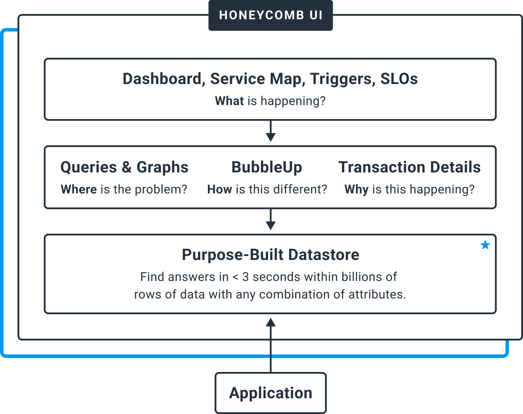
Honeycomb entered the scene with a fundamentally different way of viewing software telemetry: what is a metric, if not logs that have been aggregated along a single dimension? What is a trace, if not structured logs tied together into a useful hierarchy? These different types of data are, ultimately, just different visualizations of the same reality in your system.
We built Honeycomb in a fundamentally different way, to reflect the experience we wanted to have in understanding our production systems. That meant extracting whatever visualization our hearts desired, from a single source of truth, with no “dead ends” in a given exploration. Filtering, grouping, and aggregation all became levers to pull in order to tune the visualization and answer questions, instead of investigation-limiting characteristics of the traditional data collection or storage itself.
Honeycomb has always seen the world a little differently from legacy logging, monitoring, and APM vendors—and based on the mainstream embrace of “observability” and recognition from analysts, the industry is hungry for this fresh perspective.
With the release of our latest innovations—a new Service Map and improvements to make BubbleUp more useful and accessible than ever—we’re setting the new standard for what observability tools should be able to do for you. Let’s see what’s in the box.
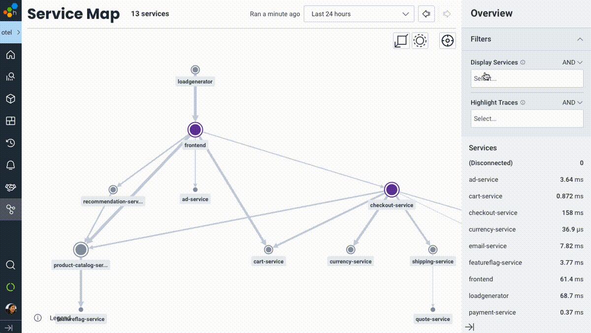
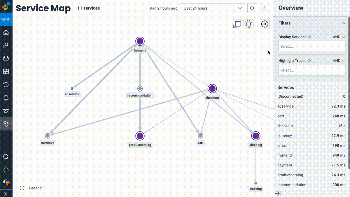
A Service Map you can do something with
I’ll be blunt: service maps in observability or monitoring tools are nothing new. Of course it’s valuable to visually represent the various services in your system. When we set out to design our take on a service map, we wanted to build beyond a table-stakes implementation and imbue it with the same qualities that differentiate the core Honeycomb experience: a truly interactive, debuggable, useful view into your system.
Honeycomb’s Service Map isn’t a piece of art for your walls (or your execs’)—it’s meant to be touched, filtered, zoomed in and out, and used as a jumping-off point into other visualizations of your system like traces or aggregate queries. We built on top of the full power of Honeycomb’s data model and query engine—so while the usual signals like upstream/downstream relationships, relative throughput, and latency cues are right there where you’d expect, you can now filter services or highlight trace paths that match any criteria in your data.
Want to see which services are touched for users with empty shopping carts? Easy. What about highlighting the path traveled for requests with a given feature flag enabled? Done. Or understanding which services are involved in any traces that were triggered by user 4289cb26? Simple.
To learn more, see our Service Map launch blog post.
What to do when a graph looks off: bubble up on those outliers
One of the consistent themes we hear about is the institutional knowledge and intuition gap between new and seasoned engineers on a given team. Transitioning from “something looks off” to “I know what it might be” to “let’s check if it’s happening everywhere, or only under certain conditions” can leave an engineer less familiar with a system struggling to catch up.
Those seasoned engineers on a team can often simply sense that, say, increased latency in Service X is due to an increase in requests that fit Criteria Y. They can confirm it with data, then move forward into figuring out why Criteria Y is suddenly overrepresented. But what about the rest of us?
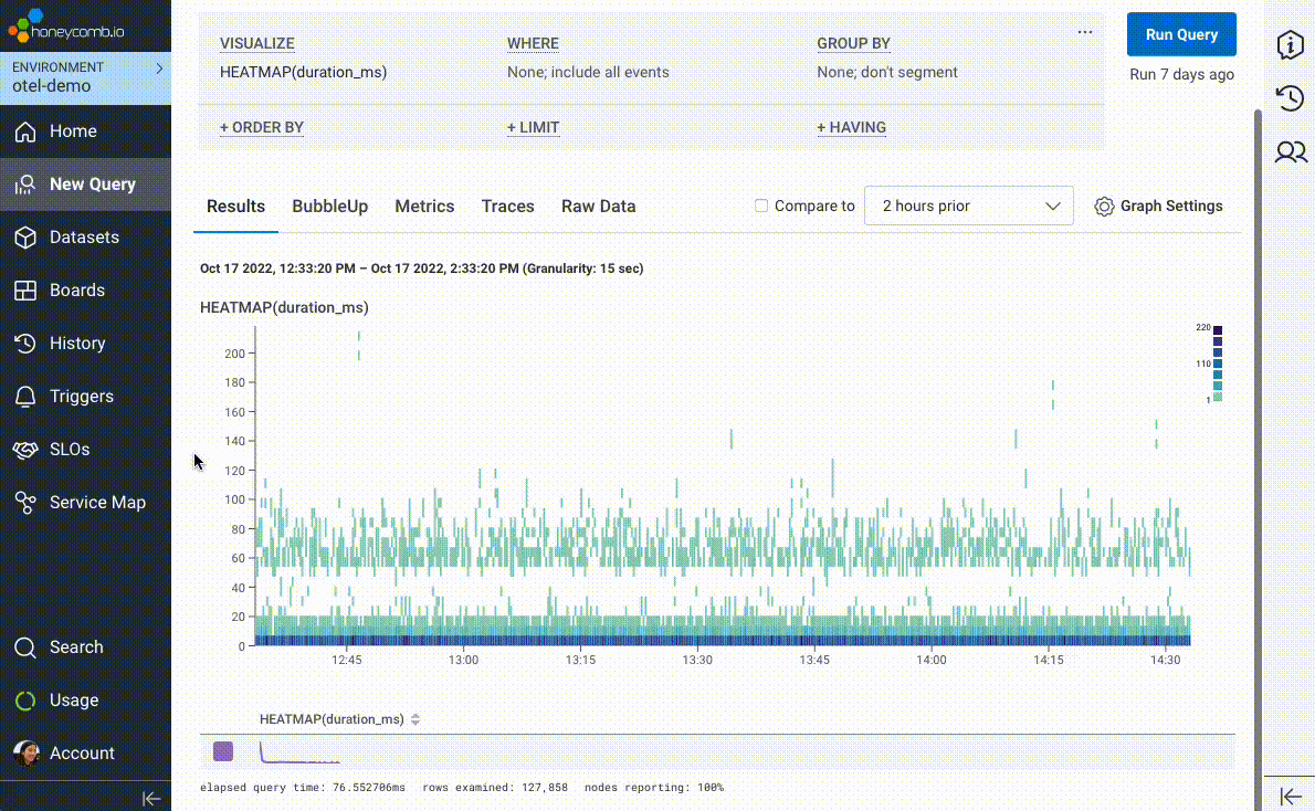
We introduced BubbleUp in 2019 to try and short-circuit the path to intuition and help answer the question, “these data points are interesting, but why? What’s different about them?” In its earliest incarnation, users would literally draw a box around “odd-looking” artifacts on a heatmap visualization. BubbleUp would then take each and every field in your data and compare the distribution across those fields between the selected points and the rest of the dataset.
But we couldn’t stop there! Once we realized the value of being able to compare a subset of interesting data points against a baseline, we wove it in as the core mechanic behind our best-in-class support for Service Level Objectives (SLOs), immediately highlighting “what’s different” about requests failing an SLO’s associated Service Level Indicator (SLI).
After all, when checking an SLO, what subset of requests are more “interesting” than the ones actively eating into your error budget?
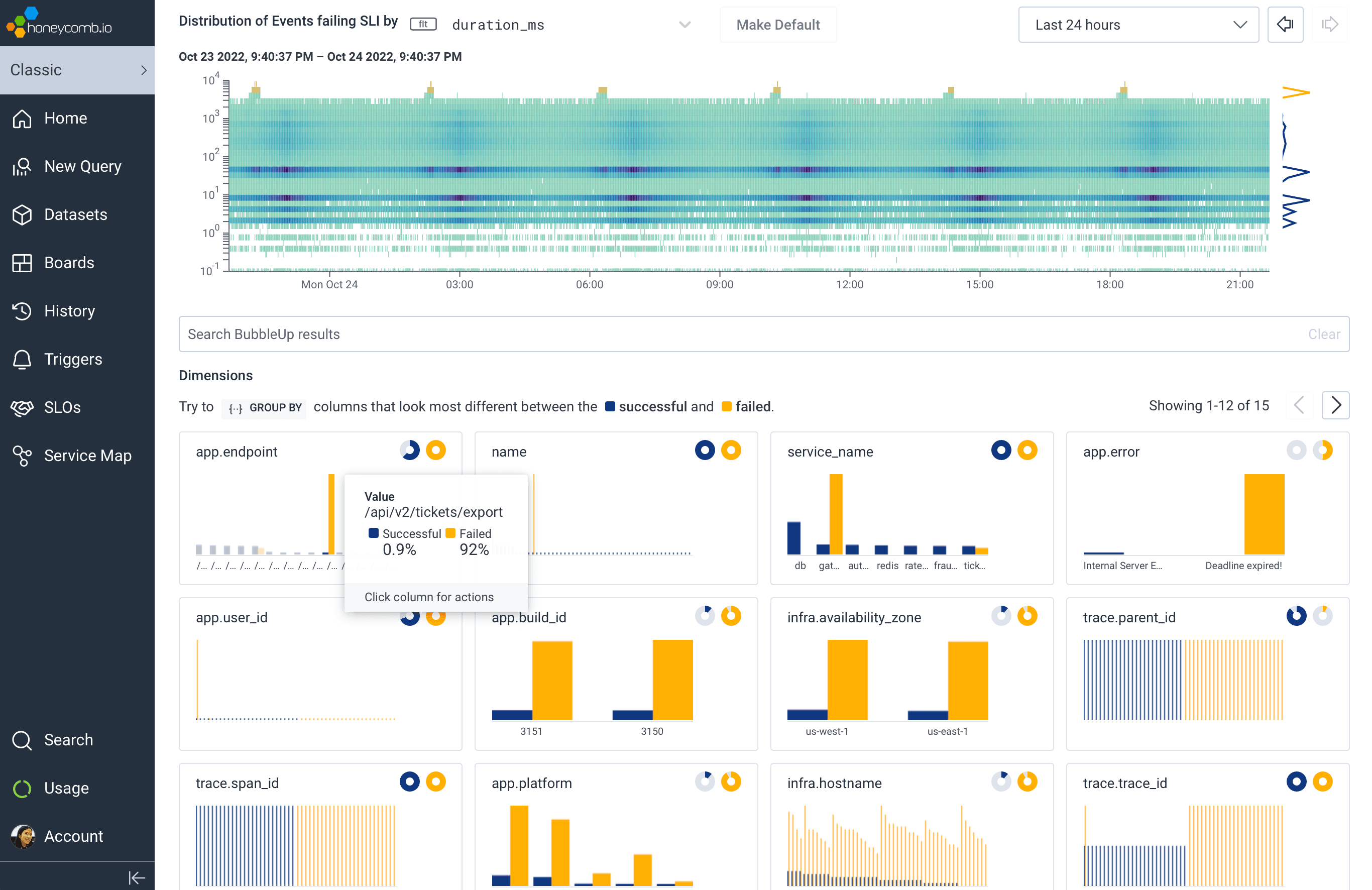
We’ve taken BubbleUp one step further: you can now bubble up on anything, not just numeric values in a heatmap. Any group—any set of outliers that you can describe as a subset, like “requests to /checkout with fewer than five items in the shopping cart,” or “invocations of the email service with foo@example.com as the recipient”—can be compared against the rest of your traffic, to help identify what’s unique about your chosen subset.
BubbleUp was built to offer a path forward when you simply don’t know which fields are important, or where to look next. We’re delighted to have made it easier and more accessible than ever to utilize BubbleUp. If more users can figure out what question to answer next, that means a faster path to understanding why and how reality has deviated from our expectations—and how to fix it.
You can learn more about BubbleUp, and the piles of additional usability improvements we’ve made to the experience in its standalone blog post.
Observability isn’t a tool or corpus of data; it’s all about what practitioners can do
I’m done debating definitions of observability. I’d much rather talk about what all the functionality we’ve built into Honeycomb lets you do (“observability” has “ability” in the word, after all):
- Eliminate dead ends. Every view in the Honeycomb product is the entry point into another; every visualization can connect to another; every graph can be zoomed into or refined. It’s all drawing from the same source of truth; after all, the tool you’re using shouldn’t get in the way when following a given clue. You can start with a graph, look under the hood (flip to raw data), zoom into an exemplar (view a representative trace), and zoom back out to find other patterns (query for similar traces)—all without worrying about whether tags (or other metadata) were correctly configured to allow that movement. This experience is core to Honeycomb and fundamental to the unique experience we deliver.
- Orient yourself with an overview of your services, then actually use it to answer questions. Honeycomb’s Service Map is meant to be played around with, filtered, and used to track any subset of traffic (as defined by any dimensions), down to—you guessed it—a single trace, and back out.
- Introduce the full potential of observability to everyone on your team. Honeycomb has always excelled at enabling power users to answer arbitrary questions about system telemetry; now we’re taking the same care to make it easy for all users to figure out which questions to ask. Our latest BubbleUp enhancements and Service Map provide friendlier entry points into a given investigation.
Concepts like Service Maps, Distributed Tracing, Anomaly Detection, and SLOs have been around for some time. But the way all of these have historically been implemented reflects the siloed approach of treating logs, metrics, and traces as fundamentally separate sources of truth. This leaves you on your own to connect the dots, often guessing at patterns because one visualization is disconnected from another.
Honeycomb challenges this traditional approach—we’ve taken a wrecking ball to the three pillars and laid our own foundation: a data store and query engine that are refreshingly silo-free. We offer the ability to look at your system at any level of granularity, zooming in and out without losing context—because at the end of the day, engineers answering questions need the big picture, the details, and several steps in between.
In the spirit of answering questions, I’ll end with one for you: can your “observability” tool do this?
If you’re curious to see what you can do with Honeycomb, we invite you to get started today—for free. Our free tier covers up to 20 million events per month, and all users get access to our Service Map until the end of 2022. Additionally, we’re hosting a live discussion on November 9th where we’ll apply our new releases to real-world concepts and best practices. Register here.
Want to know more?
Talk to our team to arrange a custom demo or for help finding the right plan.