Outlier Visualization
See Prod More Clearly With Outlier Detection
The first step to solving a problem is identifying it. The hard part is knowing which part of the code is causing the problem.
Honeycomb lets you see real-time production in hi-res, with powerful visualization bringing the data you need to the forefront so you can quickly resolve the issue affecting your users. We deliver a central, easy-to-navigate view into granular data from events, logs, and traces.
Honeycomb gives teams a familiar home page for getting the operational big picture, then lets you drill down into interactive charts – from histograms to line graphs and heat-maps – so you pinpoint the exact issue in context.
See Honeycomb in Action
An Intuitive Starting Point
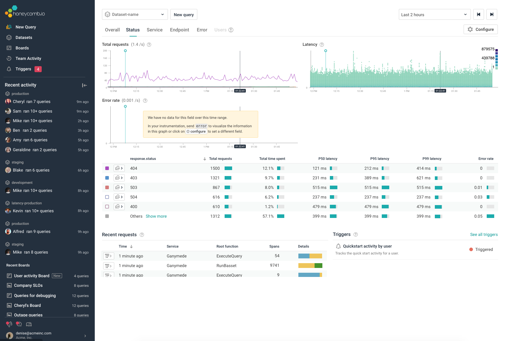
Honeycomb provides a welcome home page with a quick view of the high-level, current vital health of your services. You are quickly oriented with charts on total request rate, error rate, and latency. It’s an ideal starting point for staying proactive and being alert when issues arise.
From there, you quickly dive in to investigate deeper through flexible query, rich visual charts, and viewing trace details.
"It’s amazing going from other tools to Honeycomb - the whole process to visualize something is so complex, Honeycomb just shows me the information that is relevant to me immediately. Ridiculously powerful."
Read the case study (no login)
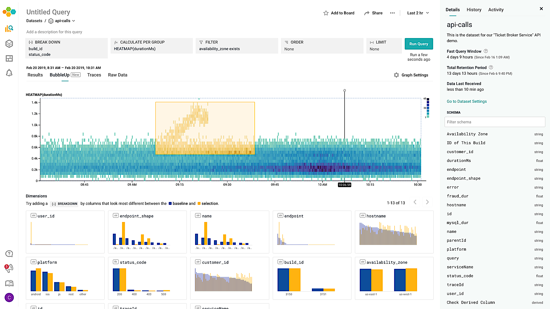
BubbleUp - Surface Important Details Automatically
Honeycomb’s BubbleUp feature uniquely detects outliers compared to the baseline and speeds up debugging, by showing you potential places to look for signal within your data.
BubbleUp automatically shows you which fields or dimensions are the most obvious best next steps in your investigation.
What took hours or even days can take minutes or seconds with Honeycomb, giving you valuable time back. The result: happy teams and even happier customers.
Visualize Outliers with BubbleUpDev, Operations and SRE Teams Working Together
Spot What's Heating Up
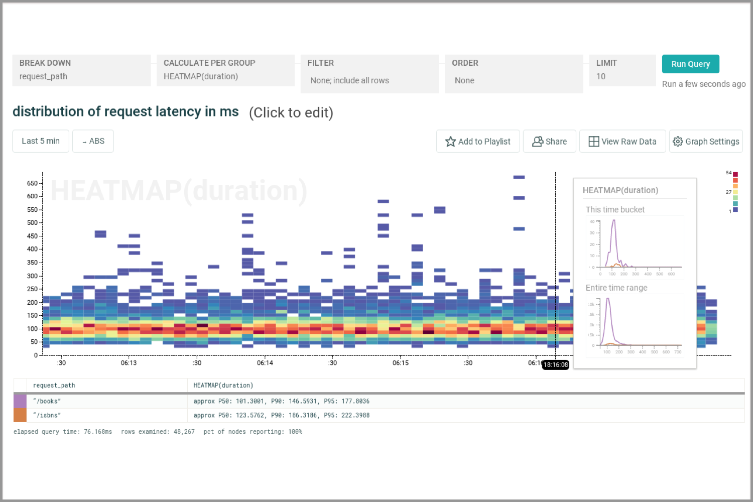
One of the most powerful features of Honeycomb is the ability to break down a calculation into groups based on values in columns. Heatmaps are the perfect way to scroll through and see what pops into view.
Heatmaps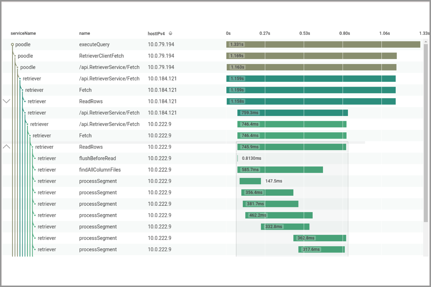
Trace Meets BubbleUp
See individual traces to deeply understand request execution. Break down, filter, and aggregate trace data to uncover patterns, find outliers, and understand historical trends.
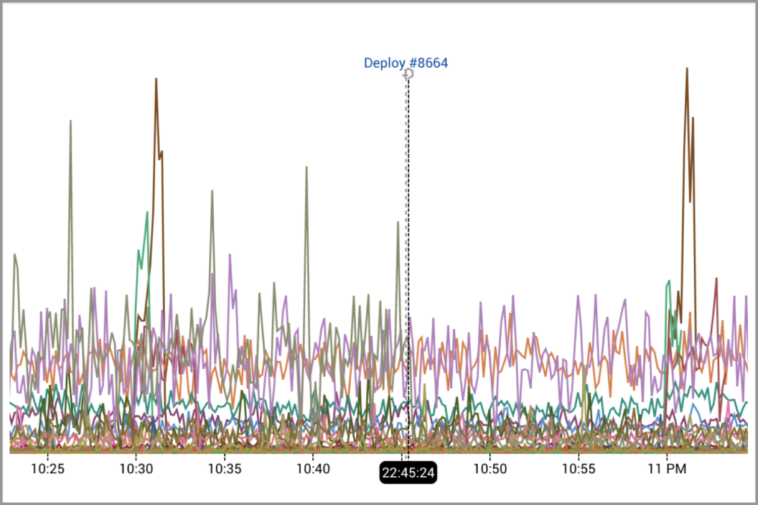
Mark Your Path
Use Markers to label external events like builds. Queries including that time period display a dotted vertical line and mouse-over message to enlighten you in the future.