Design as Infrastructure
For those not familiar with the term design system, at its core, it is a collection of reusable building blocks such as buttons, colors, text styles, icons. These blocks are also commonly referred to as components, which make everything look and feel cohesive, like it belongs to the same product.

By: Sol Escalada

2025 DORA State of AI-assisted Software Development Report
Read More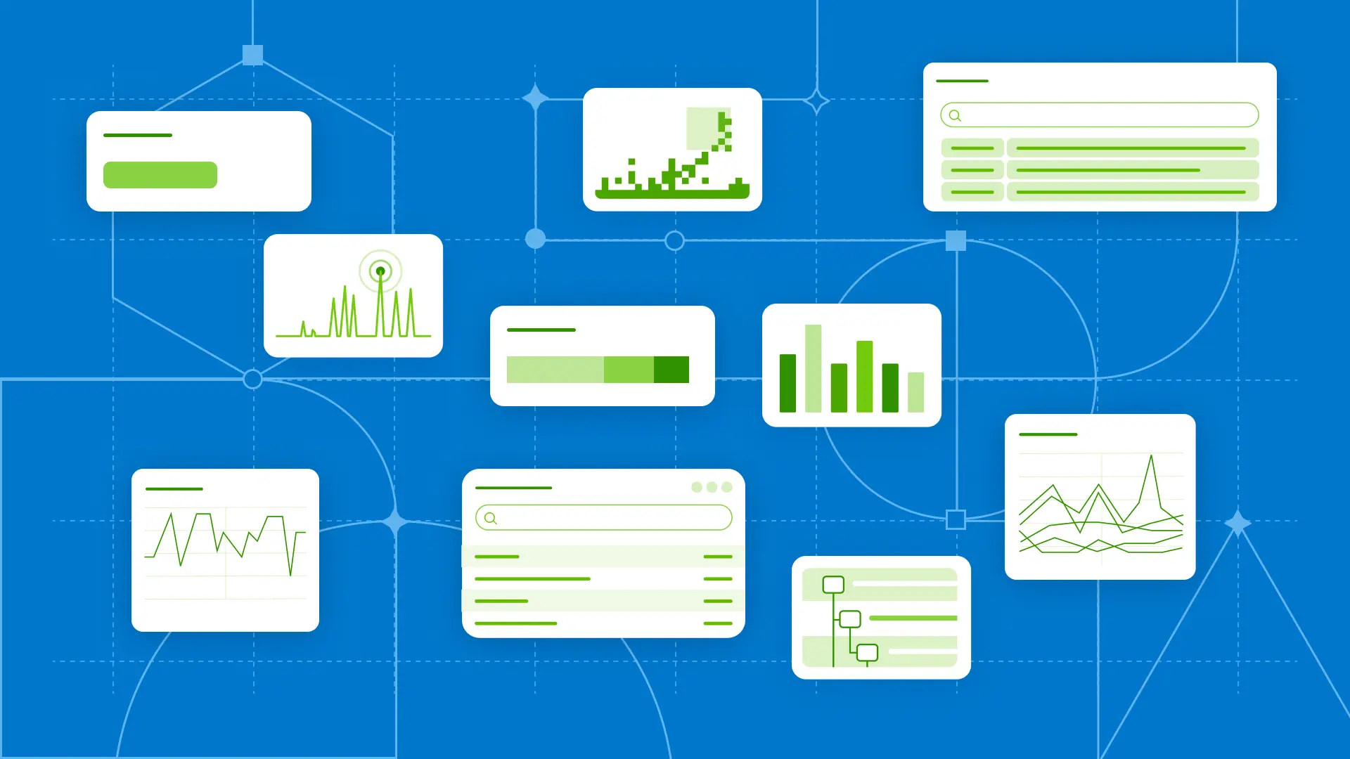
SaaS products that are built for engineers power critical workflows, yet their designs are often afterthoughts. SaaS products often assume that technical audiences will figure out their way through a complex experience, or just forgive them for the paper cuts on the way. A foundational design system can be perceived as a layer of polish rather than an infrastructure investment, especially in the early stages of a startup.
That’s where design systems come in; not as decoration, but as the framework that holds a product together as it evolves.
For those not familiar with the term design system, at its core, it is a collection of reusable building blocks such as buttons, colors, text styles, icons. These blocks are also commonly referred to as components, which make everything look and feel cohesive, like it belongs to the same product. Along with components, design systems provide structure to the product with pattern guidance and documentation for internal users.
A design system exists to keep experiences consistent, to help teams move faster, and to maintain quality as products scale. In short, it saves time, reduces confusion, and helps everyone contribute to the same product in the same language.Building a design system for an observability tool like Honeycomb poses dense, complex challenges. Generally speaking, we design solutions that can serve both expert users who spend their days immersed in our product, and newer users still mapping out their workflows. As such, design at Honeycomb isn’t simply about visual delight: it’s about using visual design to quickly surface complex problems. The color of a button isn’t simply about aesthetics; it’s about communicating a system state. The way a table is structured can help users instantly find an issue instead of drowning in a sea of rows.
A strong design system improves reliability, scalability, and developer velocity. These are the same qualities that are valued in backend infrastructure.
Why observability tools need design systems
Observability tools should make hidden complexity visible without overwhelming the user. The product surface can be densely loaded with data, interactions, and states, so inconsistencies within the design system can hinder a user's efficiency and cognitive load.
Every predictable pattern reduces cognitive friction. Every reusable component makes the product faster to use, and faster to build. That’s why design systems are beneficial for developers working in dense UIs: they give the ability to hide complexity and allow for progressive disclosure.
When designing new components for Honeycomb, we frequently have to think about heavy data density all while trying to keep the interface fast, clear, and adaptable. A functional design system prevents users from getting overwhelmed by standardizing reusable components, patterns, and consistent navigation behavior.
In its mature form, a design system should ensure that the interface it serves behaves as reliably as the systems it represents.
Laying the foundation
When building a design system for an observability tool, it’s important to consider the following and start with the foundation:
- Audit from real workflows. The wheel doesn’t have to be reinvented every time. Users are often navigating through the product with existing mental models and user expectations that are broadly used across other observability tools or other consumer products.
- Foster community, both literally and figuratively. At Honeycomb, we do this by encouraging designers and engineers to build in our community design system. Lattice community is a place to test and flesh out more experimental patterns, variants, or new components before migrating to our official Lattice design system.
- Partner with engineering early. One of the perks of designing for a tool that is made for engineers is that you get to collaborate on design decisions with engineers, and that insight is invaluable.
- Illustrate the story your data is trying to tell you with color. Semantic colors hold value. They allow users to easily scan and monitor their views, which is especially valuable in dense views like dashboards or tables. Semantic colors can help users visually locate an error badge without reading every row in a table.
- Design for accessibility, which in turn designs for general usability. One in four adults are disabled, whether permanent, temporary, or situational. Accessible design systems help ensure UIs can be effectively utilized by most users—but they also help the average user have a smoother experience with the help of behaviors like keyboard navigation and accessible semantic colors.

The image above depicts common semantic colors in Honeycomb’s design system. Success = green, warning = yellow, red = critical, and blue = informational.
Lessons learned
Clarity over delight: to reduce cognitive overload, prioritize usability and clarity.
Design for a living system and a product that feels alive: Observability tools like Honeycomb have a powerful capacity to pull data at great speed. The UI should feel like it. Design for every state possible, and don’t forget the importance of loading states. Users should visually understand how hard Honeycomb is working for them.
Lay the foundation of the foundation: The heart of Honeycomb often displays visually dense views such as tables. These sorts of views are first-class citizens, not edge cases. They are the product. There must be investment in smaller building blocks that build the system up, such as pagination, combo boxes, badges, etc. These small building blocks make up the ecosystem that is the product, and small interactions and patterns lead to an improved user experience.
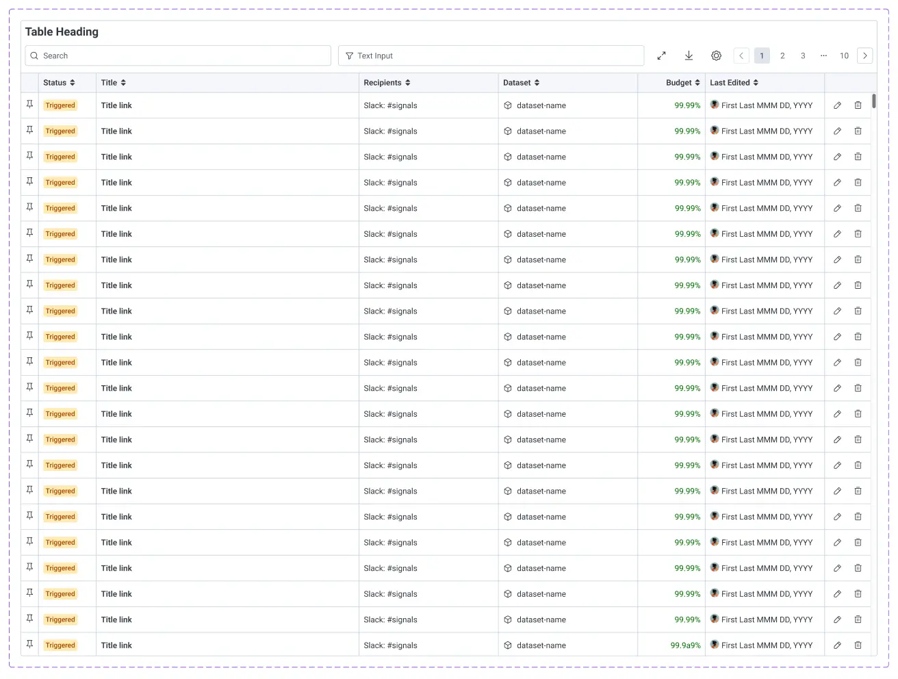
The object table component is one of Honeycomb’s most complex and visually dense components, built with many nested components (building blocks).
Conclusion
A design system is not just about visual polish: it’s part of the product’s core infrastructure. It should help relieve the visual complexity within the product and ensure that every new feature shares the same visual language.
As new features and workflows are introduced, the design system should evolve with those improvements. It should keep teams aligned, prevent drift, and accelerate faster shipping. We should think of design as infrastructure, and design to last. Let's make the design system as dependable as the backend it powers.
New to Honeycomb? Get your free account today.
Get access to distributed tracing, BubbleUp, triggers, and more.
Up to 20 million events per month included.