Designing Honeycomb for Our Users
By Sarrah Vesselov | Last modified on July 8, 2021You might have noticed some visual changes happening in Honeycomb lately. Colors, typography, icons, and some features have started to look a bit different. While these changes are just beginning to make their way into the product, we’ve been working on them for some time. Let's look at what has been going on behind the scenes to make them happen.
I joined in January 2020 Honeycomb to lead Design and, in the past year, we've grown to a team of six. Over that time, we've been hard at work establishing a design practice. Working alongside the Engineering and Product teams, we are taking Honeycomb's already user-centered approach and applying Design philosophy and process to it.
Optimizing the Honeycomb user experience
A cornerstone to growing any user experience design practice is establishing a design system. Design systems make R&D organizations more productive by reducing duplication and encouraging consistency. They help bridge the gap between design and engineering. Done right, they help us focus on sound design principles across the entire company and provide the whole organization time to focus on research and discovery instead of reinventing the wheel.
Strong design practice requires a solid foundation. That foundation is built on understanding who our users are and what problems they solve with our product. Just as you wouldn't pick out the paint and furniture for a house before you have the blueprints, you wouldn't start making visual changes to a product without understanding who you are building it for and what they want to accomplish.
Once we have a foundation, we can start working on the next step, design fundamentals. Bringing consistency and better user experience to a product means having the right toolkit in place. Colors, typography, icons, and many other essential design elements need to be available to everyone in an accessible way. Guidelines for their use and implementation are created and shared, empowering Engineering and Product to make informed decisions.
Those design elements are then used to build scalable, maintainable components within our codebase. In this way, each step builds on the next, extending our abilities, reach, and impact. The final step is what people often think of when they hear UX design: Interaction design and delighters—small surprises that bring surprise and delight—can make something seem effortless and hardly designed at all.
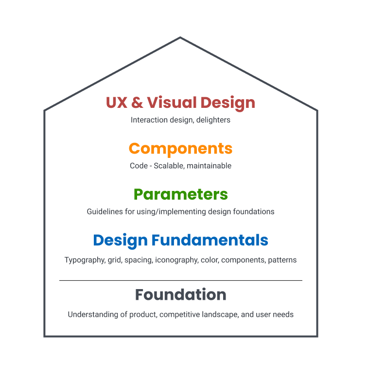
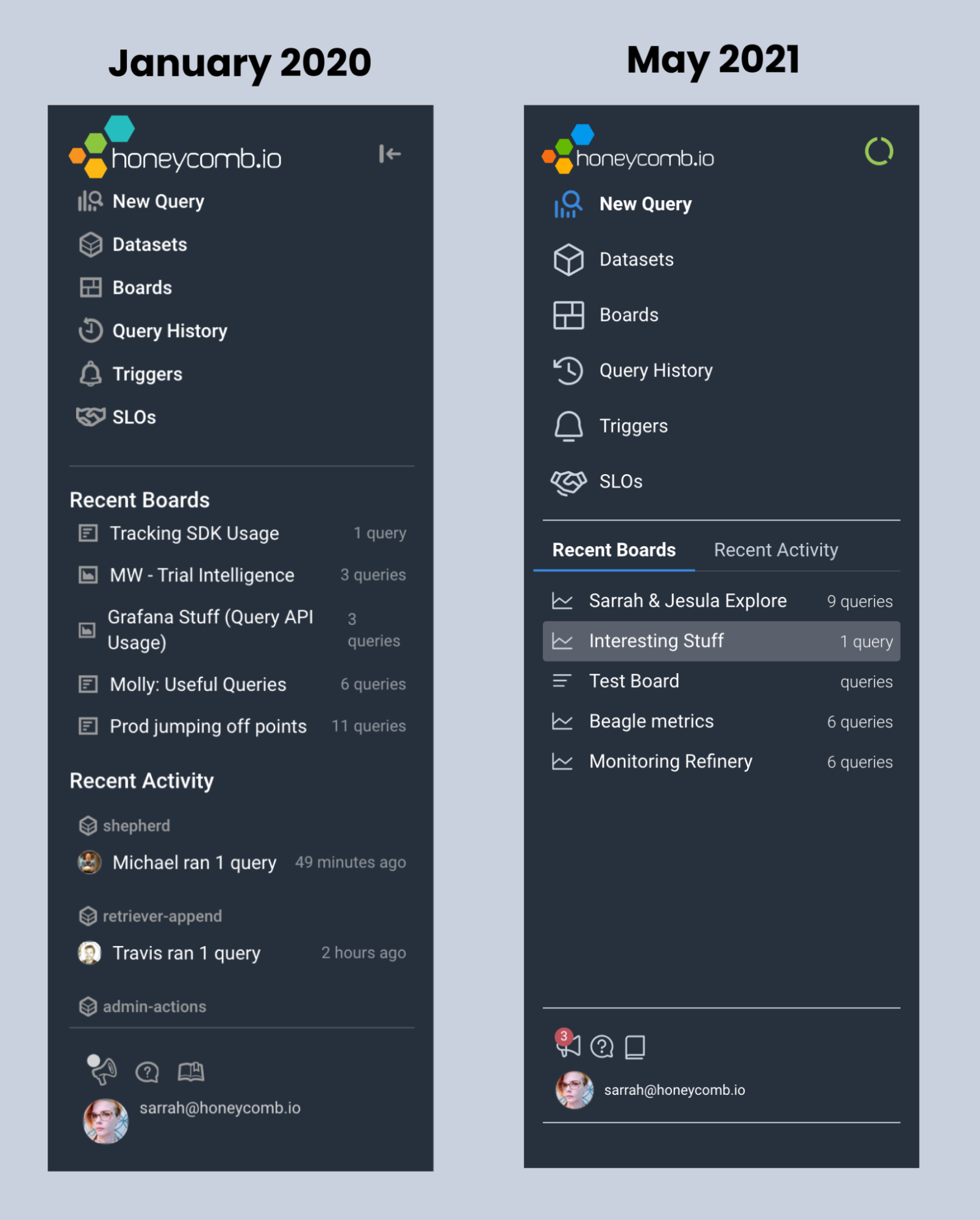
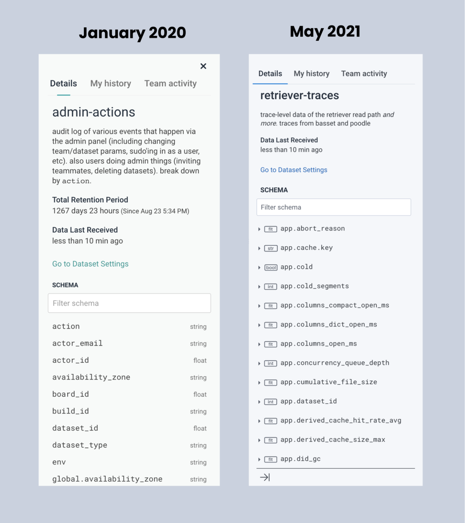
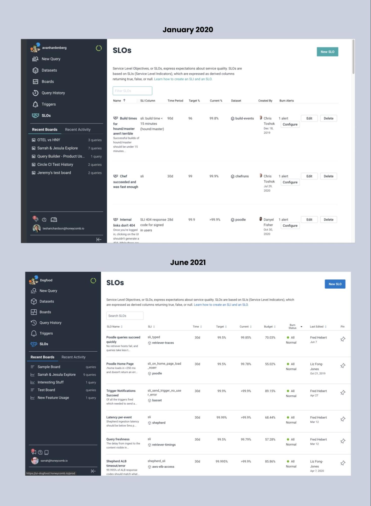
We began building our design system, Lattice, in late 2020. In the past few months, we worked to lay the foundations of typography, spacing, and iconography. Making changes to typography (font, size, weight, and line spacing) improves readability, reducing the cognitive processing load. Additional spacing in the right places makes scanning and locating critical information faster and easier. Enhancing colors and keyboard navigation for better accessibility enables a better user experience for everyone. Entire screens and flows will come together and be more consistent. It can feel slow at first, but soon the impact of this work will be felt across everything we do, externally and internally.
You can see some of these right now inside of Honeycomb. We’ve gathered some before-and-after screenshots below to highlight the difference changing just these basics can make.
So, what comes next? We've already started conducting user research on our current information architecture, focusing on how users navigate and flow from one screen to the next. We’re also focusing on making exploration in Honeycomb effortless and intuitive, with fewer clicks from one point to the next. Stay tuned for more changes, and we'd love to hear your feedback!
Related Posts
Introducing Relational Fields
Expanded fields allow you to more easily find interesting traces and learn about the spans within them, saving time for debugging and enabling more curiosity...
Safer Client-Side Instrumentation with Honeycomb's Ingest-Only API Keys
We're delighted to introduce our new Ingest API Keys, a significant step toward enabling all Honeycomb customers to manage their observability complexity simply, efficiently, and...
Now Available: Honeycomb Launches Data Residency in Europe
At Honeycomb, we are very concerned about privacy and data sovereignty—it’s something we take very seriously, and in an effort to serve our customers better,...