A Peek Behind Our UI Refresh
Sol walks through the reasoning behind a recent UI refresh: softer shadows and rounder corners, a new magma-inspired heatmap color ramp tuned for dark mode and accessibility, and small polish that makes a dense product feel calmer.

By: Sol Escalada
Design as Infrastructure
For those not familiar with the term design system, at its core, it is a collection of reusable building blocks such as buttons, colors, text styles, icons. These blocks are also commonly referred to as components, which make everything look and feel cohesive, like it belongs to the same product.
Read Now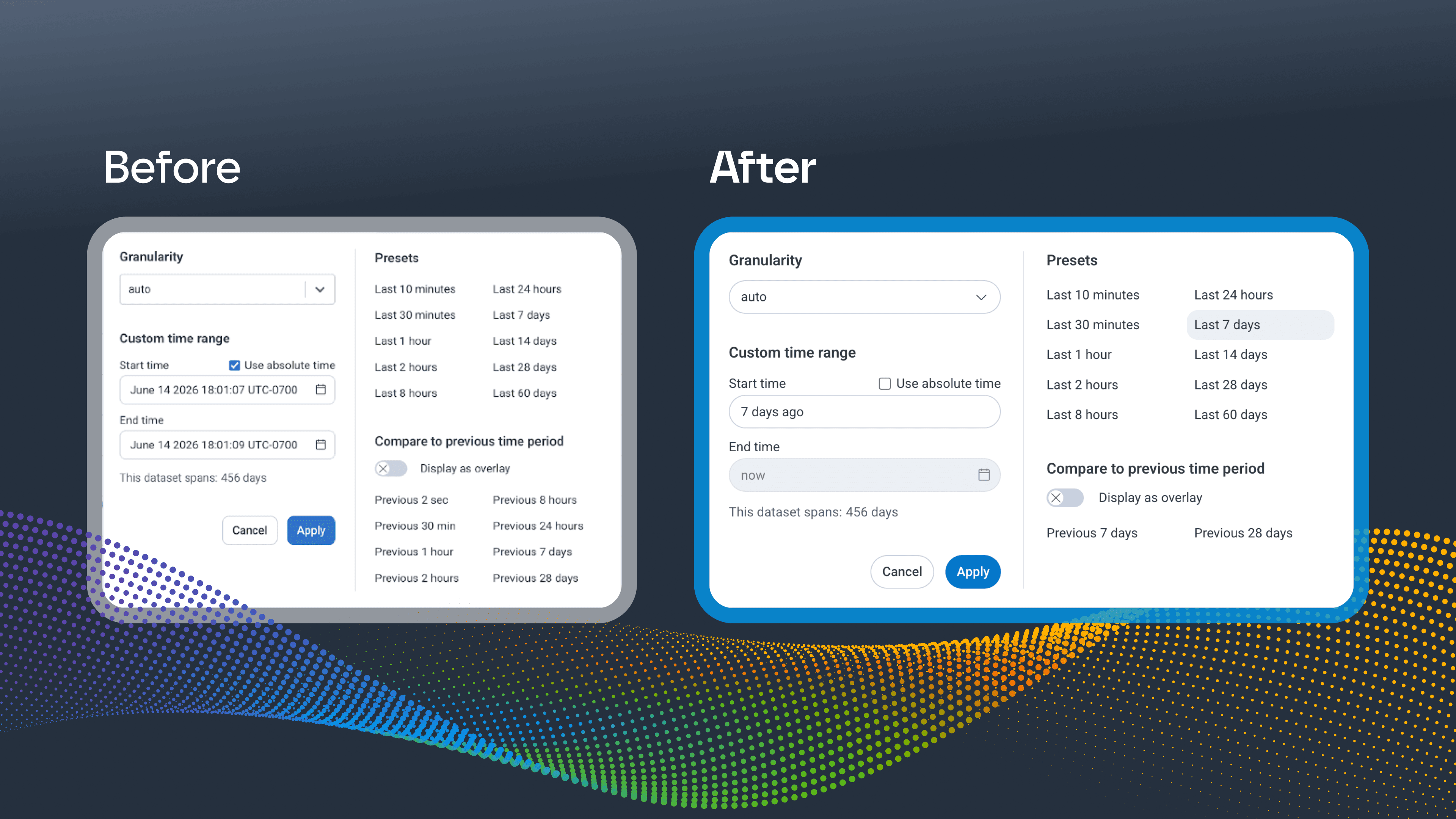
Products don't become harder to use all at once. There's usually a slow drift where as more features get added, it becomes more complex. In our own product, we (the design enablement team) found ourselves trying to slow down that drift.
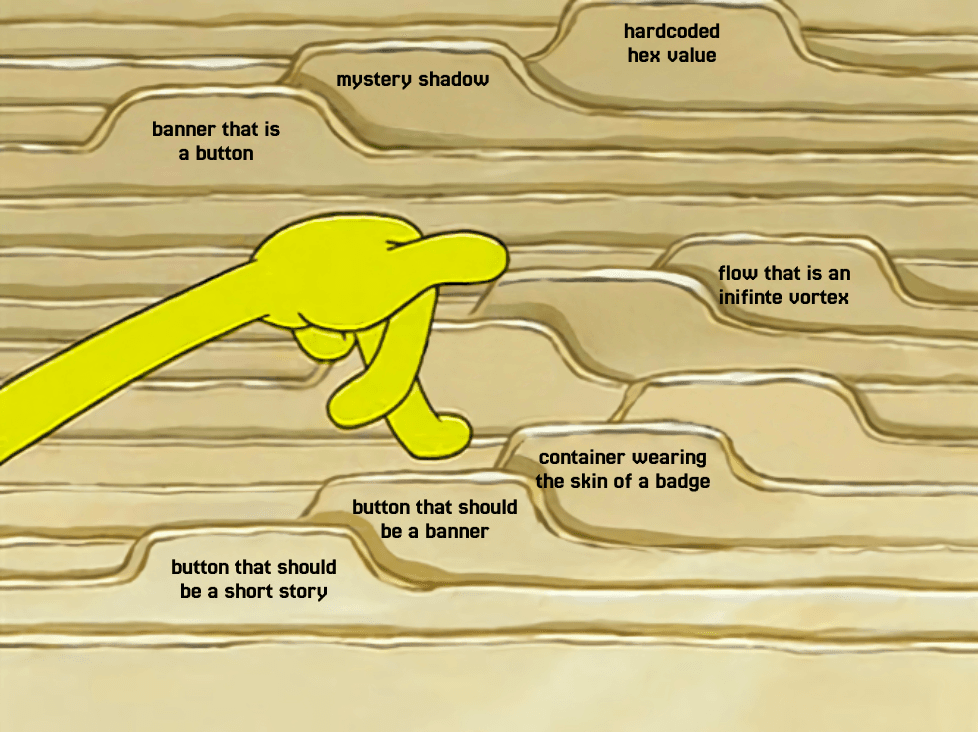
Throughout our UI, we would see a component added for one workflow, a color picked to solve for one chart, a shadow hardcoded because a design system token didn't exist yet. Each of these decisions may have been reasonable on their own, but stacked up over several years, they contributed to an interface that felt clunky.
We knew that Honeycomb's UI is where most of our users start, orient, and discover what the product can do for them, which includes our AI-assisted capabilities. We had also been hearing the same thing from customers for years: our visual design didn't match how powerful the product underneath is.
To remedy that, we implemented some UI updates, which you can now see live. Let's review some of the visual changes we made.
Softer edges and shadows
Shadows
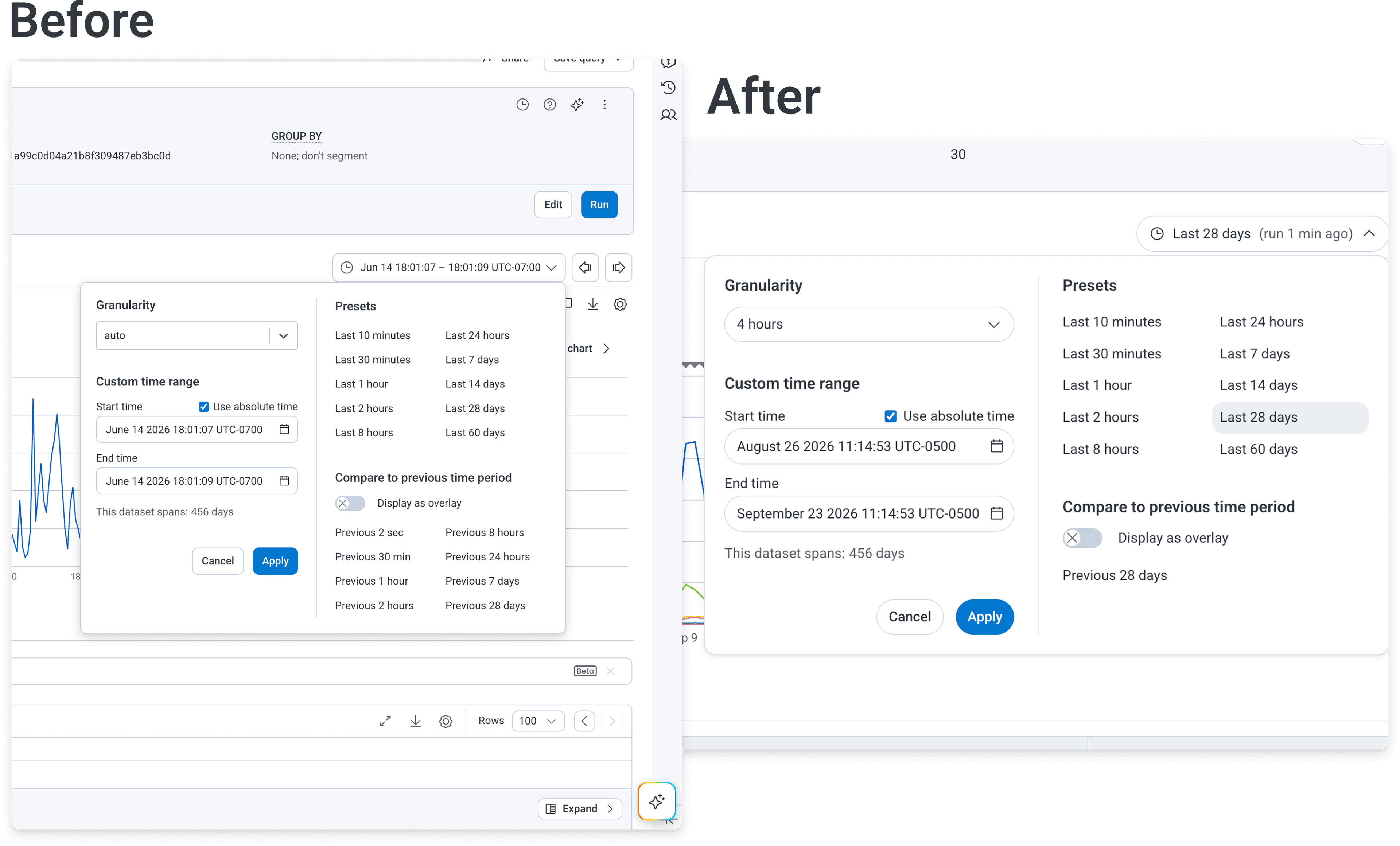
We updated and refined our shadow tokens and styles in Lattice, our design system. Shadows in a dense product are a way to communicate hierarchy. A popover, a dragged card, a modal: each needs to read as a distinct layer without adding excessive visual weight to a screen that's already carrying a lot of data.
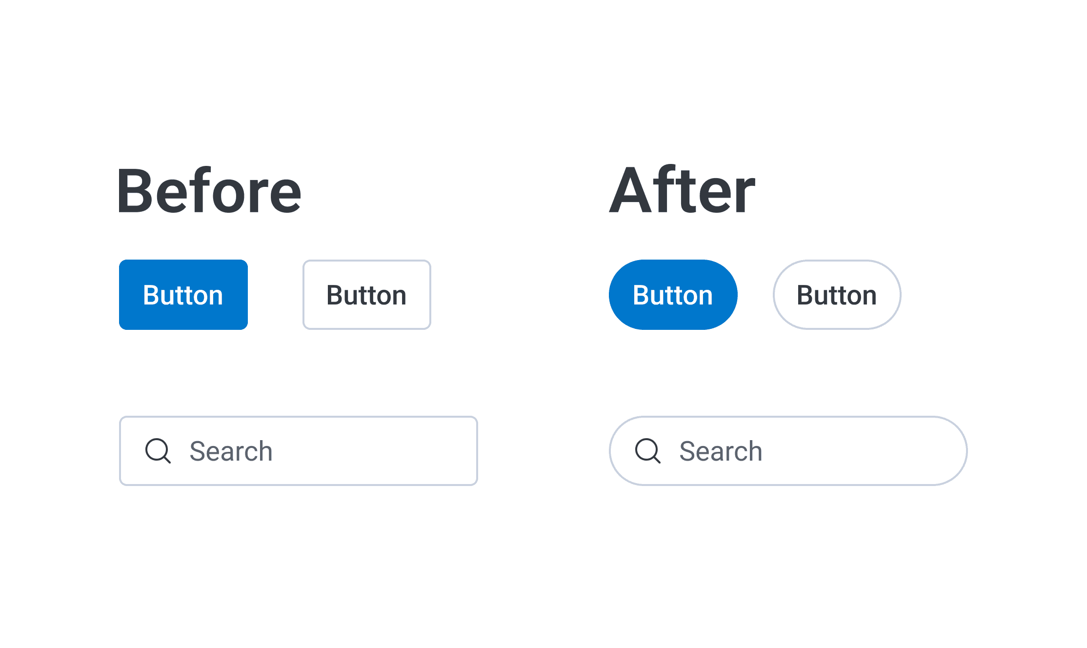
Rounder inputs and buttons
Rounder corners read as softer and less severe. The softness isn't the point on its own, though; it's that a calmer container lets the data inside it carry the visual weight.
Motion tokens
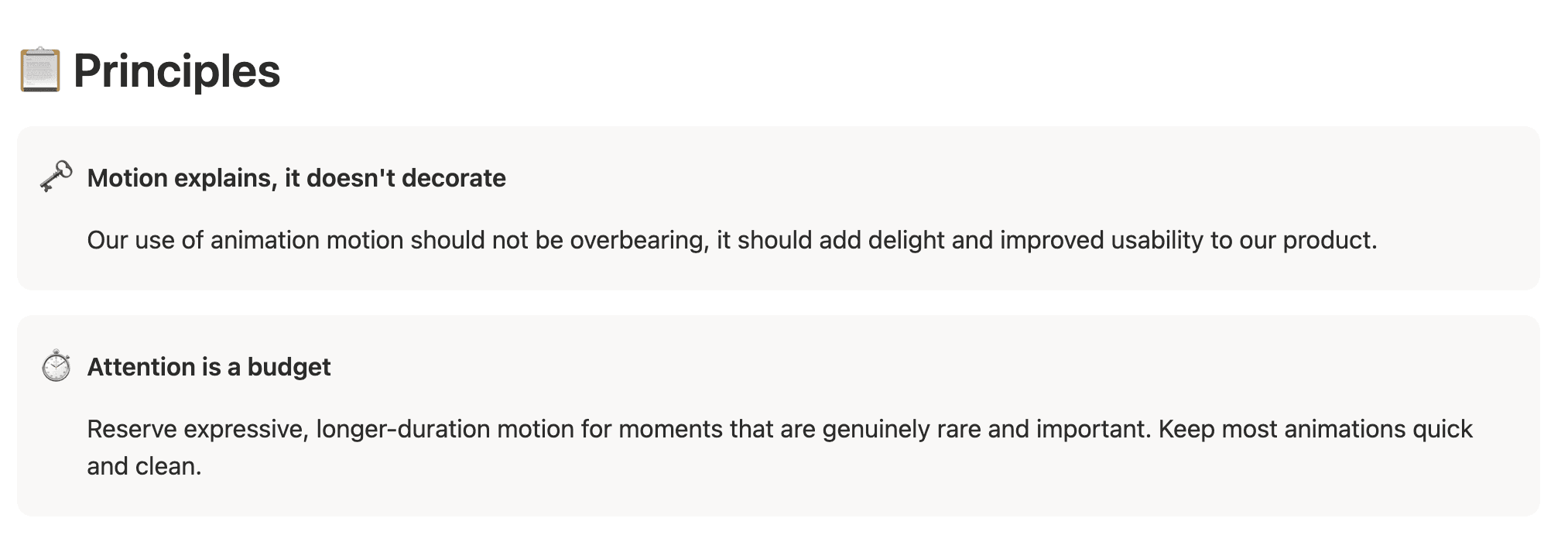
We added new motion tokens and guidance covering duration and easing. Consistent motion helps prevent distractions: when a panel always opens the same way at the same speed, users stop spending attention on it. And going back to something I wrote about in Design as Infrastructure, Honeycomb pulls data at great speed and the UI should reinforce that. Motion is an important part of how to communicate that the system is working.
The cracks showed
Updating the styles in our design system revealed every place our UI wasn't using them. As soon as we rolled out new shadows and rounder corners, all of the visual papercuts lit up.
These obvious visual changes made our refresh double as an audit. With every visual inconsistency, we were able to chase down the direct path to where we weren't using our Lattice components and tokens, which gave us the opening to run larger migrations and patch a good chunk of the design debt we'd accumulated over the years.
Updated heatmap colors
Heatmaps are one of the most information-dense surfaces we have, which makes them a good place to see the reasoning at work.
Three things drove this change:
First, we'd received several bits of feedback that our heatmap colors were too similar to each other and there was not enough visual difference between adjacent values, which diminished the purpose of a heatmap.
Second, the old colors were outdated and didn't use our brand palette.
Third, we had just enabled dark mode, which meant auditing every data visualization needed to work well in both light and dark.
We tested three color ramps before finalizing. The one we chose is a magma-inspired ramp, loosely based off of the magma and inferno color ramps, altered to use our brand colors.
We explored Viridis options too, but magma won on two counts: it was the most favored internally, and it also worked the best with colorblind filters.
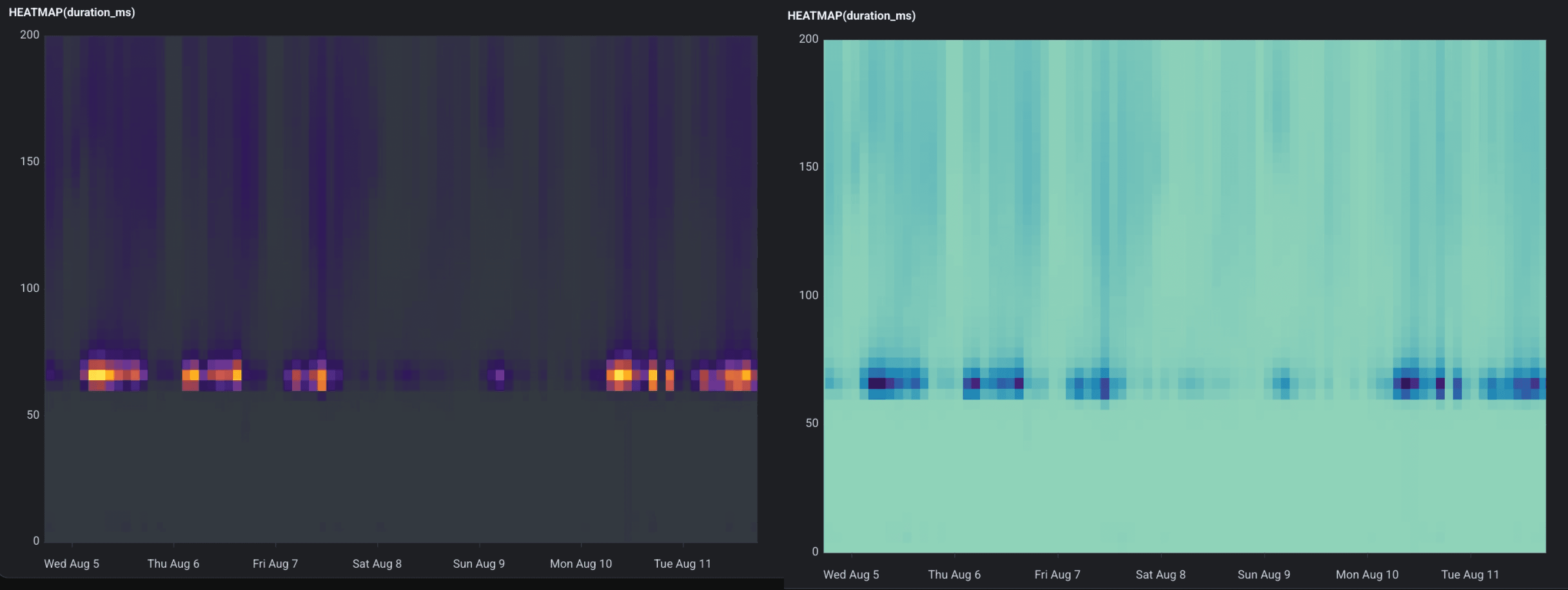
Our new colors next to the old colors for comparison. The previous individual steps are much harder to tell apart.
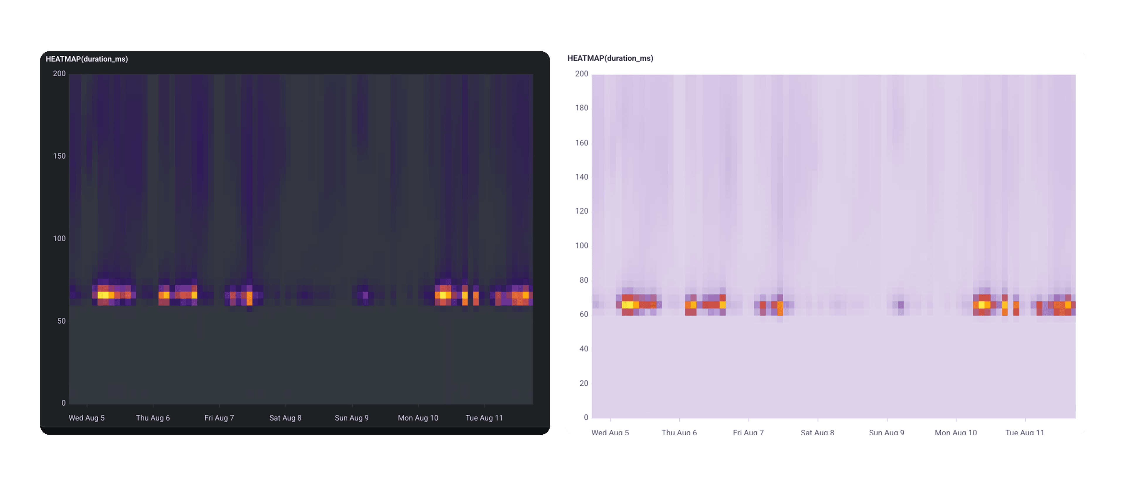
The new heatmap ramp, in both dark and light mode.
Low-count buckets and outliers are now visible instead of fading into the background, so you catch rare, interesting events.
The reception was largely positive:
“These new heatmaps look so cool.”
“Love to see something other than blue!”
“HOT DAMN these look good!!”
“I can no longer look at our old heatmap. I need this in my life now.”
We also heard constructive feedback:
“From a usability perspective…using yellow for the highest values feels counterintuitive and reduces the visual clarity of the data.”
I understand the thought here, and it's worth explaining since there are two reasons why we chose yellow to sit at the top of the ramp.
First, the yellow value has the most contrast in dark mode.
Second, think about a flame and how its center, the hottest part, is yellow. It's often how magma and inferno ramps in data visualization are designed.
This is the part of a refresh that doesn't get much coverage: you make a change, you listen to both the “hot damn” and the “this is harder to read,” and you keep tightening the places where the contrast isn't doing its job.
Canvas is easier to reach
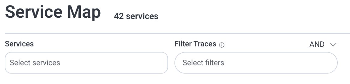
Canvas moved up in the sidebar, next to Query and Boards. Starting an investigation is now one glance away instead of a scroll down the sidebar.
The unglamorous polish
We added new tokens specifically to enable a more compact and visually organized structure. We added sizing tokens and revisited layout and spacing more broadly, which will serve us in the near future.
We also addressed papercut improvements in existing components and flows.
More to come
For now, if you're in Honeycomb and things feel a little calmer without you being able to say exactly why, that's the goal. Most of what makes a dense product feel lighter are the continuous, small improvements that aren't noticeable day-to-day.