On the Brittleness of Dashboards
Dashboards are one of the most basic and popular tools software engineers use to operate their systems. In this post, I’ll make the argument that their use is unfortunately too widespread, and that the…

By: Fred Hebert
Dashboards are one of the most basic and popular tools software engineers use to operate their systems. In this post, I’ll make the argument that their use is unfortunately too widespread, and that the reflex we have to use and rely on them tends to drown out better, more adapted approaches, particularly in the context of incidents.
Why dashboards work
Everything we do as Operators, DevOps, or Site Reliability Engineers (SREs) comes from a mental model. The mental model is our understanding of all the parts of the socio-technical system and how they interact—what code is running, where and how it runs, who touches it, how it gets changed, how customers and users interact with it, the data it emits, and so on.
These mental models vary from people to people because nobody has the same experience and because all models—mental or not—are wrong, but contextually useful. They are what lets us look into a tiny, narrow window into our systems, such as a set of limited metrics, and infer all sorts of hypotheses about the inner state of the system.
Over time, we can build the experience that lets us tie our mental models to the charts in a dashboard. We get a feel for the steady state—what is normal—and the sort of events and disruptions happening at various internal components that can result in expected fluctuations in the metrics.
It becomes a sort of high-speed, flexible, all-encompassing pattern recognition where you can glance at the dashboard and guess what’s right or wrong. And being in that position, with this ability, gives a powerful feeling of expertise.
Why dashboards are brittle
Dashboards rely on a strong sense of normalcy; when used alone, each disruption to a metric’s change must be correlated to some cause that may be hard to find.
Changing reflexes takes time and effort. As such, if your system is changing all the time and the steady-state of all the metrics is not that steady, the ability to pattern match on fluctuations to know what is meaningful or not gets lost. In effect, to maintain that strong feeling of expertise, your understanding of the system needs to grow and adjust continuously. Your mental model must be updated.
This is particularly nefarious whenever you make a change to your system that changes what “normal” stands for. This pattern recognition we grow is a heuristic, and the heuristic is only good in certain contexts. When system changes require updating that sense of normalcy, we’re left to operate the system at production speed without the mental tools to do it quite as effectively anymore.
In effect, you end up having to trade off being change-averse to protect your ability to sense the dashboard, or losing operational comfort in order to keep being able to adapt the system to a fast-changing world.
How incidents unfold
Outages are high-pressure, high-stakes situations, and when they happen:
- You can’t carefully analyze everything because there’s an emergency and lots of noise. When everything goes bad, the shock wave tends to hit most metrics in some way and you end up with heavy correlation with low causal clues.
- You can’t thoroughly complete all actions because time pressure is high.
- You are possibly responding out of context, tired, with other things on your mind, without a clear picture.
In short, you tend to have even less attention available during an incident than outside of it. Good incident response requires working with tools and patterns where you need to think less than when you’re at rest.
I’m emphasizing these sentences because they are critical. This sounds like an argument in favor of dashboards: fast pattern matching of signals generating fast explanations. We tend to use more dashboards because they’re tools that worked well when we had fewer, and we expect them to keep working tomorrow. As you add more data to each dashboard and grow the number of dashboards though, you’ll reach a point where they are no longer significantly useful during an incident because there is so much information going on that you can’t look at it all. In fact, you’ll find out that your operators only use a small subset of them and willingly ignore many of the metrics on them.
And this is a truth about incidents: there are always more signals than there is attention available. You can’t fix limited attention with more dashboards or more data; you generally help it with fewer and with better information organization.
Dashboards are a good way to expose information, but they’re not a good way to expose a lot of it. During an incident, the job includes communication, exploration, trying and running various commands, managing interrupts, looking over documentation, trying to make sense of events, and so on. Dashboards can’t demand your full attention because they won’t have it. You must keep them absolutely minimal and relevant. Accurate interpretation of crowded dashboards just isn’t compatible with high-pressure and high-stakes situations.
Where dashboards are adequate
I like to compare the dashboards to the big display in a hospital room: body temperature, pulse rate, blood pressure, respiration rate, etc. Those can tell you when something looks wrong, but the context contained in the patient chart (and the patient themselves, generally in bed and at rest) is what allows interpretation to be effective. If all we have is the display but none of the rest—the patient could be anyone, anywhere in the world—then we’re never getting an accurate picture. The risk with the dashboard is having the metrics but not seeing or knowing about the rest changing.
I also like the comparison because these vitals are high-level signals that can let you know when something might be wrong, but they also are not a diagnostic on their own: they require to be interpreted in context. As far as I understand, none of these are sufficient for diagnostics; they’re rather used as a way to manage your attention at a very high level and as one of many sources of information.
Similarly, the dashboards we use for software systems should be high-level general concepts that mediate stimuli. They shouldn’t primarily be used for figuring out why something is wrong; instead, they should help us focus on whether something might be wrong.
Once again, the issue is that during an incident, there is too much data to sift through and too little attention available. We don’t know what will be going on. The context is too rich to be compressed into a few numbers. We likely won’t have the time to carefully look over each value and ponder it individually to figure out whether it’s important or not. Our dashboards should be optimized to know what’s worth focusing on at a glance, not some sort of browser-based, tea-leaves reading session.
Framing on-call interruptions
One of the things I’ve tried to do here as an SRE has been to try and frame our on-call interruptions as their own user experience. The user flow starts with the alert, whether it’s received via a PagerDuty notification or a Slack message. I assume the operator is not looking at anything (they are possibly just waking up and in a bad mood) and currently doesn’t know what the situation is, but has a certain understanding of the system.
The alert itself should carry the base indications of what’s needed, either in its description or in links within the description:
- A quick description of the service(s) and the functionality the alert is about, in a sentence or two at most
- The consequences of the alert situation extending in time, if anything other than unhappy users
- The plausible or common failure modes and ways to quickly validate them (are you in a routine or abnormal situation?)
- Ways to interact with that subsystem (common commands, links, and so on)
- Background content that the responder may have wanted to read ahead of time because you never know what may be helpful or forgotten (design documents, past incidents, etc.)
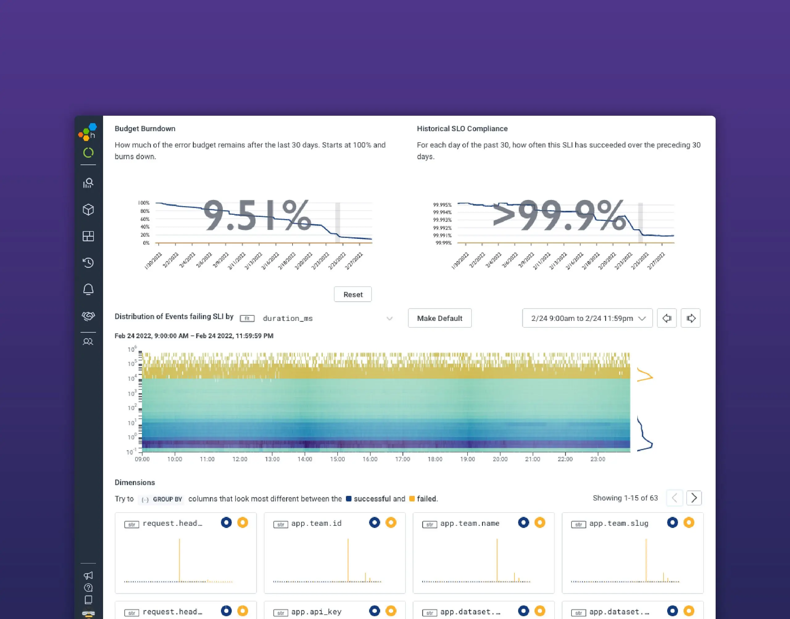
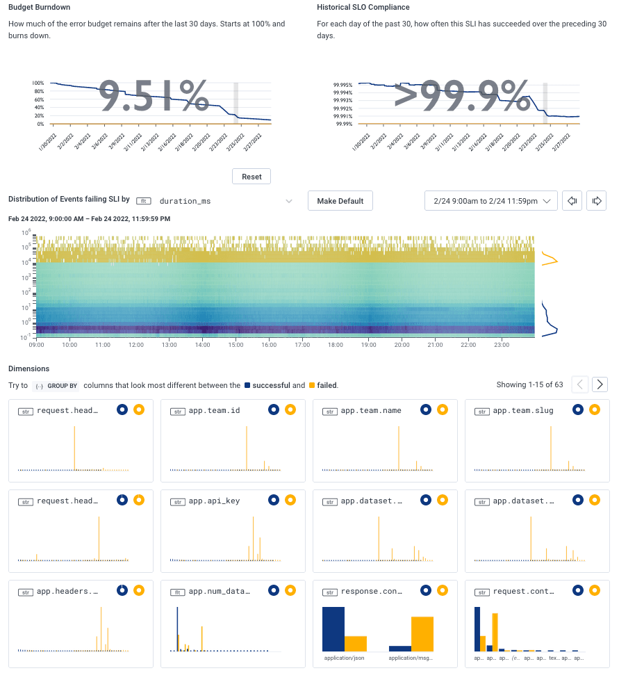
Under that workflow, we need few dashboards. Particularly in the case of service-level objectives (SLOs), Honeycomb instantly shows what may or may not be an outlier through the BubbleUp view. These can help hypothesis formation. In most cases, there’s a quick transition to an investigative mode that is very interactive, based on queries and richer data right away.
Trigger-based alerts are a case-by-case situation. Some may ask us to reach for a command line and poke at things directly, many will just redirect to a specific query, and a few will indeed redirect to a dashboard.
The alerts we have that do lead to dashboards try to keep them at a very high level, usually some informal variation of theUSE method. They should not take more than a few seconds to comprehend or have much in terms of subtle details that must be extensively pondered (Kafka is our biggest exception to this). They’re going to quickly orient the next line of investigation and that’s it.
Few dashboards in the traditional sense are required, and we rarely depend on pre-defined information displays. In general, the assumption is an alert that is based on high-level service indicators lets you bypass most of the requirements for a dashboard in the first place—we can skip most of the scan-and-match phase and direct the on-call engineer towards whatever gives them the most relevant context.
And the dashboard isn’t context, it’s the vitals. The context is richer than what the numbers directly carry and often lives outside of the observability tooling we have in place as well.
If you have more questions about dashboards or would like to share how you use them at your organization, we’d love to hear from you! Join us in our Slack community Pollinators channel or send us a tweet.
Want to know more?
Talk to our team to arrange a custom demo or for help finding the right plan.