To have Observability is to have the ability to understand your system’s internal state based on signals and externally-visible output. Honeycomb’s approach to Observability is to strive toward this: every feature of the product attempts to move closer to a unified vision of figuring out what your system did, and how it got there. Our approach is to let people smoothly move between aggregated views of their data, like heat-maps and line charts, into views that emphasize collections of events, like traces and BubbleUp, into views that emphasize single events, like raw data.
In the broader marketplace, though, Observability is often promoted as “three pillars” — separating logging, monitoring, and tracing (aka logs, metrics & traces) as three distinct capabilities. We believe that separating these capabilities misses out on the true power of solving a problem with rich observability.
The metaphor I like is to think of each feature as a lens on your data. Like a lens, they remove some wavelengths of information in exchange for emphasizing others. To debug in hi-res, you need to be able to see all the vivid colors.
Let’s say, for example, that you’re tracking a service that seems to be acting up. An alert has gone off, saying that some users are having a poor experience. Monitoring tools that track metrics—the first pillar– will interpret data as a time series of numbers and gauges — and that’s really important, because it’s useful to know such things as how long a process takes to launch or how long a web page takes to load. Using a metrics monitoring tool (e.g. Prometheus) will help generate that alert. If the monitoring tool supports high cardinality — the ability to track hundreds or thousands of different values — you can even find out which endpoints those users are encountering and, perhaps, some information about which users.
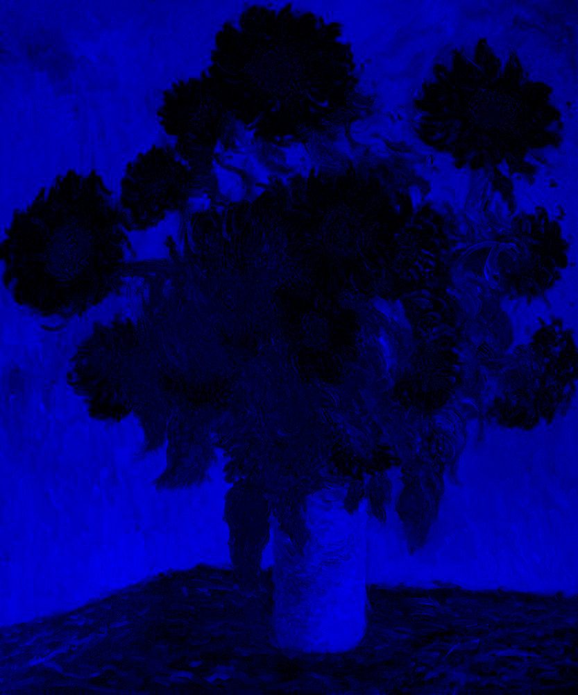
You could think of that as a magnifying glass with a blue lens on your data. It comes out looking something like this:
The second pillar is traces or tracing, which looks at individual calls and dives into how they are processed. From inside a tracing tool (e.g. Jaeger), you can do wonderful things — you can see which component took the longest or shortest, and you can see whether specific functions resulted in errors. In this case, for example, we might be able to use the information we found from the metrics to try to find a trace that hits the same endpoint. That trace might help us identify that the slow part of the trace was the call to the database, which is now taking much more time than before.
(Of course, the process of getting from the metrics monitoring tool to the tracing tool is bumpy: the two types of tools collect different data. You need to find out how to correlate information in the metrics tool and the tracing tool. The process can be time-consuming and doesn’t always give you the accuracy you need. The fields might be called different things, and might use different encodings. Indeed, the key data might not be available in the two systems.)
In our lens analogy, that’s a red lens. From this lens, the picture looks pretty different — but there’s enough in common that we can tell we’re looking at the same image. There are some parts that stand out and are much more visible; other aspects of detail entirely disappear.

But why did the database calls get slow? To continue debugging, you can look through logs, which is the third pillar. Maybe scrolling around in the logs, you might find some warnings issued by the database to show that it was overloaded at the time, or logs showing that the event queue had gotten long. That helps figure out what had happened to the database — but it’s a limited view. If we want to know how often this problem had arisen, we’d need to go back to the metrics to learn the history of the database queue.
Like before, the process of switching tools, from tracing to logging, requires a new set of searches, a new set of interactions and of course more time.
We could think of that as a green lens.

When companies sell the “three pillars of observability”, they lump all these visualizations together, but as separate capabilities:
That’s not a bad start. Some things are completely invisible in one view, but easy to see in others, so placing them side by side can help alleviate those gaps. Each image brings different aspects more clearly into view: the blue image shows the outline of the flowers best; the red shows the detail in the florets; and the green seems to get the shading and depth best.
But these three separate lenses have limitations. True observability is not just the ability to see each piece at a time; it’s also the ability to understand the whole and to see how the pieces combine to tell you the state of the underlying system.
The truth is, of course, there aren’t three different systems interacting: there is one underlying system in all its richness. If we separate out these dimensions — if we collect metrics monitoring separately from log and traces — then we lose the fact that this data reflects the single underlying system.
We need to collect and preserve that richness and dimensionality. We need to move through the data smoothly, precisely, and efficiently. We need to be able to discover where a trace has a phenomenon that may be occurring over and over in other traces, and to find out where and how often. We need to break down a monitoring chart into its underlying components to understand which factors really cause a spike.
One way to implement this is to maintain a single set of telemetry collection and storage that keeps rich enough data that we can view it as metrics monitoring, tracing, or logging — or in some other perspective.
Honeycomb’s event store acts a single source of truth for everything that has happened in your system. Monitoring, tracing, logging are simply different views of system events being stored — and it’s easy to switch quickly and easily between different views. Tracing isn’t a separate experience of the event store: it’s a different lens that brings certain aspects into sharper focus. Any point on a heat-map or a metric line-chart connects to a trace and any span on a trace can be turned into a query result.
This single event store also enables Honeycomb to provide unique features such as BubbleUp. This is the ability to visually show a slice across the data — in other words how two sets of events differ from each other, across all their various dimensions (fields). That’s the sort of question that metrics systems simply cannot show (because they don’t store the individual events), and let’s face it that would be exhausting in a dedicated log system.
—
What do you do when you have separate pieces of the complete picture? You need to manually connect the parts and make the connections, looking for correlates. In our lens analogy, that might be like seeing that an area shows as light colored in both the green and the red lens, so it must be yellow.
You COULD do that math yourself. Flip back and forth. Stare at where bits contrast.
Or, you could use a tool where seeing the image isn’t a matter of skill or experience of combining those pieces in your head: it’s all laid out, so you can see it as one complete beautiful picture.

Claude Monet,
“Bouquet of Sunflowers,” 1881