Improving Our Typography to Optimize the Honeycomb User Experience
This is the second post in our series about Lattice, Honeycomb’s new design system and how we’re applying a user-centric design philosophy to our product. Lattice begin! At Honeycomb, we understand that our users…

By: Jeremy Ford
This is the second post in our series about Lattice, Honeycomb’s new design system and how we’re applying a user-centric design philosophy to our product.
Lattice begin!
At Honeycomb, we understand that our users are often under a great deal of pressure when troubleshooting complicated issues in their applications. Therefore, our team’s mission is to ensure that our product continually serves as a supportive, intuitive, and effortless debugging tool—an experience that fades into the background and allows engineers to focus on the task at hand.
The human brain interprets tools as an extension of the body (thanks to James Rosen-Birch and Honeycomb’s own Ian Smith for surfacing this amazing study), and we strive for Honeycomb to feel this way for our users.
“The most profound technologies are those that disappear. They weave themselves into the fabric of everyday life until they are indistinguishable from it.” Mark Weiser
At the end of 2020, Honeycomb’s Design Team began working on Lattice, our new design system. Before beginning work, the team discussed goals for the first iteration that would be our north stars as we navigated through the next few months. Our primary goal was to improve our overall user experience (UX), with a heavy emphasis on accessibility. Accessibility (or a11y, for short) has been getting a lot of attention in the design and tech spaces lately—and for good reason.
According to the U.S. Centers for Disease Control and Prevention (CDC), 10.8% of people with a disability have a cognition disability with serious difficulty concentrating, remembering or making decisions, and 4.6% of people with a disability have a vision disability with blindness or serious difficulty seeing even when wearing glasses. What’s more, the American Disabilities Act (ADA) allows federal, state, and local governments to issuehefty fines to companies for non-compliance with accessibility regulations.
Over the last several months, we came across some wonderful a11y resources: The Braille Institute recently introduced Atkinson Hyperlegible, a free font that offers a higher degree of distinction between commonly misinterpreted characters like “1” and “I” or “0” and “O.” At Honeycomb, we use Figma as our main design tool, and also use Able and Stark, Figma plugins that allow designers to test visual contrast directly in their design files. Stark recently launched an impressive library of a11y resources. Our organization is inspired by these assets and wants to do our part to improve the Internet for everyone.
Alongside color, spacing, and iconography, we determined that typography was a key foundational element that would help support the rest of the system and contribute towards the enhanced UX we committed to.
Establishing a baseline
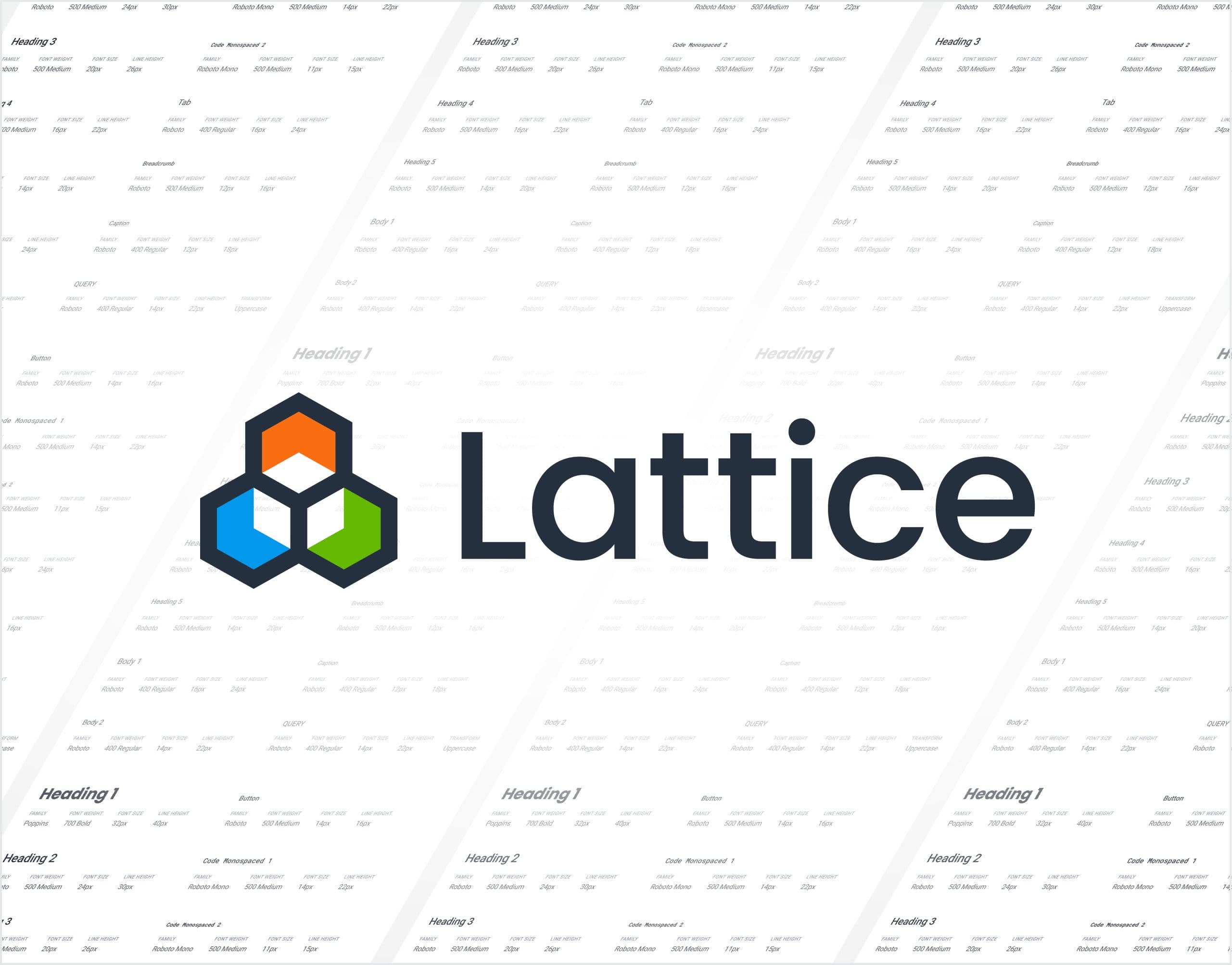
Prior to adding or removing type styles, we first needed to assess the current state of typography in Honeycomb to see what areas might distract or introduce cognitive load. We conducted an audit by capturing every unique font family, size, and weight across the product and Storybook, which didn’t quite match at this phase. (Storybook is an open-source tool that design and engineering teams can use as a repository for all of their coded design system components). We searched for unused, duplicative, or inaccessible styles that could later be removed, consolidated, or improved. This audit proved to be very fruitful, as it yielded 31 font styles and helped us establish a baseline for the next phase of the project.
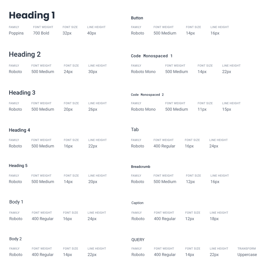
The next step was to determine how many font families, sizes, and weights we would need moving forward. Our ultimate vision was a much leaner system that would include only what was absolutely essential for engineers’ and designers’ workflows. This would result in a limited set of styles that would be simpler to use and maintain. We mocked screens from each feature using the ideal typographical hierarchy and determined that a quinary heading (H5) was the deepest level we needed in our system.
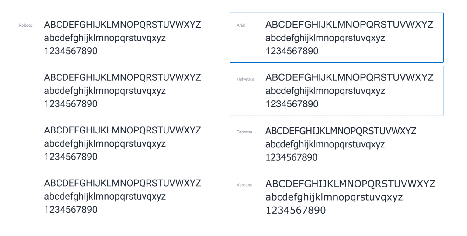
We also determined that Lattice’s type system only required two font families (we previously had three), both of which are Google Fonts:Roboto andPoppins. For users who have difficulty loading web fonts, we instrumented Arial and Helvetica as fallbacks that will render in their place. Roboto has been a part of Honeycomb since day one and continues to serve our product well—its tall x-height and subtly-condensed geometric structure strike a balance of functional and approachable, making it highly scannable.
On the heels of a sweet brand refresh from our Marketing Team, which utilized Poppins for display text, we found the perfect opportunity to unify our marketing and product visual systems by including Poppins in our product. Due to its wider footprint, which yields fewer characters per line than Roboto, we decided to treat Poppins as a display font and use it only for primary headings (H1s) as well.
During our audit, we noted that several of our product’s features didn’t have H1s. Not only did this make pages more difficult for users to consume, but it also meant screen readers weren’t able to accurately interpret the hierarchy of information—a major a11y problem.
To address this, we added H1s to every page except “New Query,” where we opted to keep the Query Builder at the top instead of introducing an H1 that would push it lower. The Query Builder is the focal point of our software and it’s vital for users to be able to iterate on their queries’ clauses as quickly as possible. We also increased the line height for nearly every type style, which drastically improved overall readability.
Guidelines for our design system
No design system is complete without guidelines to provide context for its components. Imagine a brand new, unassembled piece of IKEA furniture with no instructions—sure, you could probably figure out how to put it together, but it’s a hell of a lot faster to follow the diagram. These complementary instructions instill confidence in the consumer, expedite the build process, and reduce the need to contact the store.
Design system guidelines are no different. When written well, they should inform the designer or engineer how and when to use components, and reduce the amount of back and forth needed between the two roles. This is especially important for distributed teams like Honeycomb, where asynchronous work is commonplace.
Rather than wait for questions to be asked or answered, effective guidelines can do the talking and reduce dependencies on others. The better the system’s documentation, the more efficient and enjoyable the process will be, and the faster designs can be iterated on and implemented. Some examples of guidelines we included in Lattice are:
Written content
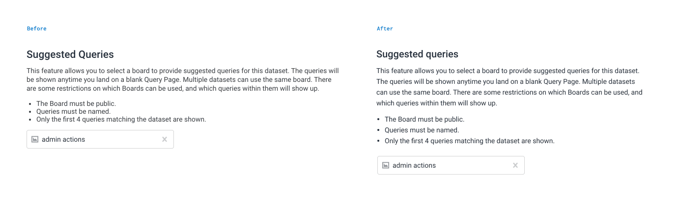
- Capitalization: Lattice calls for sentence case for optimal readability, as title case causes fluctuations in vertical eye movement and a lower-quality reading experience.
- Consistent action terms: In buttons and hyperlinks, we’re committing to consistency around actions like “New” vs. “Create.” Most of the time, one will work across the board and result in a quicker action since the user becomes used to the term.
- Alignment: Numbers in tables should be right-aligned when possible, which helps users compare values more easily.
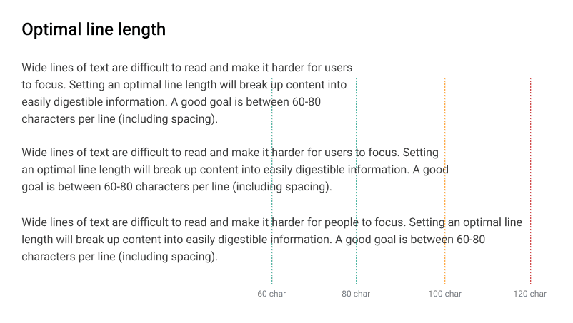
- Line length: The optimal length for a line of paragraph-sized text is between 60-80 characters. Less than 60 interrupts the reader’s flow since their eyes are forced to shift to a new line frequently, and more than 80 make it difficult to shift focus to the next line after reaching the end of the previous line.
Accessibility
- Headings: H1-H5s should be in a logical sequence for screen readers. There should be only one H1 element per page, and headings should not be skipped in a page’s hierarchy.
- Contrast: Smaller font sizes require heavier font weights or darker colors to compensate since characters light in weight and/or color can recede and become difficult to read.
What’s next for Honeycomb’s typography?
The next area of focus for typography in Honeycomb will be data visualization. We recognize opportunities for improvement within our graphs, particularly when it comes to responsiveness at varying screen sizes, where certain values can become difficult to read. The team is assessing the best way to optimize font styles and other UI elements within our charting, which should make our data visualizations in the product even better.
As far as Lattice is concerned, we’re thrilled to have a solid foundation for our designs that will continue to make system improvements much easier to release, and give engineers and designers more time and energy to focus on user research and product features.
We have more updates coming, so stay tuned! And we’d love your feedback. 🙂
Want to know more?
Talk to our team to arrange a custom demo or for help finding the right plan.